視圖容器
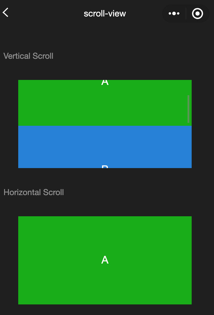
scroll-view
功能說明: 可滾動視圖區域。 使用豎向滾動時,需要給<scroll-view>一個固定高度,通過WXSS設定height。
參數及說明:
| 内容 | 類型 | 預設值 | 說明 |
|---|---|---|---|
| scroll-x | boolean | false | 允許橫向滾動 |
| scroll-y | boolean | false | 允許縱向滾動 |
| upper-threshold | number/string | 50 | 距頂部/左邊多遠時,觸發scrolltoupper |
| lower-threshold | number/string | 50 | 距底部/右邊多遠時,觸發scrolltolower事件 |
| scroll-top | number/string | - | 設定豎向滾動條位置 |
| scroll-left | number/string | - | 設定橫向滾動條位置 |
| scroll-into-view | string | - | 值應為某子元素id(id不能以數位開頭)。 設定哪個方向可滾動,則在哪個方向滾動到該元素 |
| scroll-with-animation | boolean | false | 在設定滾動條位置時使用動畫過渡 |
| enable-back-to-top | boolean | false | iOS按一下頂部狀態列、Android按兩下標題列時,滾動條返回頂部,只支持豎向 |
| refresher-enabled | boolean | false | 開啟自定義下拉刷新 |
| refresher-threshold | number | 45 | 設定自定義下拉刷新閾值 |
| refresher-default-style | string | "black" | white |
| refresher-background | string | - | 設定自定義下拉刷新區域背景顏色,默認為透明 |
| refresher-triggered | boolean | false | 設定當前下拉刷新狀態,true表示下拉刷新已經被觸發,false表示下拉刷新未被觸發 |
| bounces | boolean | true | iOS下scroll-view邊界彈性控制(同時開啟enhanced内容後生效) |
| show-scrollbar | boolean | true | 滾動條顯隱控制(同時開啟enhanced内容後生效) |
| fast-deceleration | boolean | false | 滑動减速速率控制,僅在iOS下生效(同時開啟enhanced内容後生效) |
| binddragstart | eventhandle | - | 滑動開始事件 (同時開啟 enhanced 屬性後生效) detail { scrollTop, scrollLeft } |
| binddragging | eventhandle | - | 滑動事件 (同時開啟 enhanced 屬性後生效) detail { scrollTop, scrollLeft } |
| binddragend | eventhandle | - | 滑動結束事件 (同時開啟 enhanced 屬性後生效) detail { scrollTop, scrollLeft, velocity } |
| bindscrolltoupper | eventhandle | - | 滾動到頂部/左邊時觸發 |
| bindscrolltolower | eventhandle | - | 滾動到底部/右邊時觸發 |
| bindscroll | eventhandle | - | 滾動時觸發,event.detail = {scrollLeft, scrollTop, scrollHeight, scrollWidth, deltaX, deltaY} |
| scroll-anchoring | boolean | false | 開啟scroll anchoring特性,即控制滾動位置不隨內容變化而抖動,僅在iOS下生效,安卓下可參攷CSSoverflow-anchor内容 |
| enhanced | boolean | false | 啟用scroll-view增强特性,啟用後可通過 Cwx.ScrollViewContext 操作scroll-view |
| paging-enabled | boolean | false | 分頁滑動效果(同時開啟enhanced内容後生效) |
TIP
- 滾動條的長度是預估的,若直接子節點的高度差別較大,則滾動條長度可能會不準確。
- 請勿在scroll-view中使用textarea、map、canvas、video組件。
- scroll-into-view的優先順序高於scroll-top。
- 在滾動scroll-view時會封锁頁面回彈,所以在scroll-view中滾動,是無法觸發onPullDownRefresh。
- 若要使用下拉刷新,請使用頁面的滾動,而不是scroll-view,這樣也能通過點擊頂部狀態列回到頁面頂部。
- 示例代碼:
wxml:
js
<view class="container">
  <view class="page-body">
    <view class="page-section">
      <view class="page-section-title">
        <text>Vertical Scroll</text>
      </view>
      <view class="page-section-spacing">
        <scroll-view
          scroll-y="true"
          style="height: 300rpx;"
          bindscrolltoupper="upper"
          bindscrolltolower="lower"
          bindscroll="scroll"
          scroll-into-view="{{toView}}"
          scroll-top="{{scrollTop}}"
        >
          <view id="demo1" class="scroll-view-item demo-text-1"></view>
          <view id="demo2" class="scroll-view-item demo-text-2"></view>
          <view id="demo3" class="scroll-view-item demo-text-3"></view>
        </scroll-view>
      </view>
    </view>
    <view class="page-section">
      <view class="page-section-title">
        <text>Horizontal Scroll</text>
      </view>
      <view class="page-section-spacing">
        <scroll-view
          class="scroll-view_H"
          scroll-x="true"
          bindscroll="scroll"
          style="width: 100%"
        >
          <view id="demo1" class="scroll-view-item_H demo-text-1"></view>
          <view id="demo2" class="scroll-view-item_H demo-text-2"></view>
          <view id="demo3" class="scroll-view-item_H demo-text-3"></view>
        </scroll-view>
      </view>
    </view>
  </view>
</view>
javascript:
js
const order = ["demo1", "demo2", "demo3"];

Page({
  onShareAppMessage() {
    return {
      title: "scroll-view",
      path: "page/component/pages/scroll-view/scroll-view",
    };
  },

  data: {
    toView: "green",
  },

  upper(e) {
    console.log(e);
  },

  lower(e) {
    console.log(e);
  },

  scroll(e) {
    console.log(e);
  },

  scrollToTop() {
    this.setAction({
      scrollTop: 0,
    });
  },

  tap() {
    for (let i = 0; i < order.length; ++i) {
      if (order[i] === this.data.toView) {
        this.setData({
          toView: order[i + 1],
          scrollTop: (i + 1) * 200,
        });
        break;
      }
    }
  },

  tapMove() {
    this.setData({
      scrollTop: this.data.scrollTop + 10,
    });
  },
});
wxss:
js
.page-section-spacing{
  margin-top: 60rpx;
}
.scroll-view_H{
  white-space: nowrap;
}
.scroll-view-item{
  height: 300rpx;
}
.scroll-view-item_H{
  display: inline-block;
  width: 100%;
  height: 300rpx;
}
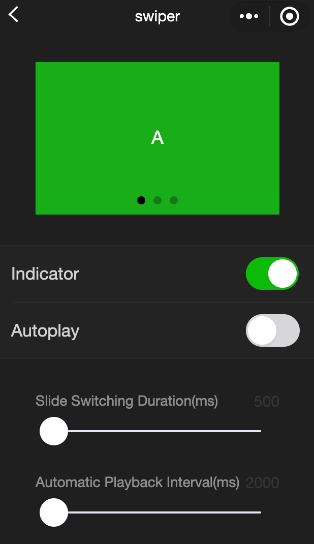
swiper
功能說明: 滑塊視圖容器,change事件返回detail中包含一個source欄位,表示導致變更的原因,可能值如下:
autoplay自動播放導致swiper變化
touch用戶滑動引起swiper變化
其他原因將用空字串表示。
參數及說明:
| 内容 | 類型 | 預設值 | 說明 |
|---|---|---|---|
| indicator-dots | boolean | false | 是否顯示面板訓示點 |
| indicator-color | color | rgba(0, 0, 0, .3) | 訓示點顏色 |
| indicator-active-color | color | #000000 | 當前選中的訓示點顏色 |
| autoplay | boolean | false | 是否自動切換 |
| current | number | 0 | 當前所在滑塊的index |
| current-item-id | String | "" | 當前所在滑塊的item-id,不能與current被同時指定 |
| interval | number | 5000 | 自動切換時間間隔 |
| duration | number | 500 | 滑動動畫時長 |
| circular | boolean | false | 是否採用銜接滑動 |
| vertical | boolean | false | 滑動方向是否為縱向 |
| display-multiple-items | number | 1 | 同時顯示的滑塊數量 |
| previous-margin | string | "0px" | 前邊距,可用於露出前一項的一小部分,接受px和rpx值 |
| easing-function | string | "default" | 指定swiper切換緩動動畫類型,合法值如下: default:默認緩動函數 linear:線性動畫 easeInCubic:緩入動畫 easeOutCubic緩出動畫 easeInOutCubic緩入緩出動畫 |
| next-margin | string | "0px" | 後邊距,可用於露出後一項的一小部分,接受px和rpx值 |
| bindchange | eventhandle | - | current 改變時會觸發 change 事件,event.detail = {current: current, source: source} |
| bindtransition | eventhandle | - | swiper-item 的位置改變時會觸發 transition 事件,event.detail = {dx: dx, dy: dy} |
| bindanimationfinish | eventhandle | - | 動畫結束時會觸發animationfinish事件,event.detail同上 |
| skip-hidden-item-layout | boolean | false | 是否跳過未顯示的滑塊佈局,設為true可優化複雜情况下的滑動效能,但會遺失隱藏狀態滑塊的佈局資訊 |
TIP
- 其中只可放置 swiper-item 組件,否則會導致未定義的行為。
- 如果在bindchange的事件回呼函數中使用setData改變current值,則有可能導致setData被不停地調用,因而通常情况下請在改變,current值前檢測source欄位來判斷是否是由於用戶觸摸引起。
示例代碼:
wxml:
js
<view class="container">
  <view class="page-body">
    <view class="page-section page-section-spacing swiper">
      <swiper
        indicator-dots="{{indicatorDots}}"
        autoplay="{{autoplay}}"
        interval="{{interval}}"
        duration="{{duration}}"
      >
        <block wx:for="{{background}}" wx:key="*this">
          <swiper-item>
            <view class="swiper-item {{item}}"></view>
          </swiper-item>
        </block>
      </swiper>
    </view>
    <view class="page-section" style="margin-top: 40rpx;margin-bottom: 0;">
      <view class="weui-cells weui-cells_after-title">
        <view class="weui-cell weui-cell_switch">
          <view class="weui-cell__bd">Indicator</view>
          <view class="weui-cell__ft">
            <switch
              checked="{{indicatorDots}}"
              bindchange="changeIndicatorDots"
            />
          </view>
        </view>
        <view class="weui-cell weui-cell_switch">
          <view class="weui-cell__bd">Auto play</view>
          <view class="weui-cell__ft">
            <switch checked="{{autoplay}}" bindchange="changeAutoplay" />
          </view>
        </view>
      </view>
    </view>

    <view class="page-section page-section-spacing">
      <view class="page-section-title">
        <text>Slide transition duration(ms)</text>
        <text class="info">{{ duration }}</text>
      </view>
      <slider
        bindchange="durationChange"
        value="{{duration}}"
        min="500"
        max="2000"
      />
      <view class="page-section-title">
        <text>Auto play Interval duration(ms)</text>
        <text class="info">{{ interval }}</text>
      </view>
      <slider
        bindchange="intervalChange"
        value="{{interval}}"
        min="2000"
        max="10000"
      />
    </view>
  </view>
</view>
javascript:
js
Page({
  onShareAppMessage() {
    return {
      title: "swiper",
      path: "page/component/pages/swiper/swiper",
    };
  },

  data: {
    background: ["demo-text-1", "demo-text-2", "demo-text-3"],
    indicatorDots: true,
    vertical: false,
    autoplay: false,
    interval: 2000,
    duration: 500,
  },

  changeIndicatorDots() {
    this.setData({
      indicatorDots: !this.data.indicatorDots,
    });
  },

  changeAutoplay() {
    this.setData({
      autoplay: !this.data.autoplay,
    });
  },

  intervalChange(e) {
    this.setData({
      interval: e.detail.value,
    });
  },

  durationChange(e) {
    this.setData({
      duration: e.detail.value,
    });
  },
});
swiper-item
功能說明: 僅可放置在swiper組件中,寬高自動設定為100%
參數及說明:
| 内容 | 類型 | 預設值 | 說明 |
|---|---|---|---|
| item-id | string | "" | 該swiper-item的識別字 |
view
功能說明: 視圖容器。
參數及說明:
| 内容 | 類型 | 預設值 | 說明 |
|---|---|---|---|
| hover-class | string | - | 指定按下去的樣式類,當hover-class='none'時,沒有點擊態效果 |
| hover-stop-propagation | boolean | false | 指定是否封锁本節點的祖先節點出現點擊態 |
| hover-start-time | number | 50 | 按住後多久出現點擊態,單位毫秒 |
| hover-stay-time | number | 400 | 手指鬆開後點擊態保留時間,單位毫秒 |
TIP
如果需要使用滾動視圖,請使用 scroll-view
示例代碼:
wxml:
js
<view class="container">
  <view class="page-body">
    <view class="page-section">
      <view class="page-section-title">
        <text>flex-direction: row\nHorizontal layout</text>
      </view>
      <view class="page-section-spacing">
        <view class="flex-wrp" style="flex-direction:row;">
          <view class="flex-item demo-text-1"></view>
          <view class="flex-item demo-text-2"></view>
          <view class="flex-item demo-text-3"></view>
        </view>
      </view>
    </view>
    <view class="page-section">
      <view class="page-section-title">
        <text>flex-direction: column\nVertical layout</text>
      </view>
      <view class="flex-wrp" style="flex-direction:column;">
        <view class="flex-item flex-item-V demo-text-1"></view>
        <view class="flex-item flex-item-V demo-text-2"></view>
        <view class="flex-item flex-item-V demo-text-3"></view>
      </view>
    </view>
  </view>
</view>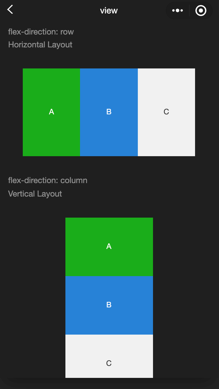
movable-area
功能說明: movable-view的可移動區域
參數及說明:
| 内容 | 類型 | 預設值 | 說明 |
|---|---|---|---|
| scale-area | boolean | false | 當裡面的movable-view設定為支持雙指縮放時,設定此值可將縮放手勢生效區域修改為整個movable-area |
TIP
- movable-area必須設定width和height内容,不設定默認為10px。
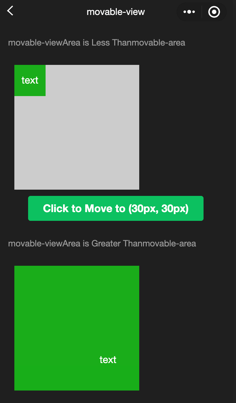
- 當movable-view小於movable-area時,movable-view的移動範圍是在movable-area內。
- 當movable-view大於movable-area時,movable-view的移動範圍必須包含movable-area(x軸方向和y軸方向分開考慮)。
wxml:
js
<view class="container">
  <view class="page-body">
    <view class="page-section">
      <view class="page-section-title first">
        movable-view  area smaller movable-area
      </view>
      <movable-area>
        <movable-view x="{{x}}" y="{{y}}" direction="all">
          text
        </movable-view>
      </movable-area>
    </view>
    <view class="btn-area">
      <button bindtap="tap" class="page-body-button" type="primary">
        click to move to (30px, 30px)
      </button>
    </view>

    <view class="page-section">
      <view class="page-section-title">movable-view region larger than movable-area</view>
      <movable-area>
        <movable-view class="max" direction="all">
          text
        </movable-view>
      </movable-area>
    </view>

    <view class="page-section">
      <view class="page-section-title">only horizontal movement is allowed.</view>
      <movable-area>
        <movable-view direction="horizontal">text</movable-view>
      </movable-area>
    </view>

    <view class="page-section">
      <view class="page-section-title">only vertical movement is allowed.</view>
      <movable-area>
        <movable-view direction="vertical">text</movable-view>
      </movable-area>
    </view>

    <view class="page-section">
      <view class="page-section-title">Can exceed the boundary</view>
      <movable-area>
        <movable-view direction="all" out-of-bounds>
          text
        </movable-view>
      </movable-area>
    </view>

    <view class="page-section">
      <view class="page-section-title">With inertia</view>
      <movable-area>
        <movable-view direction="all" inertia>
          text
        </movable-view>
      </movable-area>
    </view>

    <view class="page-section">
      <view class="page-section-title">Scalable</view>
      <movable-area scale-area>
        <movable-view
          direction="all"
          bindchange="onChange"
          bindscale="onScale"
          scale
          scale-min="0.5"
          scale-max="4"
          scale-value="{{scale}}"
        >
          text
        </movable-view>
      </movable-area>
    </view>

    <view class="btn-area">
      <button bindtap="tap2" class="page-body-button" type="primary">
        Click to zoom in 3 times
      </button>
    </view>
  </view>
</view>
javascript:
js
Page({
  onShareAppMessage() {
    return {
      title: "movable-view",
      path: "page/component/pages/movable-view/movable-view",
    };
  },

  data: {
    x: 0,
    y: 0,
    scale: 2,
  },

  tap() {
    this.setData({
      x: 30,
      y: 30,
    });
  },

  tap2() {
    this.setData({
      scale: 3,
    });
  },

  onChange(e) {
    console.log(e.detail);
  },

  onScale(e) {
    console.log(e.detail);
  },
});
movable-view
功能說明: 可移動的視圖容器,在頁面中可以拖拽滑動 movable-view 必須在 movable-area 組件中,並且必須是直接子節點,否則不能移動
參數及說明:
| 内容 | 類型 | 必填 | 說明 |
|---|---|---|---|
| direction | string | none | movable-view的移動方向,屬性值有all、 vertical、horizontal、none |
| inertia | boolean | false | movable-view是否帶有慣性 |
| out-of-bounds | boolean | false | 超過可移動區域後,movable-view是否還可以移動 |
| x | number / string | 0 | 定義x軸方向的偏移,如果x的值不在可移動範圍內,會自動移動到可移動範圍; 改變x的值會觸發動畫 |
| y | number / string | 0 | 定義y軸方向的偏移,如果y的值不在可移動範圍內,會自動移動到可移動範圍; 改變y的值會觸發動畫 |
| damping | number | 20 | 阻尼係數,用於控制x或y改變時的動畫和過界回彈的動畫,值越大移動越快 |
| friction | number | 2 | 摩擦係數,用於控制慣性滑動的動畫,值越大摩擦力越大,滑動越快停止; 必須大於0,否則會被設定成預設值 |
| disabled | boolean | false | 是否禁用 |
| scale | boolean | false | 是否支持雙指縮放,默認縮放手勢生效區域是在movable-view內 |
| scale-min | number | 0.5 | 定義縮放倍數最小值 |
| scale-max | number | 10 | 定義縮放倍數最大值 |
| scale-value | number | 1 | 定義縮放倍數,取值範圍為0.5 - 10 |
| animation | boolean | true | 是否使用動畫 |
| bindchange | eventhandle | - | 拖曳過程中觸發的事件,event.detail = {x: x, y: y, source: source},其中 source 表示產生移動的原因,數值可為: touch:拖動; touch-out-of-bounds: 超出移動範圍; out-of-bounds: 超出移動範圍後的回彈; friction: 慣性; 空字串: setData; |
| bindscale | eventhandle | - | 縮放過程中觸發的事件,event.detail = {x: x, y: y, scale: scale} |
除了基本事件外,movable-view提供了兩個特殊事件。
| 事件名; | 類型 | 觸發條件 |
|---|---|---|
| htouchmove | eventhandle | 初次手指觸摸後移動為橫向的移動,如果catch此事件,則意味著touchmove事件也被catch |
| vtouchmove | eventhandle | 初次手指觸摸後移動為縱向的移動,如果catch此事件,則意味著touchmove事件也被catch |
TIP
- movable-area必須設定width和height内容,不設定默認為10px。
- movable-view默認為絕對定位,top和left内容為0px。
cover-image
功能說明 覆蓋在原生組件之上的圖片視圖,可覆蓋的原生組件同 cover-view ,支持嵌套在 cover-view 裏。
參數及說明:
| 内容 | 類型 | 預設值 | 說明 |
|---|---|---|---|
| src | string | - | 圖標路徑,支持臨時路徑、網路位址; 暫不支持SVG和BASE64格式; |
| bindload | eventhandle | - | 圖片加載成功時觸發 |
| binderror | eventhandle | - | 圖片加載失敗時觸發 |
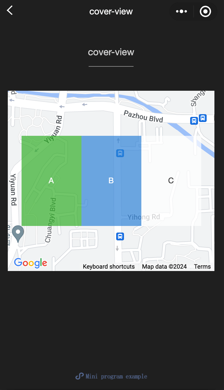
cover-view
功能說明 覆蓋在原生組件之上的文字視圖,可覆蓋的原生組件包括 map、video、canvas、camera、live-player、live-pusher,,只支持嵌套cover-view、cover-image,可在 cover-view中使用button
參數及說明:
| 内容 | 類型 | 預設值 | 說明 |
|---|---|---|---|
| scroll-top | number / string | - | 設定頂部滾動偏移量,僅在設定了overflow-y: scroll成為滾動元素後生效 |
TIP
- 事件模型遵循冒泡模型,但不會冒泡到原生組件。
- 文字建議都套上cover-view標籤,避免排版錯誤。
- 只支持基本的定位、佈局、文字樣式。 不支持設定單邊的border、background-image、shadow、overflow: visible等。
- 建議子節點不要溢出父節點。
- 支持使用z-index控制層級。
- 默認設置的樣式有: white-space: nowrap; line-height: 1.2; display: block。
- 自定義組件嵌套cover-view時,自定義組件的slot及其父節點暫不支持通過wx:if控制顯隱,否則會導致cover-view不顯示。
示例代碼:
wxml:
js
<view class="container">
<view class="page-body">
  <view class="page-section page-section-gap">
    <map
      style="width: 100%; height: 300px;"
      latitude="{{latitude}}"
      longitude="{{longitude}}"
    >
      <cover-view class="cover-view">
        <cover-view class="container">
          <cover-view class="flex-wrp" style="flex-direction:row;">
            <cover-view class="flex-item demo-text-1"></cover-view>
            <cover-view class="flex-item demo-text-2"></cover-view>
            <cover-view class="flex-item demo-text-3"></cover-view>
          </cover-view>
        </cover-view>
      </cover-view>
    </map>
  </view>
</view>
</view>
javascript:
js
Page({
  onShareAppMessage() {
    return {
      title: 'cover-view',
      path: 'page/component/pages/cover-view/cover-view'
    }
  },

  data: {
    latitude: 23.099994,
    longitude: 113.324520,
  }
})
wxss:
js
.cover-view {
  position: absolute;
  top: calc(50% - 150rpx);
  left: calc(50% - 300rpx);
  /* opacity: .7; */
}

.flex-wrp{
  display:flex;
}

.flex-item{
  width: 200rpx;
  height: 300rpx;
  font-size: 26rpx;
}

.demo-text-1 {
  background: rgba(26, 173, 25, 0.7);
}

.demo-text-2 {
  background: rgba(39, 130, 215, 0.7);
}

.demo-text-3 {
  background: rgba(255, 255, 255, 0.7);
}