View Container
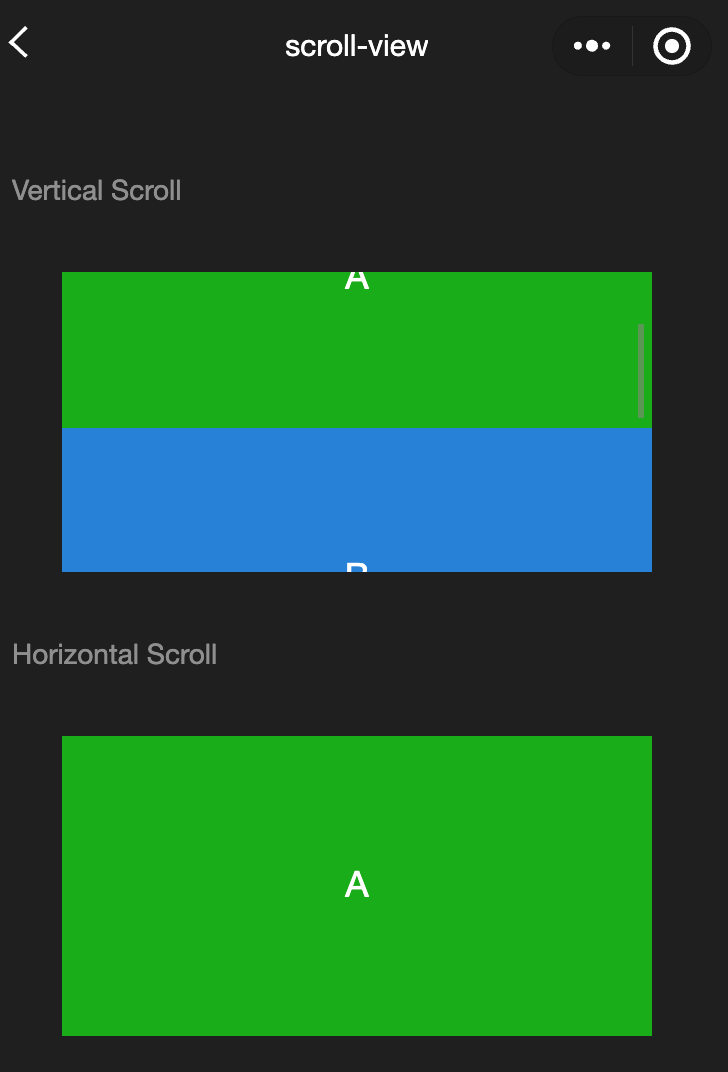
scroll-view
Functional description: Scrollable view area. When using vertical scrolling, you need to give <scroll-view> a fixed height and set the height through WXSS.
Parameters and descriptions:
| Properties | Type | Default value | Description |
|---|---|---|---|
| scroll-x | boolean | false | Allow horizontal scrolling |
| scroll-y | boolean | false | Allow vertical scrolling |
| upper-threshold | number/string | 50 | How far from the top/left to trigger scrolltoupper |
| lower-threshold | number/string | 50 | How far from the bottom/right to trigger scrolltolower event |
| scroll-top | number/string | - | Set the vertical scroll bar position |
| scroll-left | number/string | - | Set the horizontal scroll bar position |
| scroll-into-view | string | - | The value should be a child element id (id cannot start with a number). Set which direction to scroll to the element in which direction |
| scroll-with-animation | boolean | false | Use animation transition when setting the scroll bar position |
| enable-back-to-top | boolean | false | iOS clicks the top status bar, Android double-clicks the title bar, the scroll bar returns to the top, only supports vertical |
| refresher-enabled | boolean | false | Enable custom pull-down refresh |
| refresher-threshold | number | 45 | Set custom pull-down refresh threshold |
| refresher-default-style | string | "black" | white |
| refresher-background | string | - | Set custom pull-down refresh area background color, default is transparent |
| refresher-triggered | boolean | false | Set current pull-down refresh state, true means pull-down refresh has been triggered, false means pull-down refresh has not been triggered |
| bounces | boolean | true | Scroll-view boundary elasticity control under iOS (effective after enabling enhanced attribute at the same time) |
| show-scrollbar | boolean | true | Scroll bar visibility control (effective after enabling enhanced attribute at the same time) |
| fast-deceleration | boolean | false | Slide deceleration rate control, only effective under iOS (effective after enabling enhanced attribute at the same time) |
| binddragstart | eventhandle | - | Slide start event (effective when the enhanced attribute is enabled) detail { scrollTop, scrollLeft } |
| binddragging | eventhandle | - | Slide event (effective when the enhanced attribute is enabled) detail { scrollTop, scrollLeft } |
| binddragend | eventhandle | - | Slide end event (effective when the enhanced property is enabled) detail { scrollTop, scrollLeft, velocity } |
| bindscrolltoupper | eventhandle | - | Trigger when scrolling to top/left |
| bindscrolltolower | eventhandle | - | Trigger when scrolling to bottom/right |
| bindscroll | eventhandle | - | Triggered when scrolling, event.detail = {scrollLeft, scrollTop, scrollHeight, scrollWidth, deltaX, deltaY} |
| scroll-anchoring | boolean | false | Enable the scroll anchoring feature, that is, control the scroll position not to shake with content changes. It is only effective on iOS. For Android, refer to the CSS overflow-anchor property. |
| enhanced | boolean | false | Enable the scroll-view enhanced feature. After enabling, you can use Cwx.ScrollViewContext to operate the scroll-view |
| paging-enabled | boolean | false | Page sliding effect (effective after enabling the enhanced property at the same time) |
TIP
- The length of the scroll bar is estimated. If the height difference of the direct child nodes is large, the scroll bar length may be inaccurate.
- Do not use textarea, map, canvas, and video components in scroll-view.
- scroll-into-view has a higher priority than scroll-top.
- When scrolling the scroll-view, the page will be prevented from rebounding, so scrolling in the scroll-view will not trigger onPullDownRefresh.
- If you want to use pull-down refresh, use the page scrolling instead of scroll-view, so you can also return to the top of the page by clicking the top status bar.
- Sample code:
wxml:
<view class="container">
  <view class="page-body">
    <view class="page-section">
      <view class="page-section-title">
        <text>Vertical Scroll</text>
      </view>
      <view class="page-section-spacing">
        <scroll-view
          scroll-y="true"
          style="height: 300rpx;"
          bindscrolltoupper="upper"
          bindscrolltolower="lower"
          bindscroll="scroll"
          scroll-into-view="{{toView}}"
          scroll-top="{{scrollTop}}"
        >
          <view id="demo1" class="scroll-view-item demo-text-1"></view>
          <view id="demo2" class="scroll-view-item demo-text-2"></view>
          <view id="demo3" class="scroll-view-item demo-text-3"></view>
        </scroll-view>
      </view>
    </view>
    <view class="page-section">
      <view class="page-section-title">
        <text>Horizontal Scroll</text>
      </view>
      <view class="page-section-spacing">
        <scroll-view
          class="scroll-view_H"
          scroll-x="true"
          bindscroll="scroll"
          style="width: 100%"
        >
          <view id="demo1" class="scroll-view-item_H demo-text-1"></view>
          <view id="demo2" class="scroll-view-item_H demo-text-2"></view>
          <view id="demo3" class="scroll-view-item_H demo-text-3"></view>
        </scroll-view>
      </view>
    </view>
  </view>
</view>
javascript:
const order = ["demo1", "demo2", "demo3"];

Page({
  onShareAppMessage() {
    return {
      title: "scroll-view",
      path: "page/component/pages/scroll-view/scroll-view",
    };
  },

  data: {
    toView: "green",
  },

  upper(e) {
    console.log(e);
  },

  lower(e) {
    console.log(e);
  },

  scroll(e) {
    console.log(e);
  },

  scrollToTop() {
    this.setAction({
      scrollTop: 0,
    });
  },

  tap() {
    for (let i = 0; i < order.length; ++i) {
      if (order[i] === this.data.toView) {
        this.setData({
          toView: order[i + 1],
          scrollTop: (i + 1) * 200,
        });
        break;
      }
    }
  },

  tapMove() {
    this.setData({
      scrollTop: this.data.scrollTop + 10,
    });
  },
});
wxss:
.page-section-spacing{
  margin-top: 60rpx;
}
.scroll-view_H{
  white-space: nowrap;
}
.scroll-view-item{
  height: 300rpx;
}
.scroll-view-item_H{
  display: inline-block;
  width: 100%;
  height: 300rpx;
}
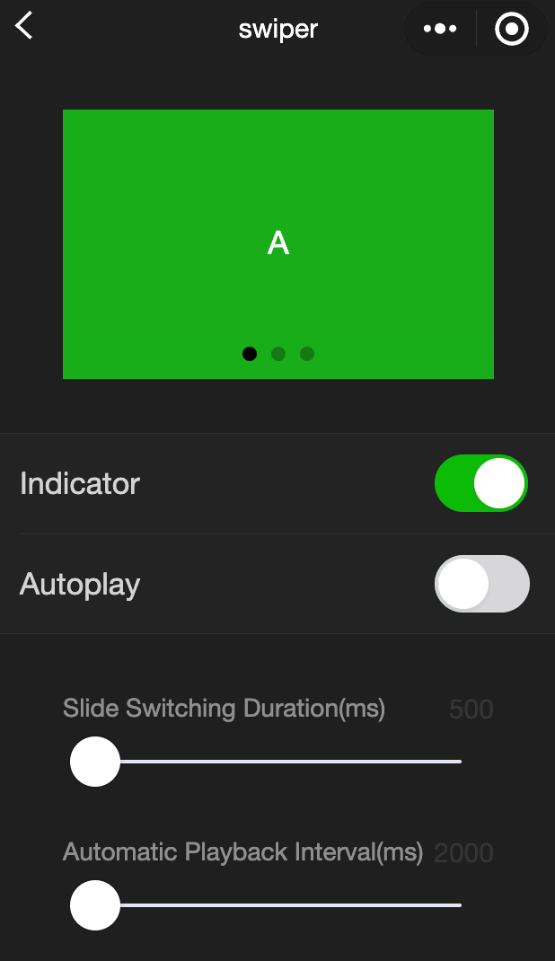
swiper
Functional description: Slider view container, the change event returns a detail containing a source field, indicating the cause of the change, with the following possible values:
autoplay causes swiper changes
touch causes swiper changes
Other reasons will be represented by an empty string.
Parameters and descriptions:
| Properties | Type | Default value | Description |
|---|---|---|---|
| indicator-dots | boolean | false | Whether to display the panel indicator |
| indicator-color | color | rgba(0, 0, 0, .3) | Indicator color |
| indicator-active-color | color | #000000 | Currently selected indicator color |
| autoplay | boolean | false | Whether to switch automatically |
| current | number | 0 | The index of the current slider |
| current-item-id | String | "" | The item-id of the current slider, which cannot be specified at the same time as current |
| interval | number | 5000 | Automatic switching time interval |
| duration | number | 500 | Sliding animation duration |
| circular | boolean | false | Whether to use continuous sliding |
| vertical | boolean | false | Whether the sliding direction is vertical |
| display-multiple-items | number | 1 | The number of sliders displayed at the same time |
| previous-margin | string | "0px" | Front margin, which can be used to expose a small part of the previous item, accepts px and rpx values |
| easing-function | string | "default" | Specify the swiper switching slow animation type, the legal values default:Default easing function linear:Linear animation easeInCubic:Ease-in animation easeOutCubicEase-out animation easeInOutCubicEase-in and ease-out animation |
| next-margin | string | "0px" | Back margin, which can be used to expose a small part of the back item, accepts px and rpx values |
| bindchange | eventhandle | - | When current changes, a change event is triggered, event.detail = {current: current, source: source} |
| bindtransition | eventhandle | - | When the position of swiper-item changes, a transition event is triggered, event.detail = {dx: dx, dy: dy} |
| bindanimationfinish | eventhandle | - | When the animation ends, the animationfinish event is triggered, event.detail is the same as above |
| skip-hidden-item-layout | boolean | false | Whether to skip the layout of undisplayed sliders. Setting it to true can optimize the sliding performance in complex situations, but the layout information of the hidden slider will be lost. |
TIP
- It can only be placed in swiper-item components can be placed in it, otherwise it will lead to undefined behavior.
- If setData is used to change the current value in the event callback function of bindchange, it may cause setData to be called continuously. Therefore, please check the source field before changing the current value to determine whether it is caused by user touch.
Sample code:
wxml:
<view class="container">
  <view class="page-body">
    <view class="page-section page-section-spacing swiper">
      <swiper
        indicator-dots="{{indicatorDots}}"
        autoplay="{{autoplay}}"
        interval="{{interval}}"
        duration="{{duration}}"
      >
        <block wx:for="{{background}}" wx:key="*this">
          <swiper-item>
            <view class="swiper-item {{item}}"></view>
          </swiper-item>
        </block>
      </swiper>
    </view>
    <view class="page-section" style="margin-top: 40rpx;margin-bottom: 0;">
      <view class="weui-cells weui-cells_after-title">
        <view class="weui-cell weui-cell_switch">
          <view class="weui-cell__bd">Indicator</view>
          <view class="weui-cell__ft">
            <switch
              checked="{{indicatorDots}}"
              bindchange="changeIndicatorDots"
            />
          </view>
        </view>
        <view class="weui-cell weui-cell_switch">
          <view class="weui-cell__bd">Auto play</view>
          <view class="weui-cell__ft">
            <switch checked="{{autoplay}}" bindchange="changeAutoplay" />
          </view>
        </view>
      </view>
    </view>

    <view class="page-section page-section-spacing">
      <view class="page-section-title">
        <text>Slide transition duration(ms)</text>
        <text class="info">{{ duration }}</text>
      </view>
      <slider
        bindchange="durationChange"
        value="{{duration}}"
        min="500"
        max="2000"
      />
      <view class="page-section-title">
        <text>Auto play Interval duration(ms)</text>
        <text class="info">{{ interval }}</text>
      </view>
      <slider
        bindchange="intervalChange"
        value="{{interval}}"
        min="2000"
        max="10000"
      />
    </view>
  </view>
</view>
javascript:
Page({
  onShareAppMessage() {
    return {
      title: "swiper",
      path: "page/component/pages/swiper/swiper",
    };
  },

  data: {
    background: ["demo-text-1", "demo-text-2", "demo-text-3"],
    indicatorDots: true,
    vertical: false,
    autoplay: false,
    interval: 2000,
    duration: 500,
  },

  changeIndicatorDots() {
    this.setData({
      indicatorDots: !this.data.indicatorDots,
    });
  },

  changeAutoplay() {
    this.setData({
      autoplay: !this.data.autoplay,
    });
  },

  intervalChange(e) {
    this.setData({
      interval: e.detail.value,
    });
  },

  durationChange(e) {
    this.setData({
      duration: e.detail.value,
    });
  },
});
swiper-item
Functional description: Can only be placed in the swiper component, the width and height are automatically set to 100%
Parameters and descriptions:
| Properties | Type | Default value | Description |
|---|---|---|---|
| item-id | string | "" | The identifier of the swiper-item |
view
Functional description: View container.
Parameters and descriptions:
| Properties | Type | Default value | Description |
|---|---|---|---|
| hover-class | string | - | Specify the style class of pressing down. When hover-class='none', there is no click state effect |
| hover-stop-propagation | boolean | false | Specifies whether to prevent the ancestor node of this node from appearing in the click state |
| hover-start-time | number | 50 | How long does it take for the click state to appear after pressing, in milliseconds |
| hover-stay-time | number | 400 | How long does the click state remain after the finger is released, in milliseconds |
TIP
If you need to use a scroll view, please use scroll-view
Sample code:
wxml:
<view class="container">
  <view class="page-body">
    <view class="page-section">
      <view class="page-section-title">
        <text>flex-direction: row\nHorizontal layout</text>
      </view>
      <view class="page-section-spacing">
        <view class="flex-wrp" style="flex-direction:row;">
          <view class="flex-item demo-text-1"></view>
          <view class="flex-item demo-text-2"></view>
          <view class="flex-item demo-text-3"></view>
        </view>
      </view>
    </view>
    <view class="page-section">
      <view class="page-section-title">
        <text>flex-direction: column\nVertical layout</text>
      </view>
      <view class="flex-wrp" style="flex-direction:column;">
        <view class="flex-item flex-item-V demo-text-1"></view>
        <view class="flex-item flex-item-V demo-text-2"></view>
        <view class="flex-item flex-item-V demo-text-3"></view>
      </view>
    </view>
  </view>
</view>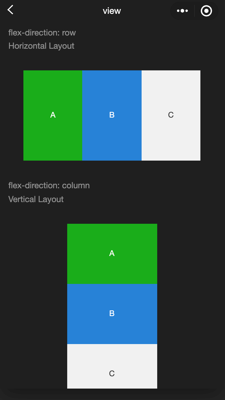
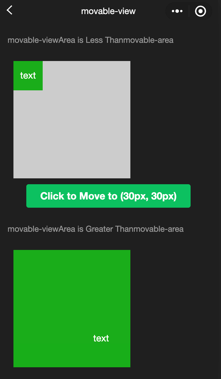
movable-area
Functional description: Movable area of
Parameters and descriptions:
| Properties | Type | Default value | Description |
|---|---|---|---|
| scale-area | boolean | false | When the movable-view inside is set to support pinch-to-zoom, setting this value can change the zoom gesture effective area to the entire movable-area |
TIP
- The movable-area must set the width and height attributes, and the default is 10px if not set.
- When movable-view is smaller than movable-area, the movable-view's moving range is within movable-area.
- When movable-view is larger than movable-area, the movable-view's moving range must include movable-area (the x-axis direction and the y-axis direction are considered separately).
wxml:
<view class="container">
  <view class="page-body">
    <view class="page-section">
      <view class="page-section-title first">
        movable-view  area smaller movable-area
      </view>
      <movable-area>
        <movable-view x="{{x}}" y="{{y}}" direction="all">
          text
        </movable-view>
      </movable-area>
    </view>
    <view class="btn-area">
      <button bindtap="tap" class="page-body-button" type="primary">
        click to move to (30px, 30px)
      </button>
    </view>

    <view class="page-section">
      <view class="page-section-title">movable-view region larger than movable-area</view>
      <movable-area>
        <movable-view class="max" direction="all">
          text
        </movable-view>
      </movable-area>
    </view>

    <view class="page-section">
      <view class="page-section-title">only horizontal movement is allowed.</view>
      <movable-area>
        <movable-view direction="horizontal">text</movable-view>
      </movable-area>
    </view>

    <view class="page-section">
      <view class="page-section-title">only vertical movement is allowed.</view>
      <movable-area>
        <movable-view direction="vertical">text</movable-view>
      </movable-area>
    </view>

    <view class="page-section">
      <view class="page-section-title">Can exceed the boundary</view>
      <movable-area>
        <movable-view direction="all" out-of-bounds>
          text
        </movable-view>
      </movable-area>
    </view>

    <view class="page-section">
      <view class="page-section-title">With inertia</view>
      <movable-area>
        <movable-view direction="all" inertia>
          text
        </movable-view>
      </movable-area>
    </view>

    <view class="page-section">
      <view class="page-section-title">Scalable</view>
      <movable-area scale-area>
        <movable-view
          direction="all"
          bindchange="onChange"
          bindscale="onScale"
          scale
          scale-min="0.5"
          scale-max="4"
          scale-value="{{scale}}"
        >
          text
        </movable-view>
      </movable-area>
    </view>

    <view class="btn-area">
      <button bindtap="tap2" class="page-body-button" type="primary">
        Click to zoom in 3 times
      </button>
    </view>
  </view>
</view>
javascript:
Page({
  onShareAppMessage() {
    return {
      title: "movable-view",
      path: "page/component/pages/movable-view/movable-view",
    };
  },

  data: {
    x: 0,
    y: 0,
    scale: 2,
  },

  tap() {
    this.setData({
      x: 30,
      y: 30,
    });
  },

  tap2() {
    this.setData({
      scale: 3,
    });
  },

  onChange(e) {
    console.log(e.detail);
  },

  onScale(e) {
    console.log(e.detail);
  },
});
movable-view
Functional description: Movable view container, which can be dragged and slid in the page movable-view Must be in movable-area the component and must be a direct child node, otherwise it cannot be moved
Parameters and descriptions:
| Properties | Type | Required | Description |
|---|---|---|---|
| direction | string | none | The moving direction of movable-view, the attribute values |
| inertia | boolean | false | Whether movable-view has inertia |
| out-of-bounds | boolean | false | Whether movable-view can still move after exceeding the movable area |
| x | number / string | 0 | Define the offset in the x-axis direction. If the value of x is not in the movable range, it will automatically move to the movable range; changing the value of x will trigger the animation |
| y | number / string | 0 | Define the offset in the y-axis direction. If the value of y is not in the movable range, it will automatically move to the movable range; changing the value of y will trigger the animation |
| damping | number | 20 | Damping coefficient, used to control the animation when x or y changes and the animation of rebounding when crossing the boundary. The larger the value, the faster the movement |
| friction | number | 2 | Friction coefficient, used to control the animation of inertial sliding. The larger the value, the greater the friction, and the faster the sliding stops; it must be greater than 0, otherwise it will be set to the default value |
| disabled | boolean | false | Whether to disable |
| scale | boolean | false | Whether to support pinch-to-zoom. The default zoom gesture effective area is within movable-view |
| scale-min | number | 0.5 | Define the minimum zoom factor |
| scale-max | number | 10 | Define the maximum zoom factor |
| scale-value | number | 1 | Define the zoom factor, the value range is 0.5 - 16 |
| animation | boolean | true | Whether to use animation |
| bindchange | eventhandle | - | Events triggered during dragging, event.detail = {x: x, y: y, source: source}, where source indicates the reason for the movement, and the value can be: touch:Drag; touch-out-of-bounds: Exceeding the moving range; out-of-bounds: Rebound after exceeding the moving range; friction: Inertia; Empty string: setData; |
| bindscale | eventhandle | - | Events triggered during the zoom process, event.detail = {x: x, y: y, scale: scale} |
| Event name; | Type | Triggering conditions |
|---|---|---|
| htouchmove | eventhandle | The movement after the first finger touch is horizontal movement. If this event is caught, it means that the touchmove event is also caught |
| vtouchmove | eventhandle | The movement after the first finger touch is vertical movement. If this event is caught, it means that the touchmove event is also caught |
TIP
- The movable-area must set the width and height attributes, and the default is 10px if not set.
- The default position of movable-view is absolute, and the top and left attributes are 0px.
cover-image
Function Description The image view overlaid on the native component, the native component that can be overlaid is the same as cover-view , and it supports nesting in cover-view inside.
Parameters and descriptions:
| Properties | Type | Default value | Description |
|---|---|---|---|
| src | string | - | Icon path, supports temporary path and network address; SVG and BASE64 formats are not supported yet; |
| bindload | eventhandle | - | Triggered when the image is loaded successfully |
| binderror | eventhandle | - | Triggered when the image fails to load |
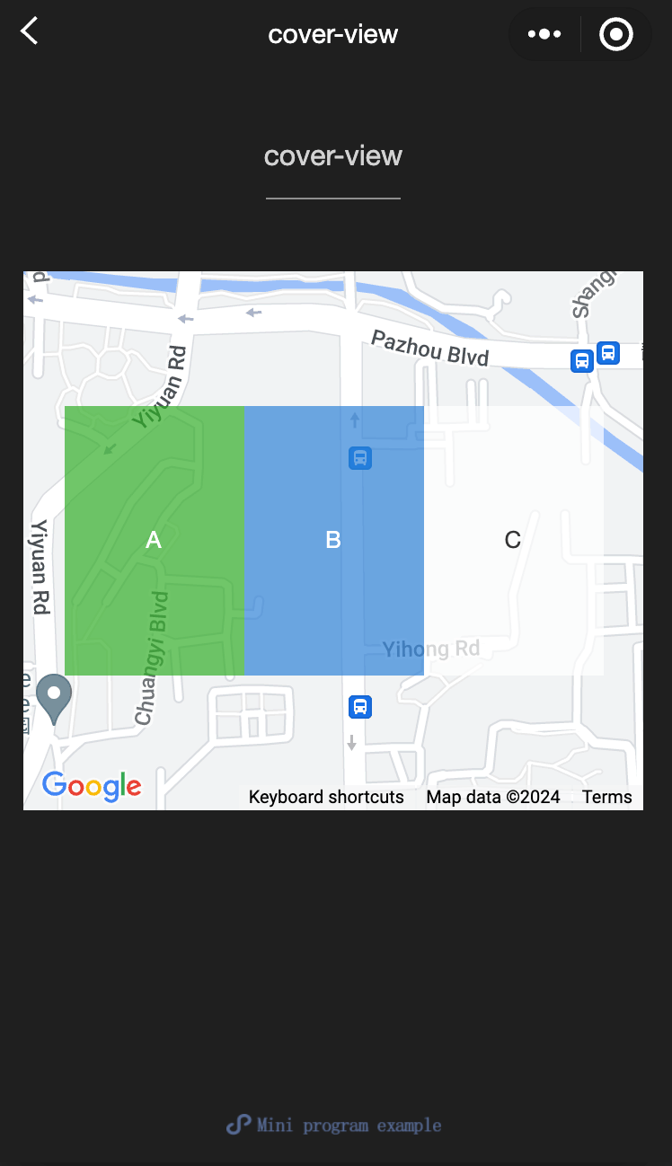
cover-view
Function Description The text view overlaid on the native component, the native components that can be overlaid include map、video、canvas、camera、live-player、live-pusher,, only supports nestingcover-view、cover-image, can be cover-viewUse inbutton
Parameters and descriptions:
| Properties | Type | Default value | Description |
|---|---|---|---|
| scroll-top | number / string | - | Set the top scroll offset, which only takes effect after overflow-y: scroll is set to become a scroll element |
TIP
- The event model follows the bubbling model, but it will not bubble to native components.
- Text suggestions are all covered with cover-view tags to avoid typographical errors.
- Only basic positioning, layout, and text styles are supported. Setting unilateral border, background-image, shadow, overflow: visible, etc. is not supported.
- It is recommended that child nodes do not overflow parent nodes.
- Support the use of z-index to control the hierarchy.
- The default styles are: white-space: nowrap; line-height: 1.2; display: block.
- When a custom component is nested in cover-view, the slot of the custom component and its parent node do not support the control of visibility through wx:if, otherwise the cover-view will not be displayed.
Sample code:
wxml:
<view class="container">
<view class="page-body">
  <view class="page-section page-section-gap">
    <map
      style="width: 100%; height: 300px;"
      latitude="{{latitude}}"
      longitude="{{longitude}}"
    >
      <cover-view class="cover-view">
        <cover-view class="container">
          <cover-view class="flex-wrp" style="flex-direction:row;">
            <cover-view class="flex-item demo-text-1"></cover-view>
            <cover-view class="flex-item demo-text-2"></cover-view>
            <cover-view class="flex-item demo-text-3"></cover-view>
          </cover-view>
        </cover-view>
      </cover-view>
    </map>
  </view>
</view>
</view>
javascript:
Page({
  onShareAppMessage() {
    return {
      title: 'cover-view',
      path: 'page/component/pages/cover-view/cover-view'
    }
  },

  data: {
    latitude: 23.099994,
    longitude: 113.324520,
  }
})
wxss:
.cover-view {
  position: absolute;
  top: calc(50% - 150rpx);
  left: calc(50% - 300rpx);
  /* opacity: .7; */
}

.flex-wrp{
  display:flex;
}

.flex-item{
  width: 200rpx;
  height: 300rpx;
  font-size: 26rpx;
}

.demo-text-1 {
  background: rgba(26, 173, 25, 0.7);
}

.demo-text-2 {
  background: rgba(39, 130, 215, 0.7);
}

.demo-text-3 {
  background: rgba(255, 255, 255, 0.7);
}