表單組件
button
功能說明: 按鈕。
參數及說明:
| 内容 | 類型 | 合法值及說明 | 預設值 | 必填 | 說明 |
|---|---|---|---|---|---|
| size | string | default:默認大小 mini:小尺寸 | default | 否 | 按鈕的大小 |
| type | string | primary:綠色 default:白色 warn:紅色 | default | 否 | 按鈕的樣式類型 |
| plain | boolean | - | false | 否 | 按鈕是否鏤空,背景色 |
| disabled | boolean | - | false | 否 | 是否禁用 |
| loading | boolean | - | false | 否 | 名稱前是否帶loading圖標 |
| form-type | string | submit:提交表單 reset:重置表單 | - | 否 | 用於 form 組件,按一下分別會觸發form組件的submit/reset事件 |
| open-type | string | share:觸發用戶轉發 getPhoneNumber:手機號快速驗證,向用戶申請,並在用戶同意後,快速填寫和驗證手機 getUserInfo:獲取用戶資訊,可以從bindgetuserinfo回檔中獲取到用戶資訊 openSetting:打開授權設定頁 feedback:打開'意見回饋'頁面,用戶可提交迴響內容並上傳日誌 | - | 否 | 宿主app開放能力 |
| hover-class | string | - | button-hover | 否 | 指定按鈕按下去的樣式類。 當hover-class='none'; 時,沒有按一下態效果 |
| hover-start-time | number | - | 20 | 否 | 按住後多久出現按一下態,單位毫秒 |
| hover-stay-time | number | - | 70 | 否 | 手指鬆開後按一下態保留時間,單位毫秒 |
| lang | string | en:英文 zh_TW:繁體中文 | en | 否 | 指定返回用戶資訊的語言 |
| bindgetuserinfo | eventhandle | - | - | 否 | 用戶點擊該按鈕時,會返回獲取到的用戶資訊,回檔的detail數據與wx.getUserInfo返回的一致,open-type='getUserInfo'時有效 |
| bindgetphonenumber | eventhandle | - | - | 否 | 手機號快速驗證回檔,open-type=getPhoneNumber時有效 注意:在觸發bindgetphonenumber回檔後應立即隱藏手機號按鈕組件,或置為disabled狀態,避免用戶重複授權手機號產生額外費用 |
| bindopensetting | eventhandle | - | - | 否 | 在打開授權設定頁後回檔,open-type=openSetting時有效 |
TIP
現時設定了form-type的button只會對當前組件中的form有效。 因而,將button封裝在自定義組件中,而form在自定義組件外,將會使這個button的form-type失效。
- 示例代碼:
wxml:
<view class="page-body">
  <view class="btn-area" id="buttonContainer">
    <button type="primary">Primary Page Action Normal</button>
    <button type="primary" loading="true">
      Primary Page Action Loading
    </button>
    <button type="primary" disabled="true">
      Primary Page Action Disabled
    </button>

    <button type="default">Secondary Page Action Normal</button>
    <button type="default" disabled="true">
      Secondary Page Action Disabled
    </button>

    <button type="warn">Warning Action Normal</button>
    <button type="warn" disabled="true">
      Warning Action Disabled
    </button>

    <view class="button-sp-area">
      <button type="primary" plain="true">
        Button
      </button>
      <button type="primary" disabled="true" plain="true">
        Disabled button
      </button>

      <button type="default" plain="true">
        Button
      </button>
      <button type="default" disabled="true" plain="true">
        Button
      </button>

      <button class="mini-btn" type="primary" size="mini">
        Button
      </button>
      <button class="mini-btn" type="default" size="mini">
        Button
      </button>
      <button class="mini-btn" type="warn" size="mini">
        Button
      </button>
    </view>
  </view>
</view>
javascript:
const types = ['default', 'primary', 'warn']
const pageObject = {
  data: {
    defaultSize: 'default',
    primarySize: 'default',
    warnSize: 'default',
    disabled: false,
    plain: false,
    loading: false
  },

  onShareAppMessage() {
    return {
      title: 'button',
      path: 'page/component/pages/button/button'
    }
  },

  setDisabled() {
    this.setData({
      disabled: !this.data.disabled
    })
  },

  setPlain() {
    this.setData({
      plain: !this.data.plain
    })
  },

  setLoading() {
    this.setData({
      loading: !this.data.loading
    })
  },

  handleContact(e) {
    console.log(e.detail)
  },

  handleGetPhoneNumber(e) {
    console.log(e.detail)
  },

  handleGetUserInfo(e) {
    console.log(e.detail)
  },

  handleOpenSetting(e) {
    console.log(e.detail.authSetting)
  },

  handleGetUserInfo(e) {
    console.log(e.detail.userInfo)
  }
}

for (let i = 0; i < types.length; ++i) {
  (function (type) {
    pageObject[type] = function () {
      const key = type + 'Size'
      const changedData = {}
      changedData[key] =
        this.data[key] === 'default' ? 'mini' : 'default'
      this.setData(changedData)
    }
  }(types[i]))
}

Page(pageObject)
wxss:
button{
  margin-top: 30rpx;
  margin-bottom: 30rpx;
}
.button-sp-area{
  margin: 0 auto;
  width: 60%;
}
.mini-btn{
  margin-right: 10rpx;
}
checkbox
功能說明: 多選項目。
參數及說明:
| 内容 | 類型 | 預設值 | 必填 | 說明 |
|---|---|---|---|---|
| value | string | - | 否 | checkbox標識,選中時觸發 checkbox-group 的change事件,並攜帶checkbox的value |
| disabled | boolean | false | 否 | 是否禁用 |
| checked | boolean | false | 否 | 當前是否選中,可用來設定默認選中 |
| color | string | #09BB07 | 否 | checkbox的顏色,同css的color |
- 示例代碼:
wxml:
<view class="container">
<view class="page-body">
<view class="page-section page-section-gap">
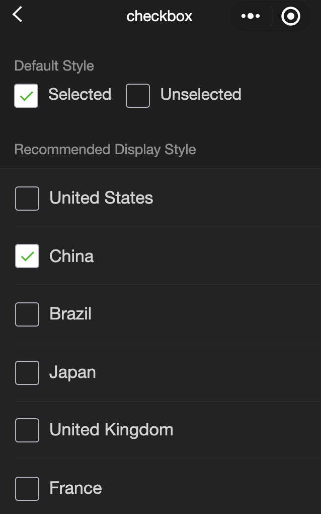
<view class="page-section-title">Default style</view>
<label class="checkbox">
<checkbox value="cb" checked="true"/>Selected
</label>
<label class="checkbox">
<checkbox value="cb" />Unselected
</label>
</view>
<view class="page-section">
<view class="page-section-title">Recommended display style</view>
<view class="weui-cells weui-cells_after-title">
<checkbox-group bindchange="checkboxChange">
<label class="weui-cell weui-check__label" wx:for="{{items}}" wx:key="{{item.value}}">
<view class="weui-cell__hd">
<checkbox value="{{item.value}}" checked="{{item.checked}}"/>
</view>
<view class="weui-cell__bd">{{item.name}}</view>
</label>
</checkbox-group>
</view>
</view>
</view>
</view>javascript:
Page({
  onShareAppMessage() {
    return {
      title: 'checkbox',
      path: 'page/component/pages/checkbox/checkbox'
    }
  },

  data: {
    items: [
      {value: 'USA', name: 'United States'},
      {value: 'CHN', name: 'China', checked: 'true'},
      {value: 'BRA', name: 'Brazil'},
      {value: 'JPN', name: 'Japan'},
      {value: 'ENG', name: 'United Kingdom'},
      {value: 'FRA', name: 'France'}
    ]
  },

  checkboxChange(e) {
    console.log('A change event is triggered in the checkbox, and the carried value is', e.detail.value)

    const items = this.data.items
    const values = e.detail.value
    for (let i = 0, lenI = items.length; i < lenI; ++i) {
      items[i].checked = false

      for (let j = 0, lenJ = values.length; j < lenJ; ++j) {
        if (items[i].value === values[j]) {
          items[i].checked = true
          break
        }
      }
    }

    this.setData({
      items
    })
  }
})
checkbox-group
功能說明: 多項選擇器,內部由多個checkbox組成。
參數及說明:
| 内容 | 類型 | 預設值 | 必填 | 說明 |
|---|---|---|---|---|
| bindchange | eventhandle | - | 否 | checkbox-group 中選取項目發生改變時觸發 change 事件,detail = {value:[選取的 checkbox 的 value 的陣列]} |
editor
- 功能說明: 按鈕。
通過setContents接口設定內容時,解析插入的html可能會由於一些非法標籤導致解析錯誤,建議開發者在小程序內使用時通過delta進行插入。
富文字組件內部引入了一些基本的樣式使得內容可以正確的展示,開發時可以進行覆蓋。
圖片控制項僅初始化時設定有效。
相關api: EditorContext
- 參數及說明:
| 内容 | 類型 | 預設值 | 必填 | 說明 |
|---|---|---|---|---|
| read-only | boolean | false | 否 | 設定編輯器為只讀 |
| placeholder | string | - | 否 | 提示資訊 |
| show-img-size | boolean | false | 否 | 點擊圖片時顯示圖片大小控制項 |
| show-img-toolbar | boolean | false | 否 | 點擊圖片時顯示工具列控制項 |
| show-img-resize | boolean | false | 否 | 點擊圖片時顯示修改尺寸控制項 |
| bindready | eventhandle | - | 否 | 編輯器初始化完成時觸發 |
| bindfocus | eventhandle | - | 否 | 編輯器對焦時觸發,event.detail = {html, text, delta} |
| bindblur | eventhandle | - | 否 | 編輯器失去焦點時觸發,detail = {html, text, delta} |
| bindinput | eventhandle | - | 否 | 編輯器內容改變時觸發,detail = {html, text, delta} |
| bindstatuschange | eventhandle | - | 否 | 通過Context方法改變編輯器內樣式時觸發,返回選區已設定的樣式 |
- 支持的標籤
| 類型 | 節點 |
|---|---|
| 行內元素 | <span> <strong> <b> <ins> <em> <i> <u> <a> <del> <s> <sub> <sup> <img> |
| 塊級元素 | <p> <h1> <h2> <h3> <h4> <h5> <h6> <hr> <ol> <ul> <li> |
- 支持的內聯樣式
| 類型 | 節點 |
|---|---|
| 行內元素 | font 、font-size 、font-style 、font-variant 、font-weight 、font-family 、letter-spacing 、text-decoration 、color 、background-color |
| 塊級元素 | text-align 、direction 、margin 、margin-top 、margin-left 、margin-right 、margin-bottom、 padding 、padding-top 、padding-left 、padding-right 、padding-bottom 、line-height 、text-indent |
TIP
- 插入的html中事件綁定會被移除。
- 粘貼時僅純文字內容會被拷貝進編輯器。
- 插入html到編輯器內時,編輯器會删除一些不必要的標籤,以保證內容的統一。 例如<p><span>xxx</span></p>會改寫為<p>xxx</p>。
- 編輯器聚焦時頁面會被上推,系統行為以保證編輯區可見。
form
當按一下form表單中form-type為submit的 button 組件時,會將表單組件中的value值進行提交,需要在表單組件中加上name來作為key。
- 參數及說明::
| 内容 | 類型 | 預設值 | 必填 | 說明 |
|---|---|---|---|---|
| bindsubmit | eventhandle | - | 否 | 攜帶 form 中的資料觸發 submit 事件,event.detail = {value : {'name': 'value'} , formId: ''} |
| bindreset | eventhandle | - | 否 | 表單重置時會觸發reset事件 |
- 示例代碼:
wxml:
<view class="container">
<view class="page-body">
<form catchsubmit="formSubmit" catchreset="formReset">
<view class="page-section page-section-gap">
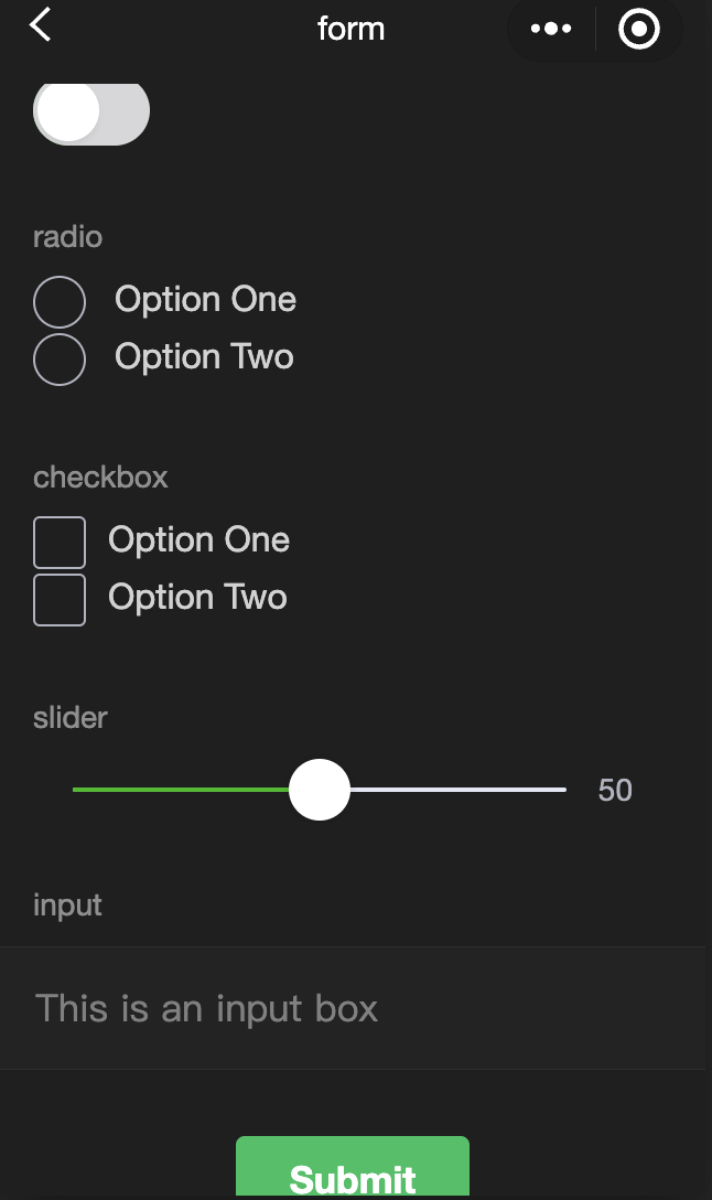
<view class="page-section-title">switch</view>
<switch name="switch" />
</view>
<view class="page-section page-section-gap">
<view class="page-section-title">radio</view>
<radio-group name="radio">
<label>
<radio value="radio1" />
Option 1
</label>
<label>
<radio value="radio2" />
Option 2
</label>
</radio-group>
</view>
<view class="page-section page-section-gap">
<view class="page-section-title">checkbox</view>
<checkbox-group name="checkbox">
<label>
<checkbox value="checkbox1" />
Option 1
</label>
<label>
<checkbox value="checkbox2" />
Option 2
</label>
</checkbox-group>
</view>
<view class="page-section page-section-gap">
<view class="page-section-title">slider</view>
<slider value="50" name="slider" show-value></slider>
</view>
<view class="page-section">
<view class="page-section-title">input</view>
<view class="weui-cells weui-cells_after-title">
<view class="weui-cell weui-cell_input">
<view class="weui-cell__bd" style="margin: 30rpx 0">
<input
class="weui-input"
name="input"
placeholder="This is an input box"
/>
</view>
</view>
</view>
</view>
<view class="btn-area">
<button style="margin: 30rpx 0" type="primary" formType="submit">
Submit
</button>
<button style="margin: 30rpx 0" formType="reset">
Reset
</button>
</view>
</form>
</view>
</view>javascript:
Page({
  onShareAppMessage() {
    return {
      title: "form",
      path: "page/component/pages/form/form",
    };
  },

  data: {
    pickerHidden: true,
    chosen: "",
  },

  pickerConfirm(e) {
    this.setData({
      pickerHidden: true,
    });
    this.setData({
      chosen: e.detail.value,
    });
  },

  pickerCancel() {
    this.setData({
      pickerHidden: true,
    });
  },

  pickerShow() {
    this.setData({
      pickerHidden: false,
    });
  },

  formSubmit(e) {
    console.log(
      "A submit event is triggered in the form, and the carried data is",
      e.detail.value
    );
  },

  formReset(e) {
    console.log(
      "A reset event is triggered in the form, and the carried data is",
      e.detail.value
    );
    this.setData({
      chosen: "",
    });
  },
});
input
功能說明: 輸入框,該組件是 原生組件 ,使用時請注意相關限制,相關API可參見
參數及說明:
| 内容 | 類型 | 合法值及說明 | 預設值 | 必填 | 說明 |
|---|---|---|---|---|---|
| value | string | - | - | 否 | 輸入框的初始內容 |
| type | string | text:文字輸入鍵盤 number:數位輸入鍵盤 idcard:身份證輸入鍵盤 digit:帶小數點的數位鍵盤 | text | 否 | input的類型 |
| password | boolean | - | false | 否 | 是否是密碼類型 |
| placeholder | string | - | 是 | 輸入框為空時預留位置 | |
| placeholder-style | string | - | 是 | 指定placeholder的樣式 | |
| placeholder-class | string | input-placeholder | 否 | 指定placeholder的樣式類 | |
| disabled | boolean | - | false | 否 | 是否禁用 |
| maxlength | number | - | 140 | 否 | 最大輸入長度,設定為-1的時候不限制最大長度 |
| cursor-spacing | number | - | 0 | 否 | 指定光標與鍵盤的距離,取input距離底部的距離和cursor-spacing指定的距離的最小值作為光標與鍵盤的距離 |
| auto-focus | boolean | - | false | 否 | (即將廢棄,請直接使用focus)自動聚焦,拉起鍵盤 |
| focus | boolean | - | false | 否 | 獲取焦點 |
| confirm-type | string | send:右下角按鈕為'發送' search:右下角按鈕為'蒐索' next:右下角按鈕為'下一個' go:右下角按鈕為'前往' done:右下角按鈕為'完成' | done | 否 | 設定鍵盤右下角按鈕的文字 |
| confirm-hold | boolean | - | false | 否 | 點擊鍵盤右下角按鈕時是否保持鍵盤不收起 |
| cursor | number | - | - | 是 | 輸入框聚焦時觸發,event.detail = { value, height },height 為鍵盤高度 |
| selection-start | number | - | -1 | 否 | 輸入框失去焦點時觸發,event.detail = {value, cursor} |
| selection-end | number | - | -1 | 否 | 光標結束位置,自動聚集時有效,需與selection-start搭配使用 |
| adjust-position | boolean | - | true | 否 | 鍵盤彈起時,是否自動上推頁面 |
| hold-keyboard | boolean | - | false | 否 | focus時,點擊頁面的時候不收起鍵盤 |
| bindinput | eventhandle | - | - | 是 | 鍵盤輸入時觸發,event.detail = {value, cursor, keyCode},keyCode 為鍵值,處理函數可以直接 return 一個字串,將取代輸入框的內容。 |
| bindfocus | eventhandle | - | - | 是 | 輸入框聚焦時觸發,event.detail = { value, height },height 為鍵盤高度 |
| bindblur | eventhandle | - | - | 是 | 輸入框失去焦點時觸發,event.detail = { value, encryptedValue, encryptError } |
| bindconfirm | eventhandle | - | - | 是 | 點選完成按鈕時觸發,event.detail = { value } |
| bindkeyboardheightchange | eventhandle | - | - | 是 | 鍵盤高度改變的時候觸發此事件,event.detail = {height: height, duration: duration} |
TIP
- confirm-type的最終表現與手機輸入法本身的實現有關,部分安卓系統輸入法和協力廠商輸入法可能不支持或不完全支持
- input組件是一個原生組件,字體是系統字體,所以無法設定font-family
- 在input聚焦期間,避免使用css動畫
- 對於將input封裝在自定義組件中、而form在自定義組件外的情况, form將不能獲得這個自定義組件中input的值
- 鍵盤高度發生變化,keyboardheightchange事件可能會多次觸發,開發者對於相同的height值應該忽略掉
- 示例代碼:
wxml:
<view class="page-body">
<view class="page-section">
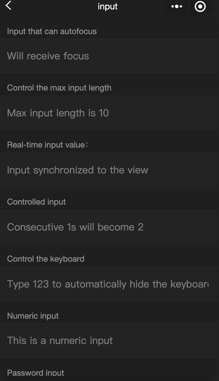
<view class="weui-cells__title">Input that can be auto-focused</view>
<view class="weui-cells weui-cells_after-title">
<view class="weui-cell weui-cell_input">
<input class="weui-input" auto-focus placeholder="Will be focused" />
</view>
</view>
</view>
<view class="page-section">
<view class="weui-cells__title">
Input that controls the max input length
</view>
<view class="weui-cells weui-cells_after-title">
<view class="weui-cell weui-cell_input">
<input
class="weui-input"
maxlength="10"
placeholder="The max input length is 10"
/>
</view>
</view>
</view>
<view class="page-section">
<view class="weui-cells__title">
Get the input value in real-time: {{ inputValue }}
</view>
<view class="weui-cells weui-cells_after-title">
<view class="weui-cell weui-cell_input">
<input
class="weui-input"
maxlength="10"
bindinput="bindKeyInput"
placeholder="Input is synced to the view"
/>
</view>
</view>
</view>
<view class="page-section">
<view class="weui-cells__title">Input that the controls the typing</view>
<view class="weui-cells weui-cells_after-title">
<view class="weui-cell weui-cell_input">
<input
class="weui-input"
bindinput="bindReplaceInput"
placeholder="Typing two consecutive ones will generate a two"
/>
</view>
</view>
</view>
<view class="page-section">
<view class="weui-cells__title">Input that controls the keyboard</view>
<view class="weui-cells weui-cells_after-title">
<view class="weui-cell weui-cell_input">
<input
class="weui-input"
bindinput="bindHideKeyboard"
placeholder="Typing 123 will automatically close the keyboard"
/>
</view>
</view>
</view>
<view class="page-section">
<view class="weui-cells__title">Input for entering numbers</view>
<view class="weui-cells weui-cells_after-title">
<view class="weui-cell weui-cell_input">
<input
class="weui-input"
type="number"
placeholder="This is a number input box"
/>
</view>
</view>
</view>
<view class="page-section">
<view class="weui-cells__title">Input for entering a password</view>
<view class="weui-cells weui-cells_after-title">
<view class="weui-cell weui-cell_input">
<input
class="weui-input"
password
type="text"
placeholder="This is a password input box"
/>
</view>
</view>
</view>
<view class="page-section">
<view class="weui-cells__title">Input with a decimal point</view>
<view class="weui-cells weui-cells_after-title">
<view class="weui-cell weui-cell_input">
<input
class="weui-input"
type="digit"
placeholder="Numeric keyboard with a decimal point"
/>
</view>
</view>
</view>
<view class="page-section">
<view class="weui-cells__title">Input for entering ID card numbers</view>
<view class="weui-cells weui-cells_after-title">
<view class="weui-cell weui-cell_input">
<input
class="weui-input"
type="idcard"
placeholder="ID card input keyboard"
/>
</view>
</view>
</view>
<view class="page-section">
<view class="weui-cells__title">
Input that controls the placeholder color
</view>
<view class="weui-cells weui-cells_after-title">
<view class="weui-cell weui-cell_input">
<input
class="weui-input"
placeholder-style="color:#F76260"
placeholder="The color of the placeholder font is red"
/>
</view>
</view>
</view>
</view>javascript:
Page({
  data: {
    focus: false,
    inputValue: "",
  },
  bindKeyInput: function (e) {
    this.setData({
      inputValue: e.detail.value,
    });
  },
  bindReplaceInput: function (e) {
    var value = e.detail.value;
    var pos = e.detail.cursor;
    var left;
    if (pos !== -1) {
      // The cursor is in the middle
      left = e.detail.value.slice(0, pos);
      // Calculates the cursor position
      pos = left.replace(/11/g, "2").length;
    }

    // Returns the object directly, filters the input, and controls the cursor position
    return {
      value: value.replace(/11/g, "2"),
      cursor: pos,
    };

    // Or returns the string directly, with the cursor at the end
    // return value.replace(/11/g,'2'),
  },
  bindHideKeyboard: function (e) {
    if (e.detail.value === "123") {
      // Closes the keyboard
      wx.hideKeyboard();
    }
  },
});
label
- 功能說明: 用來改進表單組件的可用性。
使用for内容找到對應的id,或者將控制項放在該標籤下,當按一下時,就會觸發對應的控制項。 for優先順序高於內部控制項,內部有多個控制項的時候默認觸發第一個控制項。 現時可以綁定的控制項有: button checkbox radio switch input
- 參數及說明:
| 内容 | 類型 | 預設值 | 必填 | 說明 |
|---|---|---|---|---|
| for | string | - | 否 | 綁定控制項的id |
- 示例代碼:
wxml:
<view class="container">
<view class="page-body">
<view class="page-section page-section-gap">
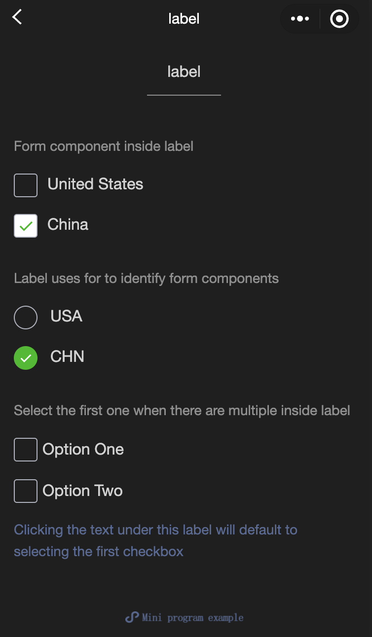
<view class="page-section-title">The form component is inside the label</view>
<checkbox-group class="group" bindchange="checkboxChange">
<view class="label-1" wx:for="{{checkboxItems}}">
<label>
<checkbox value="{{item.name}}" checked="{{item.checked}}"></checkbox>
<text class="label-1-text">{{item.value}}</text>
</label>
</view>
</checkbox-group>
</view>
<view class="page-section page-section-gap">
<view class="page-section-title">Label uses for to identify the form component</view>
<radio-group class="group" bindchange="radioChange">
<view class="label-2" wx:for="{{radioItems}}">
<radio id="{{item.name}}" value="{{item.name}}" checked="{{item.checked}}"></radio>
<label class="label-2-text" for="{{item.name}}"><text>{{item.name}}</text></label>
</view>
</radio-group>
</view>
<view class="page-section page-section-gap">
<view class="page-section-title">If there are multiple controls in the label, the first one is selected</view>
<label class="label-3">
<checkbox class="checkbox-3">Option 1</checkbox>
<checkbox class="checkbox-3">Option 2</checkbox>
<view class="label-3-text">When tapping the text under this label, the first checkbox is selected by default</view>
</label>
</view>
</view>
</view>javascript:
Page({
  onShareAppMessage() {
    return {
      title: 'label',
      path: 'page/component/pages/label/label'
    }
  },

  data: {
    checkboxItems: [
      {name: 'USA', value: 'United States'},
      {name: 'CHN', value: 'China', checked: 'true'}
    ],
    radioItems: [
      {name: 'USA', value: 'United States'},
      {name: 'CHN', value: 'China', checked: 'true'}
    ],
    hidden: false
  },

  checkboxChange(e) {
    const checked = e.detail.value
    const changed = {}
    for (let i = 0; i < this.data.checkboxItems.length; i++) {
      if (checked.indexOf(this.data.checkboxItems[i].name) !== -1) {
        changed['checkboxItems[' + i + '].checked'] = true
      } else {
        changed['checkboxItems[' + i + '].checked'] = false
      }
    }
    this.setData(changed)
  },

  radioChange(e) {
    const checked = e.detail.value
    const changed = {}
    for (let i = 0; i < this.data.radioItems.length; i++) {
      if (checked.indexOf(this.data.radioItems[i].name) !== -1) {
        changed['radioItems[' + i + '].checked'] = true
      } else {
        changed['radioItems[' + i + '].checked'] = false
      }
    }
    this.setData(changed)
  },

  tapEvent() {
    console.log('the button is tapped')
  }
})
wxss:
.label-1, .label-2{
  margin: 30rpx 0;
}
.label-3-text{
  color: #576B95;
  font-size: 28rpx;
}
.checkbox-3{
  display: block;
  margin: 30rpx 0;
}
picker
功能說明: 從底部彈起的滾動選擇器。
參數及說明:
| 内容 | 類型 | 合法值及說明 | 預設值 | 必填 | 說明 |
|---|---|---|---|---|---|
| mode | string | selector:普通選擇器 multiSelector:多列選擇器 time:時間選擇器 date:日期選擇器 region:省市區選擇器 | selector | 否 | 選擇器類型 |
| disabled | boolean | - | false | 否 | 是否禁用 |
| bindcancel | eventhandle | - | - | 否 | 取消選擇時觸發 |
普通選擇器: mode = selector
| 内容名 | 類型 | 預設值 | 說明 |
|---|---|---|---|
| range | array/object array | [] | mode為selector或multiSelector時,range有效 |
| range-key | string | - | 當range是一個Object Array時,通過range-key來指定Object中key的值作為選擇器顯示內容 |
| value | number | 0 | 表示選擇了range中的第幾個(下標從0開始) |
| bindchange | eventhandle | - | value 改變時觸發 change 事件,event.detail = {value} |
多列選擇器: mode = multiSelector
| 内容名 | 類型 | 預設值 | 說明 |
|---|---|---|---|
| range | array/object array | [] | mode為selector或multiSelector時,range有效 |
| range-key | string | - | 當range是一個Object Array時,通過range-key來指定Object中key的值作為選擇器顯示內容 |
| value | number | [] | 表示選擇了range中的第幾個(下標從0開始) |
| bindchange | eventhandle | - | value 改變時觸發 change 事件,event.detail = {value} |
| bindcolumnchange | eventhandle | - | 列改變時觸發 |
時間選擇器: mode = time
| 内容名 | 類型 | 預設值 | 說明 |
|---|---|---|---|
| value | string | - | 表示選中的時間,格式為'hh:mm' |
| start | string | - | 表示有效時間範圍的開始,字串格式為'hh:mm' |
| end | string | - | 表示有效時間範圍的結束,字串格式為'hh:mm' |
| bindchange | eventhandle | - | value 改變時觸發 change 事件,event.detail = {value} |
日期選擇器: mode = date
| 内容名 | 類型 | Valid values | 預設值 | 說明 |
|---|---|---|---|---|
| value | string | - | Current day | 表示選中的日期,格式為'YYYY-MM-DD' |
| start | string | - | - | 表示有效日期範圍的開始,字串格式為'YYYY-MM-DD' |
| end | string | - | - | 表示有效日期範圍的結束,字串格式為'YYYY-MM-DD' |
| fields | string | year:選擇器細微性為年 month:選擇器細微性為月份 day:選擇器細微性為天 | day | 有效值year, month,day, 表示選擇器的細微性 |
| bindchange | eventhandle | - | - | value 改變時觸發 change 事件,event.detail = {value} |
地域選擇器: mode = region
| 内容名 | 類型 | Valid values | 預設值 | 說明 |
|---|---|---|---|---|
| value | Array | [] | Current day | 表示選中的地域,默認選中每一列的第一個值 |
| custom-item | string | - | - | 可為每一列的頂部添加一個自定義的項 |
| bindchange | evenhandle | - | - | value 改變時觸發 change 事件,event.detail = {value: value, code: code, postcode: postcode},其中欄位 code 是統計用區劃代碼,postcode 是郵遞區號 |
- 示例代碼:
wxml:
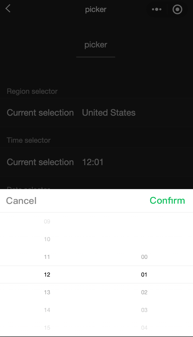
<view class="section">
  <view class="section__title">Normal picker</view>
  <picker bindchange="bindPickerChange" value="{{index}}" range="{{array}}">
    <view class="picker">
      Currently selected: {{array[index]}}
    </view>
  </picker>
</view>
<view class="section">
  <view class="section__title">Multi-column picker</view>
  <picker mode="multiSelector" bindchange="bindMultiPickerChange" bindcolumnchange="bindMultiPickerColumnChange" value="{{multiIndex}}" range="{{multiArray}}">
    <view class="picker">
      Currently selected: {{multiArray[0][multiIndex[0]]}}, {{multiArray[1][multiIndex[1]]}}, {{multiArray[2][multiIndex[2]]}}
    </view>
  </picker>
</view>
<view class="section">
  <view class="section__title">Time picker</view>
  <picker mode="time" value="{{time}}" start="09:01" end="21:01" bindchange="bindTimeChange">
    <view class="picker">
      Currently selected: {{time}}
    </view>
  </picker>
</view>

<view class="section">
  <view class="section__title">Date picker</view>
  <picker mode="date" value="{{date}}" start="2015-09-01" end="2017-09-01" bindchange="bindDateChange">
    <view class="picker">
      Currently selected: {{date}}
    </view>
  </picker>
</view>
<view class="section">
  <view class="section__title">Region picker</view>
  <picker mode="region" bindchange="bindRegionChange" value="{{region}}" custom-item="{{customItem}}">
    <view class="picker">
      Currently selected: {{region[0]}}, {{region[1]}}, {{region[2]}}
    </view>
  </picker>
</view>
javascript:
Page({
  data: {
    array: ['United States', 'China', 'Brazil', 'Japan'],
    objectArray: [
      {
        id: 0,
        name: 'United States'
      },
      {
        id: 1,
        name: 'China'
      },
      {
        id: 2,
        name: 'Brazil'
      },
      {
        id: 3,
        name: 'Japan'
      }
    ],
    index: 0,
    multiArray: [['Invertebrates', 'Vertebrates'], ['Flatworms', 'Nematodes', 'Annelates', 'Mollusks', 'Arthropods'], ['Pork tapeworms', 'Blood-sucking worms']],
    objectMultiArray: [
      [
        {
          id: 0,
          name: 'Invertebrates'
        },
        {
          id: 1,
          name: 'Vertebrates'
        }
      ], [
        {
          id: 0,
          name: 'Flatworms'
        },
        {
          id: 1,
          name: 'Nematodes'
        },
        {
          id: 2,
          name: 'Annelates'
        },
        {
          id: 3,
          name: 'Mollusks'
        },
        {
          id: 4,
          name: 'Arthropods'
        }
      ], [
        {
          id: 0,
          name: 'Pork tapeworms'
        },
        {
          id: 1,
          name: 'Blood-sucking worms'
        }
      ]
    ],
    multiIndex: [0, 0, 0],
    date: '2016-09-01',
    time: '12:01',
    region: ['Guangdong Province', 'Guangzhou', 'Haizhu District'],
    customItem: 'All'
  },
  bindPickerChange: function(e) {
    console.log('The picker sends selection change, and the carried value is' e.detail.value)
    this.setData({
      index: e.detail.value
    })
  },
  bindMultiPickerChange: function (e) {
    console.log('The picker sends selection change, and the carried value is' e.detail.value)
    this.setData({
      multiIndex: e.detail.value
    })
  },
  bindMultiPickerColumnChange: function (e) {
    console.log('The modified column is', e.detail.column, ', and the value is', e.detail.value);
    var data = {
      multiArray: this.data.multiArray,
      multiIndex: this.data.multiIndex
    };
    data.multiIndex[e.detail.column] = e.detail.value;
    switch (e.detail.column) {
      case 0:
        switch (data.multiIndex[0]) {
          case 0:
            data.multiArray[1] = ['Flatworms', 'Nematodes', 'Annelates', 'Mollusks', 'Arthropods'];
            data.multiArray[2] = ['Pork tapeworms', 'Blood-sucking worms'];
            break;
          case 1:
            data.multiArray[1] = ['Fish', ''Amphibians', 'Reptiles'];
            data.multiArray[2] = ['Carassius auratus', 'Hairtail'];
            break;
        }
        data.multiIndex[1] = 0;
        data.multiIndex[2] = 0;
        break;
      case 1:
        switch (data.multiIndex[0]) {
          case 0:
            switch (data.multiIndex[1]) {
              case 0:
                data.multiArray[2] = ['Pork tapeworms', 'Blood-sucking worms'];
                break;
              case 1:
                data.multiArray[2] = ['Roundworms'];
                break;
              case 2:
                data.multiArray[2] = ['Ants', 'Leech'];
                break;
              case 3:
                data.multiArray[2] = ['Mussels', 'Snails', 'Slugs'];
                break;
              case 4:
                data.multiArray[2] = ['Insects', 'Crustaceans', 'Arachnids', 'Myriapods'];
                break;
            }
            break;
          case 1:
            switch (data.multiIndex[1]) {
              case 0:
                data.multiArray[2] = ['Carassius auratus', 'Hairtail'];
                break;
              case 1:
                data.multiArray[2] = [''Frogs', 'Giant salamanders'];
                break;
              case 2:
                data.multiArray[2] = ['Lizards', 'Turtles', 'Geckos'];
                break;
            }
            break;
        }
        data.multiIndex[2] = 0;
        break;
    }
    console.log(data.multiIndex);
    this.setData(data);
  },
  bindDateChange: function(e) {
    console.log('The picker sends selection change, and the carried value is' e.detail.value)
    this.setData({
      date: e.detail.value
    })
  },
  bindTimeChange: function(e) {
    console.log('The picker sends selection change, and the carried value is' e.detail.value)
    this.setData({
      time: e.detail.value
    })
  },
  bindRegionChange: function (e) {
    console.log('The picker sends selection change, and the carried value is' e.detail.value)
    this.setData({
      region: e.detail.value
    })
  }
})
picker-view
功能說明: 嵌入頁面的滾動選擇器。 其中只可放置 picker-view-column 組件,其它節點不會顯示。
參數及說明:
| 内容名 | 類型 | 預設值 | 必填 | 說明 |
|---|---|---|---|---|
| value | Array.<number> | - | 否 | 數組中的數位依次表示picker-view內的picker-view-column選擇的第幾項(下標從0開始),數位大於picker-view-column可選項長度時,選擇最後一項。 |
| mask-class | string | - | 否 | 設定蒙層的類名 |
| vaindicator-stylelue | string | - | 否 | 設定選擇器中間選中框的樣式 |
| bindchange | eventhandle | - | 否 | 捲動選擇時觸發 change 事件,event.detail = {value};value為數組,表示 picker-view 內的 picker-view-column 目前選擇的是第幾項(下標從 0 開始) |
| bindpickstart | eventhandle | - | 否 | 當滾動選擇開始時候觸發事件 |
| bindpickend | eventhandle | - | 否 | 當滾動選擇結束時候觸發事件 |
| indicator-class | string | - | 否 | 設定選擇器中間選中框的類名 |
| mask-style | string | - | 否 | 設定蒙層的樣式 |
| immediate-change | boolean | false | 否 | 是否在手指鬆開時立即觸發change事件。 若不開啟則會在滾動動畫結束後觸發change事件 |
- 示例代碼:
wxml:
<view class="container">
<view class="page-body">
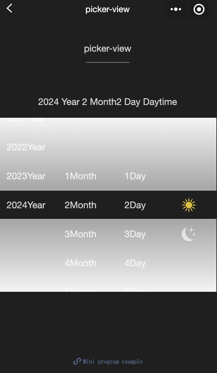
<view class="selected-date">{{year}}Year{{month}}Month{{day}}Day{{isDaytime ? "Day" : "Night"}}</view>
<picker-view indicator-style="height: 50px;" style="width: 100%; height: 300px;" value="{{value}}" bindchange="bindChange">
<picker-view-column>
<view wx:for="{{years}}" wx:key="{{years}}" style="line-height: 50px; text-align: center;">{{item}}Year</view>
</picker-view-column>
<picker-view-column>
<view wx:for="{{months}}" wx:key="{{months}}" style="line-height: 50px; text-align: center;">{{item}}Month</view>
</picker-view-column>
<picker-view-column>
<view wx:for="{{days}}" wx:key="{{days}}" style="line-height: 50px; text-align: center;">{{item}}Day</view>
</picker-view-column>
<picker-view-column>
<view class="icon-container">
<image class="picker-icon" src="../lib/daytime.png" />
</view>
<view class="icon-container">
<image class="picker-icon" src="../lib/night.png" />
</view>
</picker-view-column>
</picker-view>
</view>
</view>jacascript:
const date = new Date()
const years = []
const months = []
const days = []

for (let i = 1990; i <= date.getFullYear(); i++) {
  years.push(i)
}

for (let i = 1; i <= 12; i++) {
  months.push(i)
}

for (let i = 1; i <= 31; i++) {
  days.push(i)
}

Page({
  onShareAppMessage() {
    return {
      title: 'picker-view',
      path: 'page/component/pages/picker-view/picker-view'
    }
  },

  data: {
    years,
    year: date.getFullYear(),
    months,
    month: 2,
    days,
    day: 2,
    value: [9999, 1, 1],
    isDaytime: true,
  },

  bindChange(e) {
    const val = e.detail.value
    this.setData({
      year: this.data.years[val[0]],
      month: this.data.months[val[1]],
      day: this.data.days[val[2]],
      isDaytime: !val[3]
    })
  }
})
picker-view-column
- 功能說明 滾動選擇器子項。 僅可放置於 picker-view 中,其子節點的高度會自動設定成與 picker-view 的選中框的高度一致。
radio
功能說明: 單選項目。
參數及說明:
| 内容名 | 類型 | 預設值 | 必填 | 說明 |
|---|---|---|---|---|
| value | string | - | 否 | radio標識。 當該radio選中時, radio-group 的change事件會攜帶radio的value |
| checked | boolean | false | 否 | 當前是否選中 |
| disabled | boolean | false | 否 | 當前是否選中 |
| color | string | #09BB07 | 否 | radio的顏色,同css的color |
- 示例代碼:
wxml:
<view class="page-body">
  <view class="page-section">
    <view class="page-section-title">Default style</view>
    <label class="radio">
      <radio value="r1" checked="true"/>Selected
    </label>
    <label class="radio">
      <radio value="r2" />Unselected
    </label>
  </view>


  <view class="page-section">
    <view class="page-section-title">Recommended display style</view>
    <view class="weui-cells weui-cells_after-title">
      <radio-group bindchange="radioChange">
        <label class="weui-cell weui-check__label" wx:for="{{items}}" wx:key="{{item.value}}">

          <view class="weui-cell__hd">
            <radio value="{{item.value}}" checked="true"/>
          </view>
          <view class="weui-cell__bd">{{item.name}}</view>
        </label>
      </radio-group>
    </view>
  </view>
</view>
javascript:
Page({
  onShareAppMessage() {
    return {
      title: 'radio',
      path: 'page/component/pages/radio/radio'
    }
  },

  data: {
    items: [
      {value: 'USA', name: 'United States'},
      {value: 'CHN', name: 'China', checked: 'true'},
      {value: 'BRA', name: 'Brazil'},
      {value: 'JPN', name: 'Japan'},
      {value: 'ENG', name: 'United Kingdom'},
      {value: 'FRA', name: 'France'},
    ]
  },

  radioChange(e) {
    console.log('A change event is triggered in the radio, and the carried value is: ', e.detail.value)

    const items = this.data.items
    for (let i = 0, len = items.length; i < len; ++i) {
      items[i].checked = items[i].value === e.detail.value
    }

    this.setData({
      items
    })
  }
})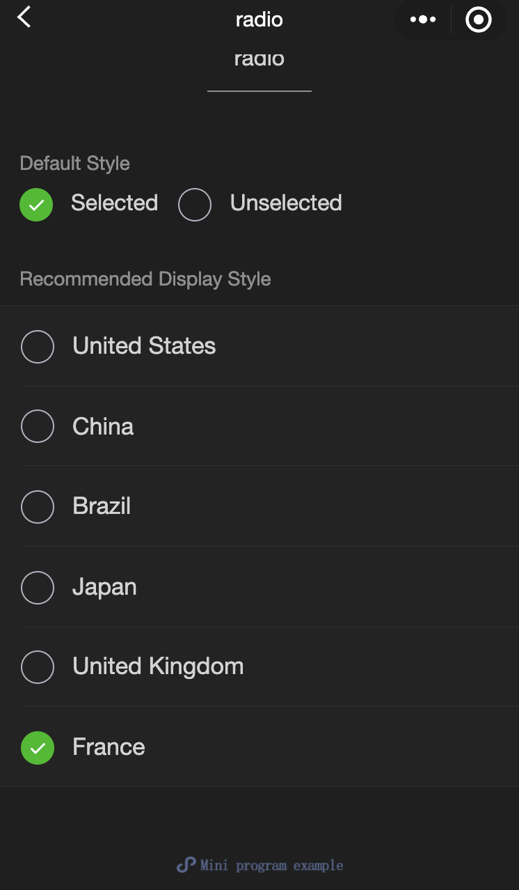
radio-group
功能說明: 單項選擇器,內部由多個radio組成。
參數及說明:
| 内容名 | 類型 | 預設值 | 必填 | 說明 |
|---|---|---|---|---|
| bindchange | eventhandle | - | 否 | radio-group 中選取項目發生變更時觸發 change 事件,detail = {value:[選取的 radio 的 value 的陣列]} |
slider
功能說明: 滑動選擇器。
參數及說明:
| 内容名 | 類型 | 預設值 | 必填 | 說明 |
|---|---|---|---|---|
| min | number | 0 | 否 | 最小值 |
| max | number | 100 | 否 | 最大值 |
| step | number | 1 | 否 | 步長,取值必須大於0,並且可被(max - min)整除 |
| disabled | boolean | false | 否 | 是否禁用 |
| value | number | 0 | 否 | 當前取值 |
| color | color | #e9e9e9 | 否 | 背景條的顏色(請使用backgroundColor) |
| selected-color | color | #1aad19 | 否 | 已選擇的顏色(請使用activeColor) |
| activeColor | color | #1aad19 | 否 | 已選擇的顏色 |
| backgroundColor | color | #e9e9e9 | 否 | 背景條的顏色 |
| block-size | number | 28 | 否 | 滑塊的大小,取值範圍為12 - 28 |
| block-color | color | #ffffff | 否 | 滑塊的顏色 |
| show-value | boolean | false | 否 | 是否顯示當前value |
| bindchange | eventhandle | - | 否 | 完成一次拖曳後觸發的事件,event.detail = {value} value |
| bindchanging | eventhandle | - | 否 | 拖曳過程中觸發的事件,event.detail = {value} value |
- 示例代碼:
wxml:
<view class="page">
  <view class="page__hd">
    <text class="page__title">slider</text>
    <text class="page__desc">Slider</text>
  </view>
  <view class="page__bd">
    <view class="page-section page-section-gap">
      <view class="page-section-title">Set the step</view>
      <view class="body-view">
        <slider value="60" bindchange="slider2change" step="5" />
      </view>
    </view>

    <view class="page-section page-section-gap">
      <view class="page-section-title">Show the current value</view>
      <view class="body-view">
        <slider value="50" bindchange="slider3change" show-value />
      </view>
    </view>

    <view class="page-section page-section-gap">
      <view class="page-section-title">Set the min/max values</view>
      <view class="body-view">
        <slider
          value="100"
          bindchange="slider4change"
          min="50"
          max="200"
          show-value
        />
      </view>
    </view>
  </view>
</view>
javascript:
var pageData = {}
for (var i = 1; i < 5; ++i) {
  (function (index) {
    pageData[`slider${index}change`] = function (e) {
      console.log(`A change event is triggered in slider${index}, and the carried value is` e.detail.value)
    }
  })(i);
}
Page(pageData)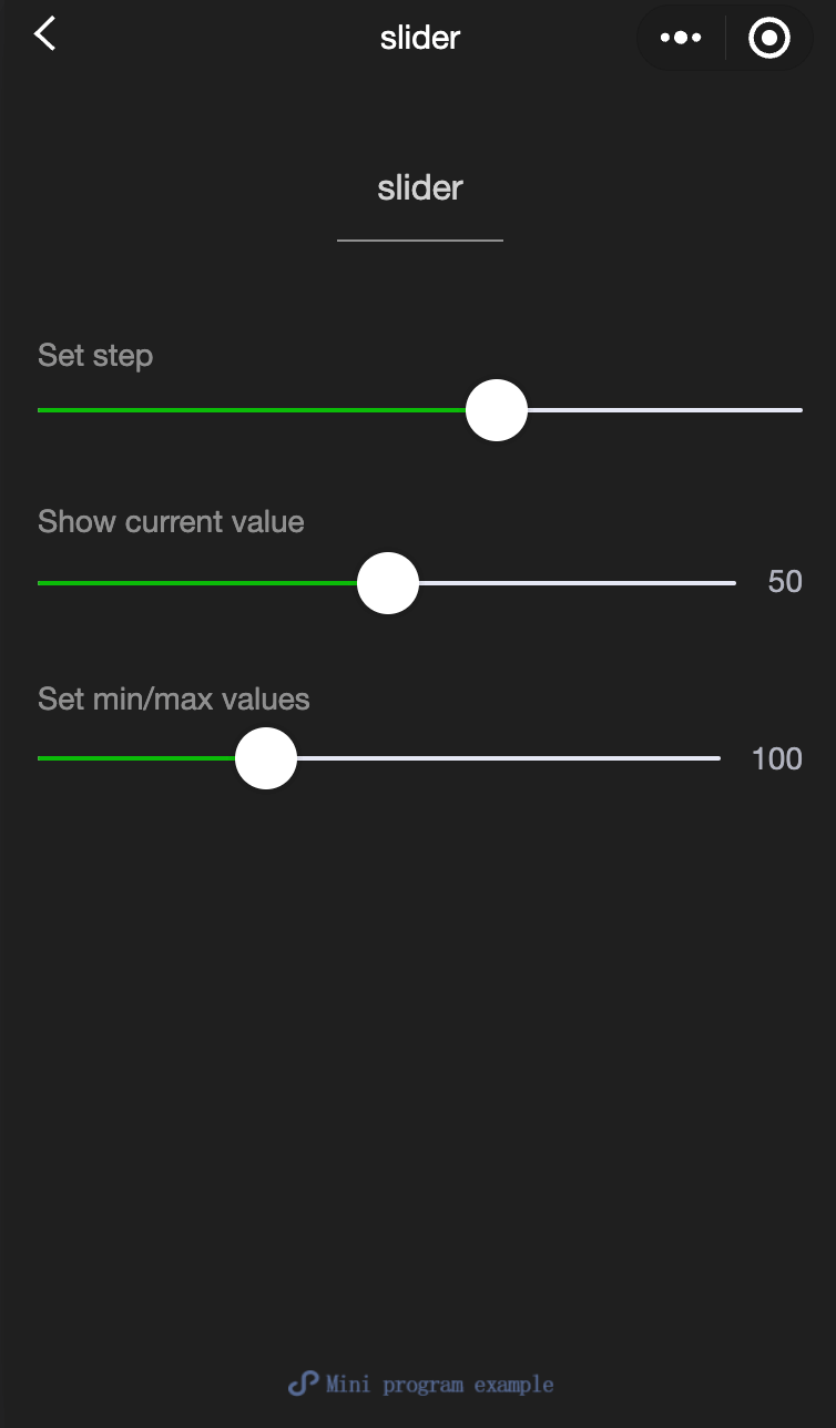
switch
功能說明: 開關選擇器。
參數及說明:
| 内容名 | 類型 | 預設值 | 必填 | 說明 |
|---|---|---|---|---|
| checked | boolean | false | 否 | 是否選中 |
| disabled | boolean | false | 否 | 是否禁用 |
| type | string | switch | 否 | 樣式,有效值: switch,checkbox |
| color | string | #04BE02 | 否 | switch的顏色,同css的color |
| bindchange | eventhandle | - | 否 | 點擊導致 checked 改變時會觸發 change 事件,event.detail={ value} |
- 示例代碼:
wxml:
<view class="page">
  <view class="page__hd">
    <text class="page__title">switch</text>
    <text class="page__desc">Switch</text>
  </view>
  <view class="page__bd">
    <view class="section section_gap">
      <view class="section__title">type="switch"</view>
      <view class="body-view">
        <switch checked="{{switch1Checked}}" bindchange="switch1Change" />
      </view>
    </view>

    <view class="section section_gap">
      <view class="section__title">type="checkbox"</view>
      <view class="body-view">
        <switch
          type="checkbox"
          checked="{{switch2Checked}}"
          bindchange="switch2Change"
        />
      </view>
    </view>
  </view>
</view>
javascript:
var pageData = {
  data: {
    switch1Checked: true,
    switch2Checked: false,
    switch1Style: '',
    switch2Style: 'text-decoration: line-through'
  }
}
for (var i = 1; i <= 2; ++i) {
  (function (index) {
    pageData[`switch${index}Change`] = function (e) {
      console.log(`A change event is triggered in switch${index}, and the carried value is` e.detail.value)
      var obj = {}
      obj[`switch${index}Checked`] = e.detail.value
      this.setData(obj)
      obj = {}
      obj[`switch${index}Style`] = e.detail.value ? '' : 'text-decoration: line-through'
      this.setData(obj)
    }
  })(i)
}
Page(pageData)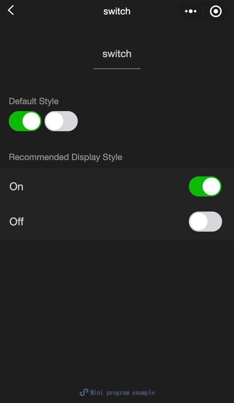
textarea
功能說明: 輸入框,該組件是 原生組件 ,使用時請注意相關限制。
參數及說明:
| 内容 | 類型 | 合法值及說明 | 預設值 | 必填 | 說明 |
|---|---|---|---|---|---|
| value | string | - | - | 否 | 輸入框的內容 |
| placeholder | string | - | - | 否 | 輸入框為空時預留位置 |
| placeholder-style | string | - | - | 否 | 指定placeholder的樣式,現時僅支持color,font-size和font-weight |
| placeholder-class | string | - | textarea-placeholder | 否 | 指定placeholder的樣式類 |
| fixed | boolean | - | false | 否 | 如果textarea是在一個position:fixed的區域,需要顯示指定内容fixed為true |
| show-confirm-bar | boolean | - | true | 否 | 是否顯示鍵盤上方帶有'完成'按鈕那一欄 |
| disabled | boolean | - | false | 否 | 是否禁用 |
| maxlength | number | - | 140 | 否 | 最大輸入長度,設定為-1的時候不限制最大長度 |
| auto-focus | boolean | - | false | 否 | 自動聚焦,拉起鍵盤。 |
| focus | boolean | - | false | 否 | 獲取焦點 |
| auto-height | boolean | - | false | 否 | 是否自動增高,設定auto-height時,style.height不生效 |
| cursor-spacing | number / string | - | 0 | 否 | 指定光標與鍵盤的距離。 取textarea距離底部的距離和cursor-spacing指定的距離的最小值作為光標與鍵盤的距離 |
| cursor | number | - | -1 | 否 | 指定focus時的光標位置 |
| selection-start | number | - | -1 | 否 | 光標起始位置,自動聚集時有效,需與selection-end搭配使用 |
| selection-end | number | - | -1 | 否 | 光標結束位置,自動聚集時有效,需與selection-start搭配使用 |
| adjust-position | boolean | - | true | 否 | 鍵盤彈起時,是否自動上推頁面 |
| hold-keyboard | boolean | - | false | 否 | focus時,點擊頁面的時候不收起鍵盤 |
| confirm-type | string | send:右下角按鈕為'發送' search:右下角按鈕為'蒐索' next:右下角按鈕為'下一個' go:右下角按鈕為'前往' done:右下角按鈕為'完成' return:右下角按鈕為'換行'; | return | 否 | 設定鍵盤右下角按鈕的文字 |
| confirm-hold | boolean | - | false | 否 | 點擊鍵盤右下角按鈕時是否保持鍵盤不收起 |
| bindfocus | eventhandle | - | false | 否 | 輸入框聚焦時觸發,event.detail = { value, height },height 為鍵盤高度 |
| bindblur | eventhandle | - | false | 否 | 輸入框失去焦點時觸發,event.detail = {value, cursor} |
| bindlinechange | eventhandle | - | false | 否 | 輸入框行數變化時調用,event.detail = {height: 0, heightRpx: 0, lineCount: 0} |
| bindinput | eventhandle | - | false | 否 | 當鍵盤輸入時,觸發 input 事件,event.detail = {value, cursor, keyCode},keyCode 為鍵值,目前工具還不支援傳回keyCode參數。 **bindinput 處理函數的回傳值不會反映在 textarea 上** |
| bindconfirm | eventhandle | - | false | 否 | 點選完成時, 觸發 confirm 事件,event.detail = {value: value} |
| bindkeyboardheightchange | eventhandle | - | false | 否 | 鍵盤高度改變的時候觸發此事件,event.detail = {height: height, duration: duration} |
TIP
- textarea的blur事件會晚於頁面上的tap事件,如果需要在button的點擊事件獲取textarea,可以使用form的bindsubmit。
- 不建議在多行文字上對用戶的輸入進行修改,所以textarea的bindinput處理函數並不會將返回值反映到textarea上。
- 鍵盤高度發生變化,keyboardheightchange事件可能會多次觸發,開發者對於相同的height值應該忽略掉。
- 示例代碼:
wxml:
<view class="section">
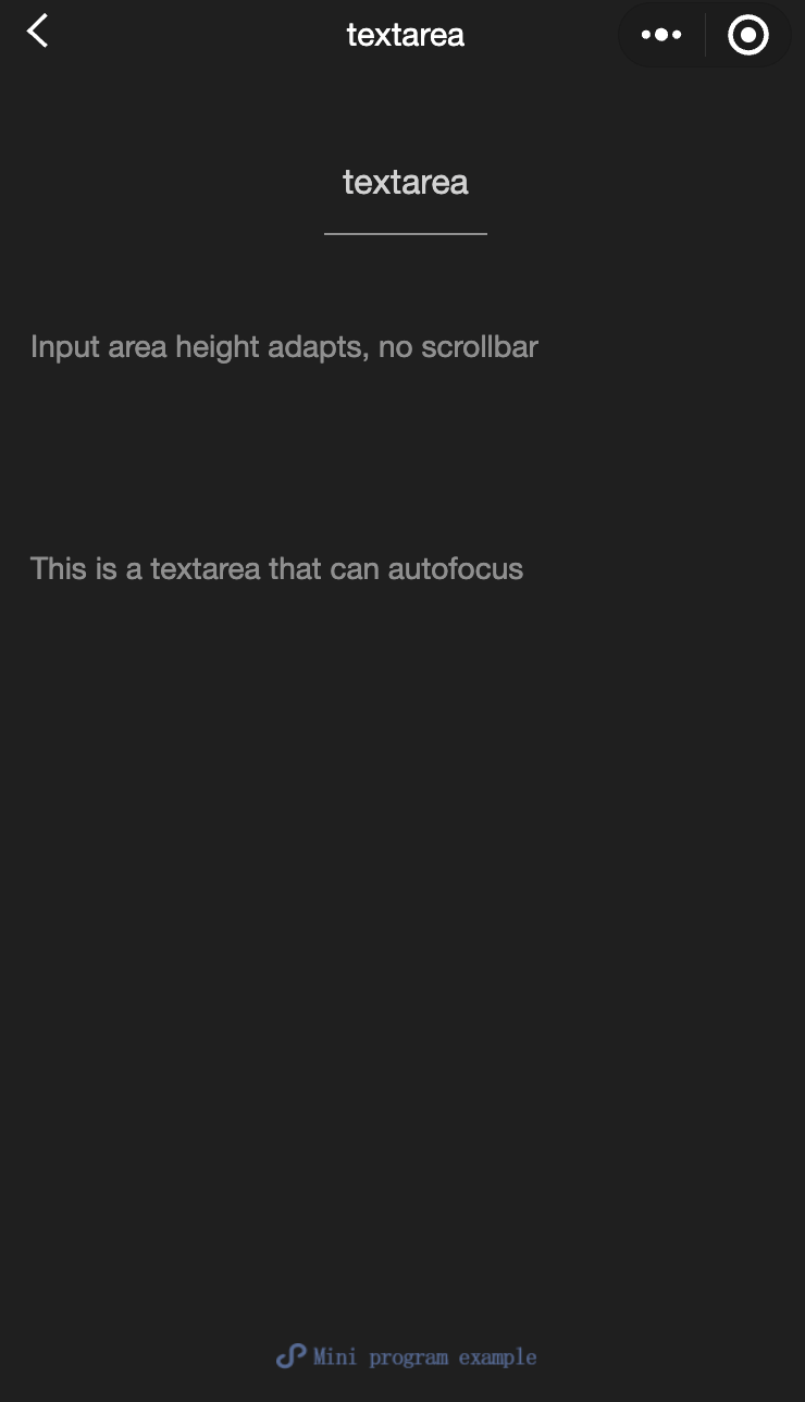
<textarea bindblur="bindTextAreaBlur" auto-height placeholder="Automatic height adjustment" />
</view>
<view class="section">
<textarea placeholder="The placeholder color is red" placeholder-style="color:red;" />
</view>
<view class="section">
<textarea placeholder="This is a textarea that can be automatically focused" auto-focus />
</view>
<view class="section">
<textarea placeholder="This will only be focused when the button is tapped" focus="{{focus}}" />
<view class="btn-area">
<button bindtap="bindButtonTap">Make the input box focused</button>
</view>
</view>
<view class="section">
<form bindsubmit="bindFormSubmit">
<textarea placeholder="Textarea in the form component" name="textarea"/>
<button form-type="submit"> Submit </button>
</form>
</view>javascript:
Page({
  data: {
    height: 20,
    focus: false,
  },
  bindButtonTap: function () {
    this.setData({
      focus: true,
    });
  },
  bindTextAreaBlur: function (e) {
    console.log(e.detail.value);
  },
  bindFormSubmit: function (e) {
    console.log(e.detail.value.textarea);
  },
});