基礎內容
icon
功能說明: 圖標組件
參數及說明:
| 内容 | 類型 | 預設值 | 說明 |
|---|---|---|---|
| type | string | - | icon的類型,有效值: success,success_no_circle,info,warn,waiting,cancel,download,search,clear |
| size | umber / string | 23 | icon的大小,單位默認為px |
| color | string | - | icon的顏色,同css的color |
示例代碼:
wxml:
js
<view class="container">
<view class="icon-box">
<icon class="icon-box-img" type="success" size="93"></icon>
<view class="icon-box-ctn">
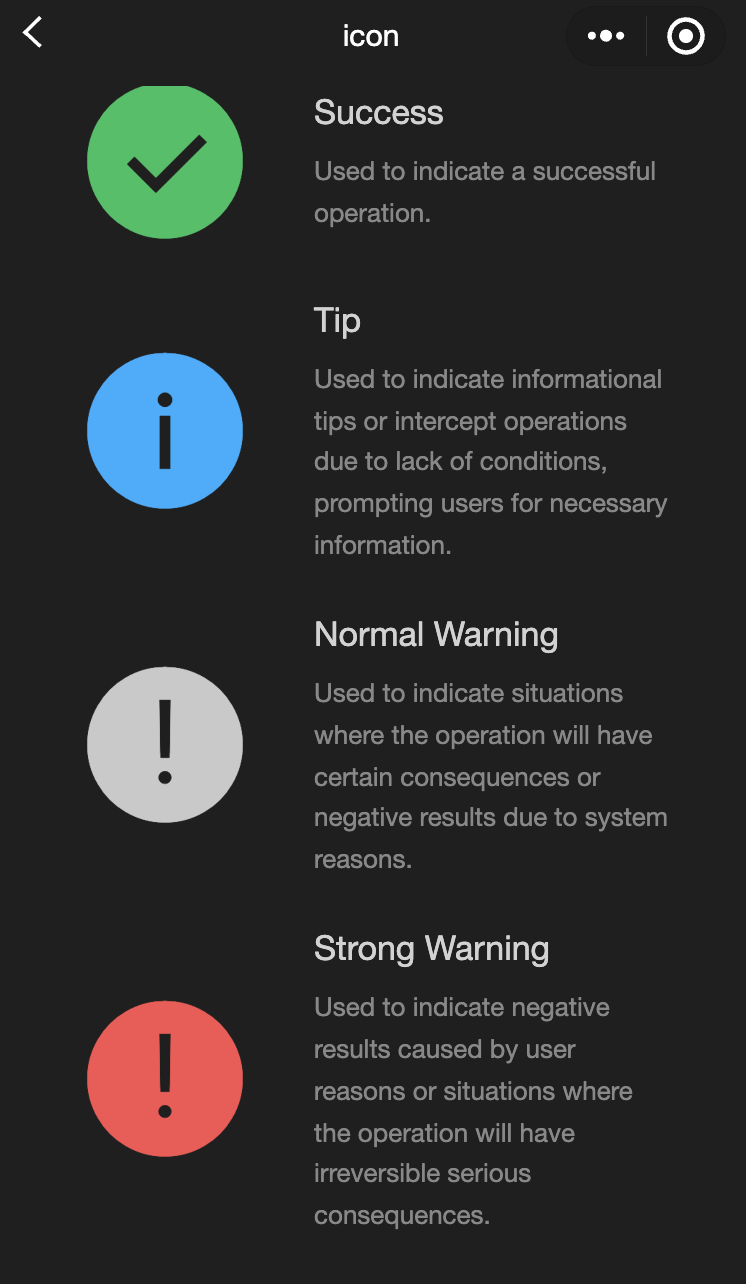
<view class="icon-box-title">Success</view>
<view class="icon-box-desc">Used to indicate a successful operation.</view>
</view>
</view>
<view class="icon-box">
<icon class="icon-box-img" type="info" size="93"></icon>
<view class="icon-box-ctn">
<view class="icon-box-title">Info</view>
<view class="icon-box-desc">Used for informational prompts and to intercept operations lacking necessary conditions, prompting the user for required information.</view>
</view>
</view>
<view class="icon-box">
<icon class="icon-box-img" type="warn" size="93" color="#C9C9C9"></icon>
<view class="icon-box-ctn">
<view class="icon-box-title">Warning</view>
<view class="icon-box-desc">Indicates potential consequences of an operation or negative outcomes due to system issues.</view>
</view>
</view>
<view class="icon-box">
<icon class="icon-box-img" type="warn" size="93"></icon>
<view class="icon-box-ctn">
<view class="icon-box-title">Strong warning</view>
<view class="icon-box-desc">Indicates negative outcomes from user actions or irreversible serious consequences.</view>
</view>
</view>
<view class="icon-box">
<icon class="icon-box-img" type="waiting" size="93"></icon>
<view class="icon-box-ctn">
<view class="icon-box-title">Waiting</view>
<view class="icon-box-desc">Indicates that the user needs to wait for the result.</view>
</view>
</view>
<view class="icon-box">
<view class="icon-small-wrp">
<icon class="icon-small" type="success_no_circle" size="23"></icon>
</view>
<view class="icon-box-ctn">
<view class="icon-box-title">Multi-select icon_Selected</view>
<view class="icon-box-desc">Used in the multi-select control to indicate that the item has been selected.</view>
</view>
</view>
<view class="icon-box">
<view class="icon-small-wrp">
<icon class="icon-small" type="circle" size="23"></icon>
</view>
<view class="icon-box-ctn">
<view class="icon-box-title">Multi-select icon_Not selected</view>
<view class="icon-box-desc">Used in the multi-select control to indicate that the item is selectable but has not been selected.</view>
</view>
</view>
<view class="icon-box">
<view class="icon-small-wrp">
<icon class="icon-small" type="warn" size="23"></icon>
</view>
<view class="icon-box-ctn">
<view class="icon-box-title">Error</view>
<view class="icon-box-desc">Indicates that an error occurs in the form.</view>
</view>
</view>
<view class="icon-box">
<view class="icon-small-wrp">
<icon class="icon-small" type="success" size="23"></icon>
</view>
<view class="icon-box-ctn">
<view class="icon-box-title">Single-select icon_Selected</view>
<view class="icon-box-desc">Used in the single-select control to indicate that the item has been selected.</view>
</view>
</view>
<view class="icon-box">
<view class="icon-small-wrp">
<icon class="icon-small" type="download" size="23"></icon>
</view>
<view class="icon-box-ctn">
<view class="icon-box-title">Download</view>
<view class="icon-box-desc">Indicates that the item is downloadable.</view>
</view>
</view>
<view class="icon-box">
<view class="icon-small-wrp">
<icon class="icon-small" type="info_circle" size="23"></icon>
</view>
<view class="icon-box-ctn">
<view class="icon-box-title">Info</view>
<view class="icon-box-desc">Indicates that there is an information prompt in the form.</view>
</view>
</view>
<view class="icon-box">
<view class="icon-small-wrp">
<icon class="icon-small" type="cancel" size="23"></icon>
</view>
<view class="icon-box-ctn">
<view class="icon-box-title">Stop or close</view>
<view class="icon-box-desc">Indicates close or stop in the form.</view>
</view>
</view>
<view class="icon-box">
<view class="icon-small-wrp">
<icon class="icon-small" type="search" size="14"></icon>
</view>
<view class="icon-box-ctn">
<view class="icon-box-title">Search</view>
<view class="icon-box-desc">Used in the search control to indicate that search can be implemented.</view>
</view>
</view>
</view>javascript:
js
Page({
  data: {
    iconSize: [20, 30, 40, 50, 60, 70],
    iconColor: [
      "red",
      "orange",
      "yellow",
      "green",
      "rgb(0,255,255)",
      "blue",
      "purple",
    ],
    iconType: [
      "success",
      "success_no_circle",
      "info",
      "warn",
      "waiting",
      "cancel",
      "download",
      "search",
      "clear",
    ],
  },
});
progress
功能說明: 進度條
參數及說明:
| 内容 | 類型 | 預設值 | 說明 |
|---|---|---|---|
| percent | float | - | 百分比0~100 |
| show-info | boolean | false | 在進度條右側顯示百分比 |
| border-radius | number / string | 0 | 圓角大小,單位: px |
| font-size | number / string | 16 | 右側百分比字體大小,單位: px |
| stroke-width | number / string | 6 | 進度條線的寬度 |
| color | color | #09BB07 | 進度條顏色(請使用activeColor) |
| activeColor | color | #09BB07 | 已選擇的進度條的顏色 |
| backgroundColor | color | #EBEBEB | 未選擇的進度條的顏色 |
| active | boolean | false | 進度條從左往右的動畫 |
| active-mode | string | backwards | backwards:動畫從頭播 backwards:動畫從上次結束點接著播 |
| bindactiveend | eventhandle | - | 動畫完成事件 |
- 示例代碼:
wxml:
js
<view class="progress-box">
  <progress percent="20" show-info stroke-width="3"/>
</view>

<view class="progress-box">
  <progress percent="40" active stroke-width="3" />
  <icon class="progress-cancel" type="cancel"></icon>
</view>

<view class="progress-box">
  <progress percent="60" active stroke-width="3" />
</view>

<view class="progress-box">
  <progress percent="80" color="#10AEFF" active stroke-width="3" />
</view>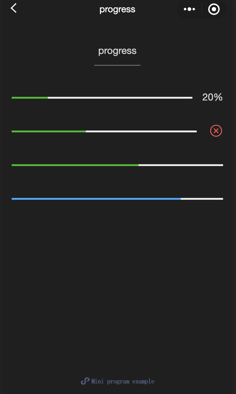
text
功能說明: 文字
參數及說明:
| 内容 | 類型 | 預設值 | 說明 |
|---|---|---|---|
| selectable | boolean | false | 文字是否可選 |
| space | string | - | 顯示連續空格: ensp:中文字元空格一半大小 emsp中文字元空格大小 nbsp:根據字體設置的空格大小 |
| decode | boolean | false | 是否解碼 |
TIP
wxml:
js
<view class="container">
<view class="page-body">
<view class="page-section page-section-spacing">
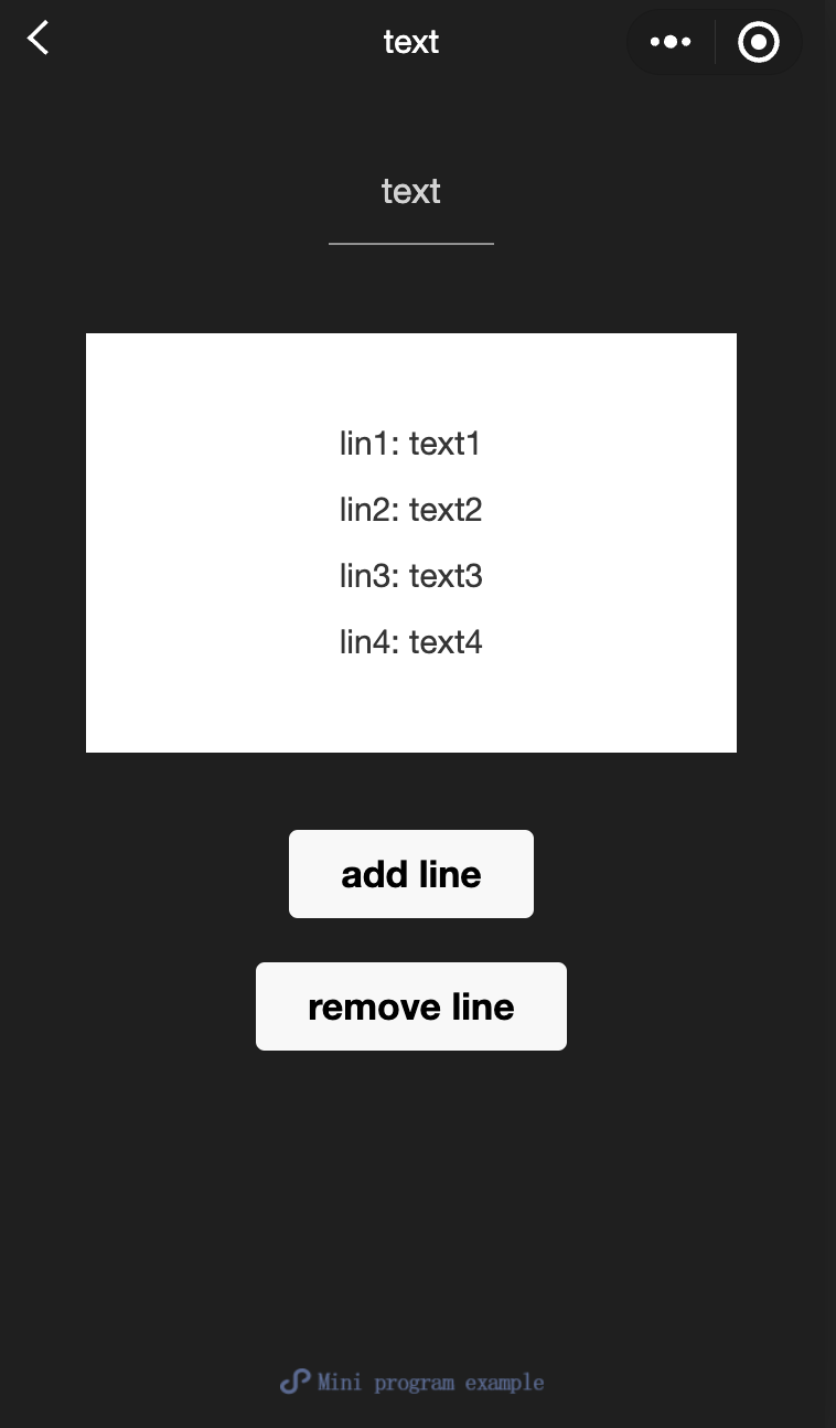
<view class="text-box" scroll-y="true" scroll-top="{{scrollTop}}">
<text>{{ text }}</text>
</view>
<button disabled="{{!canAdd}}" bindtap="add">
add line
</button>
<button disabled="{{!canRemove}}" bindtap="remove">
remove line
</button>
</view>
</view>
</view>javascript:
js
const texts = [
  "lin1: text1",
  "lin2: text2",
  "lin3: text3",
  "lin4: text4",
  "lin5: text5",
  "lin6: text6",
  "lin7: text7",
  "lin8: text8",
  "lin9: text9",
  "lin10: text10",
  "lin11: text11",
  "lin12: text12",
  "......",
];

Page({
  onShareAppMessage() {
    return {
      title: "text",
      path: "page/component/pages/text/text",
    };
  },

  data: {
    text: "",
    canAdd: true,
    canRemove: false,
  },
  extraLine: [],

  add() {
    this.extraLine.push(texts[this.extraLine.length % 12]);
    this.setData({
      text: this.extraLine.join("\n"),
      canAdd: this.extraLine.length < 12,
      canRemove: this.extraLine.length > 0,
    });
    setTimeout(() => {
      this.setData({
        scrollTop: 99999,
      });
    }, 0);
  },
  remove() {
    if (this.extraLine.length > 0) {
      this.extraLine.pop();
      this.setData({
        text: this.extraLine.join("\n"),
        canAdd: this.extraLine.length < 12,
        canRemove: this.extraLine.length > 0,
      });
    }
    setTimeout(() => {
      this.setData({
        scrollTop: 99999,
      });
    }, 0);
  },
});
rich-text
功能說明: 富文本
參數及說明:
| 内容 | 類型 | 預設值 | 說明 |
|---|---|---|---|
| nodes | array / string | [] | 節點清單/ HTML String |
| space | string | - | 顯示連續空格: ensp: 中文字元空格一半大小 emsp: 中文字元空格大小 nbsp: 根據字體設置的空格大小 |
支持默認事件,包括:tap、touchstart、touchmove、touchcancel、touchend和longtap
- nodes
nodes内容推薦使用Array類型,由於組件會將String類型轉換為Array類型,因而效能會有所下降, 現支持兩種節點,通過type來區分,分別是元素節點和文字節點,默認是元素節點,在富文字區域裏顯示的HTML節點。
元素節點: type = node
| 内容 | 說明 | 類型 | 必填 | 備註 |
|---|---|---|---|---|
| name | 標籤名 | string | 是 | 支持部分受信任的HTML節點 |
| attrs | 内容 | object | 否 | 支持部分受信任的内容,遵循Pascal命名法 |
| children | 子節點清單 | array | 否 | 結構和nodes一致 |
- 文字節點: type=text
| 内容 | 說明 | 類型 | 必填 | 備註 |
|---|---|---|---|---|
| text | 文字 | string | 是 | 支持entities |
- 受信任的HTML節點及内容
全域支持class和style内容,不支持id内容
| 節點 | 内容 | 節點 | 内容 |
|---|---|---|---|
| a | - | img | alt,src,height,width |
| abbr | - | ins | - |
| b | - | ins | - |
| br | - | legend | - |
| code | - | li | - |
| col | span,width | ol | start,type |
| colgroup | span,width | p | - |
| dd | - | q | - |
| del | - | span | - |
| div | - | strong | - |
| dl | - | sub | - |
| dt | - | sup | - |
| em | - | table | width |
| fieldset | - | tbody | - |
| h1 | - | td | colspan,height,rowspan,width |
| h2 | - | tfoot | - |
| h3 | - | th | colspan,height,rowspan,width |
| h4 | - | thead | - |
| h5 | - | tr | - |
| h6 | - | ul | - |
| hr | - | - | - |
TIP
- nodes不推薦使用String類型,效能會有所下降。
- rich-text組件內遮罩所有節點的事件。
- attrs内容不支持id,支持class。
- name内容大小寫不敏感。
- 如果使用了不受信任的HTML節點,該節點及其所有子節點將會被移除。
- img標籤僅支持網絡圖片。
- 如果在自定義組件中使用rich-text組件,那麼僅自定義組件的wxss樣式對rich-text中的class生效。
示例代碼:
wxml:
js
<view class="container">
  <view class="page-body">
    <view class="page-section">
      <view class="page-section-title">Rendering via HTML String</view>
      <view class="page-content">
        <scroll-view scroll-y>{{ htmlSnip }}</scroll-view>
        <button style="margin: 30rpx 0" type="primary" bindtap="renderHtml">
          Rendering HTML
        </button>
        <block wx:if="{{renderedByHtml}}">
          <rich-text nodes="{{htmlSnip}}"></rich-text>
        </block>
      </view>
    </view>

    <view class="page-section">
      <view class="page-section-title">Rendering by nodes</view>
      <view class="page-content">
        <scroll-view scroll-y>{{ nodeSnip }}</scroll-view>
        <button style="margin: 30rpx 0" type="primary" bindtap="renderNode">
          Rendering Node
        </button>
        <block wx:if="{{renderedByNode}}">
          <rich-text nodes="{{nodes}}"></rich-text>
        </block>
      </view>
    </view>
  </view>
</view>
javascript:
js
const htmlSnip = `<div class="div_class">
  <h1>Title</h1>
  <p class="p">
    Life is <i>like</i> a box of
    <b> chocolates</b>.
  </p>
</div>
`;

const nodeSnip = `Page({
  data: {
    nodes: [{
      name: 'div',
      attrs: {
        class: 'div_class',
        style: 'line-height: 60px; color: red;'
      },
      children: [{
        type: 'text',
        text: 'You never know what you're gonna get.'
      }]
    }]
  }
})
`;

Page({
  onShareAppMessage() {
    return {
      title: "rich-text",
      path: "page/component/pages/rich-text/rich-text",
    };
  },

  data: {
    htmlSnip,
    nodeSnip,
    renderedByHtml: false,
    renderedByNode: false,
    nodes: [
      {
        name: "div",
        attrs: {
          class: "div_class",
          style: "line-height: 60px; color: #1AAD19;",
        },
        children: [
          {
            type: "text",
            text: "You never know what you're gonna get.",
          },
        ],
      },
    ],
  },
  renderHtml() {
    this.setData({
      renderedByHtml: true,
    });
  },
  renderNode() {
    this.setData({
      renderedByNode: true,
    });
  },
  enterCode(e) {
    console.log(e.detail.value);
    this.setData({
      htmlSnip: e.detail.value,
    });
  },
});