Basic Content
icon
Functional description: Icon component
Parameters and descriptions:
| Properties | Type | Default value | Description |
|---|---|---|---|
| type | string | - | The type of icon, valid values: success, success_no_circle, info, warn, waiting, cancel, download, search, clear |
| size | umber / string | 23 | The size of the icon, the default unit is px |
| color | string | - | The color of the icon, the same as the color of css |
Sample code:
wxml:
js
<view class="container">
<view class="icon-box">
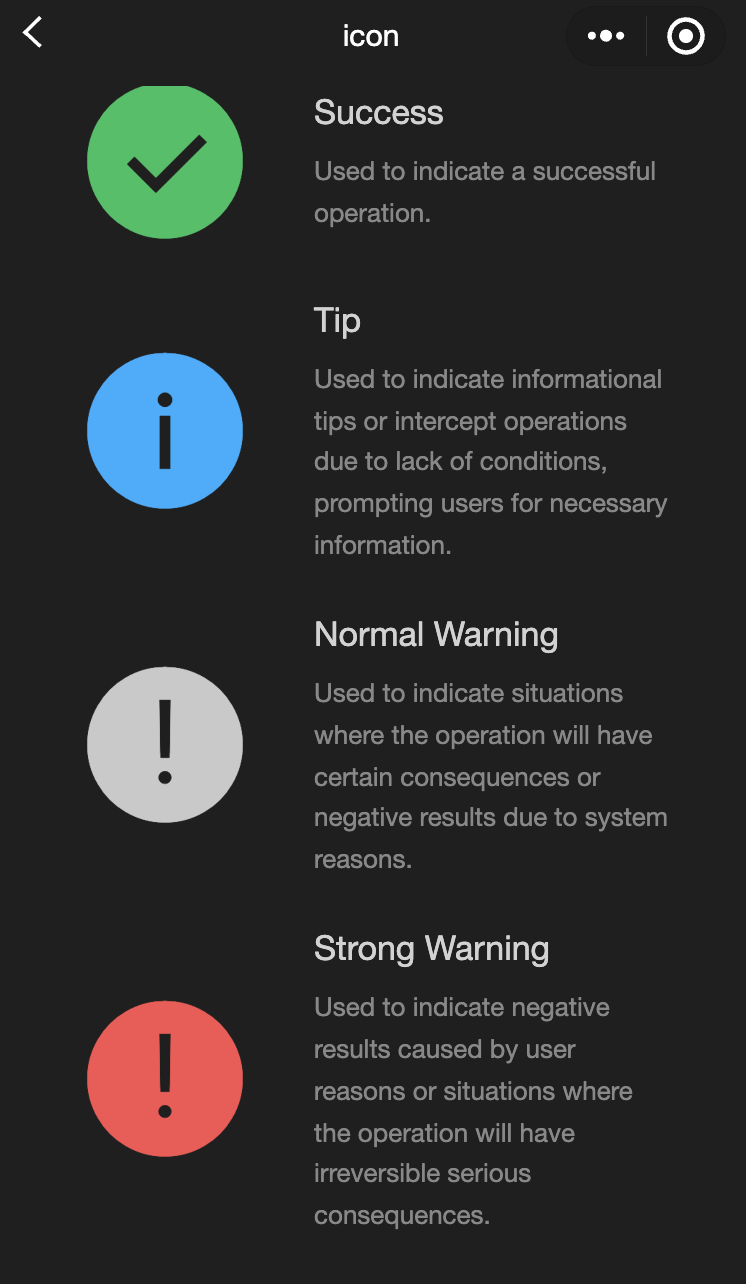
<icon class="icon-box-img" type="success" size="93"></icon>
<view class="icon-box-ctn">
<view class="icon-box-title">Success</view>
<view class="icon-box-desc">Used to indicate a successful operation.</view>
</view>
</view>
<view class="icon-box">
<icon class="icon-box-img" type="info" size="93"></icon>
<view class="icon-box-ctn">
<view class="icon-box-title">Info</view>
<view class="icon-box-desc">Used for informational prompts and to intercept operations lacking necessary conditions, prompting the user for required information.</view>
</view>
</view>
<view class="icon-box">
<icon class="icon-box-img" type="warn" size="93" color="#C9C9C9"></icon>
<view class="icon-box-ctn">
<view class="icon-box-title">Warning</view>
<view class="icon-box-desc">Indicates potential consequences of an operation or negative outcomes due to system issues.</view>
</view>
</view>
<view class="icon-box">
<icon class="icon-box-img" type="warn" size="93"></icon>
<view class="icon-box-ctn">
<view class="icon-box-title">Strong warning</view>
<view class="icon-box-desc">Indicates negative outcomes from user actions or irreversible serious consequences.</view>
</view>
</view>
<view class="icon-box">
<icon class="icon-box-img" type="waiting" size="93"></icon>
<view class="icon-box-ctn">
<view class="icon-box-title">Waiting</view>
<view class="icon-box-desc">Indicates that the user needs to wait for the result.</view>
</view>
</view>
<view class="icon-box">
<view class="icon-small-wrp">
<icon class="icon-small" type="success_no_circle" size="23"></icon>
</view>
<view class="icon-box-ctn">
<view class="icon-box-title">Multi-select icon_Selected</view>
<view class="icon-box-desc">Used in the multi-select control to indicate that the item has been selected.</view>
</view>
</view>
<view class="icon-box">
<view class="icon-small-wrp">
<icon class="icon-small" type="circle" size="23"></icon>
</view>
<view class="icon-box-ctn">
<view class="icon-box-title">Multi-select icon_Not selected</view>
<view class="icon-box-desc">Used in the multi-select control to indicate that the item is selectable but has not been selected.</view>
</view>
</view>
<view class="icon-box">
<view class="icon-small-wrp">
<icon class="icon-small" type="warn" size="23"></icon>
</view>
<view class="icon-box-ctn">
<view class="icon-box-title">Error</view>
<view class="icon-box-desc">Indicates that an error occurs in the form.</view>
</view>
</view>
<view class="icon-box">
<view class="icon-small-wrp">
<icon class="icon-small" type="success" size="23"></icon>
</view>
<view class="icon-box-ctn">
<view class="icon-box-title">Single-select icon_Selected</view>
<view class="icon-box-desc">Used in the single-select control to indicate that the item has been selected.</view>
</view>
</view>
<view class="icon-box">
<view class="icon-small-wrp">
<icon class="icon-small" type="download" size="23"></icon>
</view>
<view class="icon-box-ctn">
<view class="icon-box-title">Download</view>
<view class="icon-box-desc">Indicates that the item is downloadable.</view>
</view>
</view>
<view class="icon-box">
<view class="icon-small-wrp">
<icon class="icon-small" type="info_circle" size="23"></icon>
</view>
<view class="icon-box-ctn">
<view class="icon-box-title">Info</view>
<view class="icon-box-desc">Indicates that there is an information prompt in the form.</view>
</view>
</view>
<view class="icon-box">
<view class="icon-small-wrp">
<icon class="icon-small" type="cancel" size="23"></icon>
</view>
<view class="icon-box-ctn">
<view class="icon-box-title">Stop or close</view>
<view class="icon-box-desc">Indicates close or stop in the form.</view>
</view>
</view>
<view class="icon-box">
<view class="icon-small-wrp">
<icon class="icon-small" type="search" size="14"></icon>
</view>
<view class="icon-box-ctn">
<view class="icon-box-title">Search</view>
<view class="icon-box-desc">Used in the search control to indicate that search can be implemented.</view>
</view>
</view>
</view>javascript:
js
Page({
  data: {
    iconSize: [20, 30, 40, 50, 60, 70],
    iconColor: [
      "red",
      "orange",
      "yellow",
      "green",
      "rgb(0,255,255)",
      "blue",
      "purple",
    ],
    iconType: [
      "success",
      "success_no_circle",
      "info",
      "warn",
      "waiting",
      "cancel",
      "download",
      "search",
      "clear",
    ],
  },
});
progress
Functional description: Progress bar
Parameters and descriptions:
| Properties | Type | Default value | Description |
|---|---|---|---|
| percent | float | - | Percentage 0~105 |
| show-info | boolean | false | Display the percentage on the right side of the progress bar |
| border-radius | number / string | 0 | Corner size, unit: px |
| font-size | number / string | 16 | Right percentage font size, unit: px |
| stroke-width | number / string | 6 | Progress bar line width |
| color | color | #09BB07 | Progress bar color (please use activeColor) |
| activeColor | color | #09BB07 | Selected progress bar color |
| backgroundColor | color | #EBEBEB | Unselected progress bar color |
| active | boolean | false | Progress bar animation from left to right |
| active-mode | string | backwards | backwards:Animation plays from the beginning backwards:Animation continues from the last end point |
| bindactiveend | eventhandle | - | Animation completion event |
- Sample code:
wxml:
js
<view class="progress-box">
  <progress percent="20" show-info stroke-width="3"/>
</view>

<view class="progress-box">
  <progress percent="40" active stroke-width="3" />
  <icon class="progress-cancel" type="cancel"></icon>
</view>

<view class="progress-box">
  <progress percent="60" active stroke-width="3" />
</view>

<view class="progress-box">
  <progress percent="80" color="#10AEFF" active stroke-width="3" />
</view>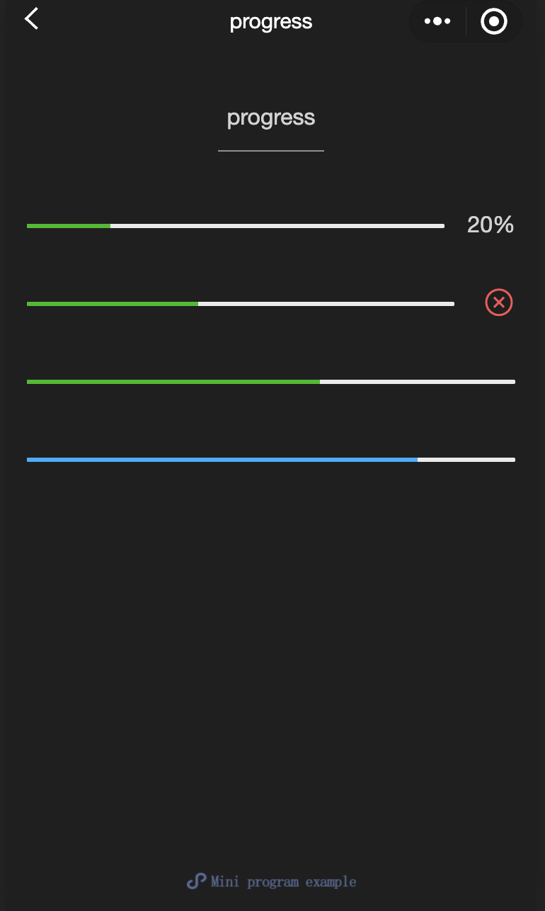
text
Functional description: Text
Parameters and descriptions:
| Properties | Type | Default value | Description |
|---|---|---|---|
| selectable | boolean | false | Is text selectable |
| space | string | - | Show continuous spaces: ensp:Half the size of Chinese character spaces emspChinese character space size nbsp:Space size according to font settings |
| decode | boolean | false | Decode |
TIP
wxml:
js
<view class="container">
<view class="page-body">
<view class="page-section page-section-spacing">
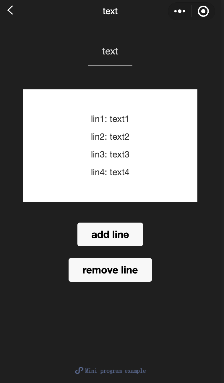
<view class="text-box" scroll-y="true" scroll-top="{{scrollTop}}">
<text>{{ text }}</text>
</view>
<button disabled="{{!canAdd}}" bindtap="add">
add line
</button>
<button disabled="{{!canRemove}}" bindtap="remove">
remove line
</button>
</view>
</view>
</view>javascript:
js
const texts = [
  "lin1: text1",
  "lin2: text2",
  "lin3: text3",
  "lin4: text4",
  "lin5: text5",
  "lin6: text6",
  "lin7: text7",
  "lin8: text8",
  "lin9: text9",
  "lin10: text10",
  "lin11: text11",
  "lin12: text12",
  "......",
];

Page({
  onShareAppMessage() {
    return {
      title: "text",
      path: "page/component/pages/text/text",
    };
  },

  data: {
    text: "",
    canAdd: true,
    canRemove: false,
  },
  extraLine: [],

  add() {
    this.extraLine.push(texts[this.extraLine.length % 12]);
    this.setData({
      text: this.extraLine.join("\n"),
      canAdd: this.extraLine.length < 12,
      canRemove: this.extraLine.length > 0,
    });
    setTimeout(() => {
      this.setData({
        scrollTop: 99999,
      });
    }, 0);
  },
  remove() {
    if (this.extraLine.length > 0) {
      this.extraLine.pop();
      this.setData({
        text: this.extraLine.join("\n"),
        canAdd: this.extraLine.length < 12,
        canRemove: this.extraLine.length > 0,
      });
    }
    setTimeout(() => {
      this.setData({
        scrollTop: 99999,
      });
    }, 0);
  },
});
rich-text
Functional description: Rich Text
Parameters and descriptions:
| Properties | Type | Default value | Description |
|---|---|---|---|
| nodes | array / string | [] | Node list / HTML String |
| space | string | - | Show continuous spaces: ensp: Half the size of Chinese character spaces emsp: Chinese character space size nbsp: Space size according to font settings |
Supports default events, including: tap, touchstart, touchmove, touchcancel, touchend and longtap
- nodes
It is recommended to use the Array type for the nodes attribute. Since the component will convert the String type to the Array type, the performance will be reduced. Two types of nodes are currently supported, which are distinguished by type, namely element nodes and text nodes. The default is element nodes, which are HTML nodes displayed in the rich text area.
Element node: type = node
| Properties | Description | Type | Required | Remarks |
|---|---|---|---|---|
| name | Tag name | string | Yes | Supports some trusted HTML nodes |
| attrs | Properties | object | No | Supports some trusted attributes, following the Pascal naming method |
| children | Subnode list | array | No | The structure is consistent with nodes |
- Text node: type=text
| Properties | Description | Type | Required | Remarks |
|---|---|---|---|---|
| text | Text | string | Yes | Support entities |
- Trusted HTML nodes and attributes
Globally supports class and style attributes, but does not support id attributes
| Node | Properties | Node | Properties |
|---|---|---|---|
| a | - | img | alt,src,height,width |
| abbr | - | ins | - |
| b | - | ins | - |
| br | - | legend | - |
| code | - | li | - |
| col | span,width | ol | start,type |
| colgroup | span,width | p | - |
| dd | - | q | - |
| del | - | span | - |
| div | - | strong | - |
| dl | - | sub | - |
| dt | - | sup | - |
| em | - | table | width |
| fieldset | - | tbody | - |
| h1 | - | td | colspan,height,rowspan,width |
| h2 | - | tfoot | - |
| h3 | - | th | colspan,height,rowspan,width |
| h4 | - | thead | - |
| h5 | - | tr | - |
| h6 | - | ul | - |
| hr | - | - | - |
TIP
- It is not recommended to use the String type for nodes, as the performance will be reduced.
- The rich-text component blocks all node events.
- The attrs attribute does not support id, but supports class.
- The name attribute is case-insensitive.
- If an untrusted HTML node is used, the node and all its child nodes will be removed.
- The img tag only supports network images.
- If the rich-text component is used in a custom component, only the wxss style of the custom component is effective for the class in rich-text.
Sample code:
wxml:
js
<view class="container">
  <view class="page-body">
    <view class="page-section">
      <view class="page-section-title">Rendering via HTML String</view>
      <view class="page-content">
        <scroll-view scroll-y>{{ htmlSnip }}</scroll-view>
        <button style="margin: 30rpx 0" type="primary" bindtap="renderHtml">
          Rendering HTML
        </button>
        <block wx:if="{{renderedByHtml}}">
          <rich-text nodes="{{htmlSnip}}"></rich-text>
        </block>
      </view>
    </view>

    <view class="page-section">
      <view class="page-section-title">Rendering by nodes</view>
      <view class="page-content">
        <scroll-view scroll-y>{{ nodeSnip }}</scroll-view>
        <button style="margin: 30rpx 0" type="primary" bindtap="renderNode">
          Rendering Node
        </button>
        <block wx:if="{{renderedByNode}}">
          <rich-text nodes="{{nodes}}"></rich-text>
        </block>
      </view>
    </view>
  </view>
</view>
javascript:
js
const htmlSnip = `<div class="div_class">
  <h1>Title</h1>
  <p class="p">
    Life is <i>like</i> a box of
    <b> chocolates</b>.
  </p>
</div>
`;

const nodeSnip = `Page({
  data: {
    nodes: [{
      name: 'div',
      attrs: {
        class: 'div_class',
        style: 'line-height: 60px; color: red;'
      },
      children: [{
        type: 'text',
        text: 'You never know what you're gonna get.'
      }]
    }]
  }
})
`;

Page({
  onShareAppMessage() {
    return {
      title: "rich-text",
      path: "page/component/pages/rich-text/rich-text",
    };
  },

  data: {
    htmlSnip,
    nodeSnip,
    renderedByHtml: false,
    renderedByNode: false,
    nodes: [
      {
        name: "div",
        attrs: {
          class: "div_class",
          style: "line-height: 60px; color: #1AAD19;",
        },
        children: [
          {
            type: "text",
            text: "You never know what you're gonna get.",
          },
        ],
      },
    ],
  },
  renderHtml() {
    this.setData({
      renderedByHtml: true,
    });
  },
  renderNode() {
    this.setData({
      renderedByNode: true,
    });
  },
  enterCode(e) {
    console.log(e.detail.value);
    this.setData({
      htmlSnip: e.detail.value,
    });
  },
});