Form Component
button
Function Description: Button。
Parameters and descriptions:
| Properties | Type | Legal values | Default value | Required | Description |
|---|---|---|---|---|---|
| size | string | default:Default size mini:Small size | default | No | Button size |
| type | string | primary:Green default:White warn:Red | default | No | Button style type |
| plain | boolean | - | false | No | Whether the button is hollow, background color |
| disabled | boolean | - | false | No | Whether disabled |
| loading | boolean | - | false | No | Whether there is a loading icon before the name |
| form-type | string | submit:Submit the form reset:Reset the form | - | No | Used for form Component, click to trigger the submit/reset event of the form component |
| open-type | string | share:Trigger user forwarding getPhoneNumber:Quick verification of mobile phone number, apply to the user, and after the user agrees, quickly fill in and verify the mobile phone getUserInfo:Get user information, which can be obtained from the bindgetuserinfo callback openSetting:Open the authorization settings page feedback:Open the 'Feedback' page, users can submit feedback and upload logs | - | No | Host app open capabilities |
| hover-class | string | - | button-hover | No | Specify the style class of the button pressed. When hover-class='none';, there is no click state effect |
| hover-start-time | number | - | 20 | No | How long does it take for the click state to appear after pressing, in milliseconds |
| hover-stay-time | number | - | 70 | No | The click state retention time after the finger is released, in milliseconds |
| lang | string | en:English zh_TW:Traditional Chinese | en | No | Specify the language for returning user information |
| bindgetuserinfo | eventhandle | - | - | No | When the user clicks the button, the obtained user information will be returned. The callback detail data is consistent with that returned by wx.getUserInfo. It is valid when open-type='getUserInfo' |
| bindgetphonenumber | eventhandle | - | - | No | Quick verification callback for mobile phone number. It is valid when open-type=getPhoneNumber Note: After triggering the bindgetphonenumber callback, the mobile phone number button component should be hidden immediately, or set to disabled state to avoid additional charges caused by users repeatedly authorizing mobile phone numbers |
| bindopensetting | eventhandle | - | - | No | Callback after opening the authorization setting page. It is valid when open-type=openSetting |
TIP
Currently, the button with form-type set will only be valid for the form in the current component. Therefore, encapsulating the button in a custom component and the form outside the custom component will invalidate the form-type of this button.
- Sample code:
wxml:
<view class="page-body">
<view class="btn-area" id="buttonContainer">
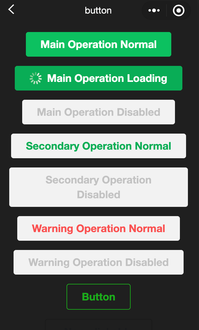
<button type="primary">Primary Page Action Normal</button>
<button type="primary" loading="true">
Primary Page Action Loading
</button>
<button type="primary" disabled="true">
Primary Page Action Disabled
</button>
<button type="default">Secondary Page Action Normal</button>
<button type="default" disabled="true">
Secondary Page Action Disabled
</button>
<button type="warn">Warning Action Normal</button>
<button type="warn" disabled="true">
Warning Action Disabled
</button>
<view class="button-sp-area">
<button type="primary" plain="true">
Button
</button>
<button type="primary" disabled="true" plain="true">
Disabled button
</button>
<button type="default" plain="true">
Button
</button>
<button type="default" disabled="true" plain="true">
Button
</button>
<button class="mini-btn" type="primary" size="mini">
Button
</button>
<button class="mini-btn" type="default" size="mini">
Button
</button>
<button class="mini-btn" type="warn" size="mini">
Button
</button>
</view>
</view>
</view>javascript:
const types = ['default', 'primary', 'warn']
const pageObject = {
  data: {
    defaultSize: 'default',
    primarySize: 'default',
    warnSize: 'default',
    disabled: false,
    plain: false,
    loading: false
  },

  onShareAppMessage() {
    return {
      title: 'button',
      path: 'page/component/pages/button/button'
    }
  },

  setDisabled() {
    this.setData({
      disabled: !this.data.disabled
    })
  },

  setPlain() {
    this.setData({
      plain: !this.data.plain
    })
  },

  setLoading() {
    this.setData({
      loading: !this.data.loading
    })
  },

  handleContact(e) {
    console.log(e.detail)
  },

  handleGetPhoneNumber(e) {
    console.log(e.detail)
  },

  handleGetUserInfo(e) {
    console.log(e.detail)
  },

  handleOpenSetting(e) {
    console.log(e.detail.authSetting)
  },

  handleGetUserInfo(e) {
    console.log(e.detail.userInfo)
  }
}

for (let i = 0; i < types.length; ++i) {
  (function (type) {
    pageObject[type] = function () {
      const key = type + 'Size'
      const changedData = {}
      changedData[key] =
        this.data[key] === 'default' ? 'mini' : 'default'
      this.setData(changedData)
    }
  }(types[i]))
}

Page(pageObject)
wxss:
button{
  margin-top: 30rpx;
  margin-bottom: 30rpx;
}
.button-sp-area{
  margin: 0 auto;
  width: 60%;
}
.mini-btn{
  margin-right: 10rpx;
}
checkbox
Function Description: Multi-select item。
Parameters and descriptions:
| Properties | Type | Default value | Required | Description |
|---|---|---|---|---|
| value | string | - | No | Checkbox flag, triggered when selected checkbox-group The change event carries the value of the checkbox |
| disabled | boolean | false | No | Disabled |
| checked | boolean | false | No | Whether currently selected, can be used to set the default selected |
| color | string | #09BB07 | No | checkbox color, same as CSS color |
- Sample code:
wxml:
<view class="container">
<view class="page-body">
<view class="page-section page-section-gap">
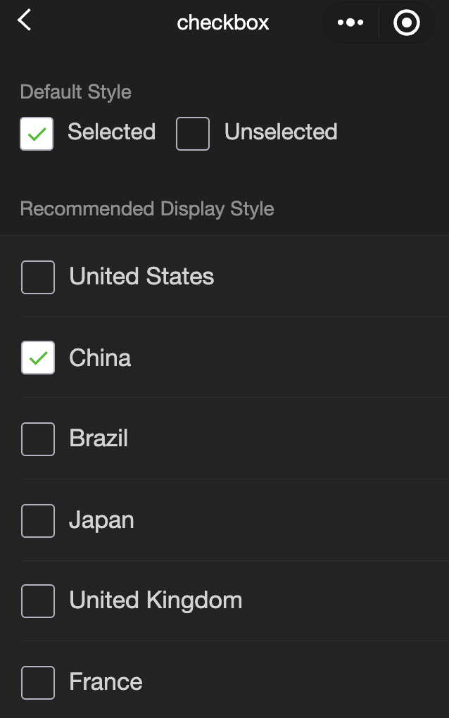
<view class="page-section-title">Default style</view>
<label class="checkbox">
<checkbox value="cb" checked="true"/>Selected
</label>
<label class="checkbox">
<checkbox value="cb" />Unselected
</label>
</view>
<view class="page-section">
<view class="page-section-title">Recommended display style</view>
<view class="weui-cells weui-cells_after-title">
<checkbox-group bindchange="checkboxChange">
<label class="weui-cell weui-check__label" wx:for="{{items}}" wx:key="{{item.value}}">
<view class="weui-cell__hd">
<checkbox value="{{item.value}}" checked="{{item.checked}}"/>
</view>
<view class="weui-cell__bd">{{item.name}}</view>
</label>
</checkbox-group>
</view>
</view>
</view>
</view>javascript:
Page({
  onShareAppMessage() {
    return {
      title: 'checkbox',
      path: 'page/component/pages/checkbox/checkbox'
    }
  },

  data: {
    items: [
      {value: 'USA', name: 'United States'},
      {value: 'CHN', name: 'China', checked: 'true'},
      {value: 'BRA', name: 'Brazil'},
      {value: 'JPN', name: 'Japan'},
      {value: 'ENG', name: 'United Kingdom'},
      {value: 'FRA', name: 'France'}
    ]
  },

  checkboxChange(e) {
    console.log('A change event is triggered in the checkbox, and the carried value is', e.detail.value)

    const items = this.data.items
    const values = e.detail.value
    for (let i = 0, lenI = items.length; i < lenI; ++i) {
      items[i].checked = false

      for (let j = 0, lenJ = values.length; j < lenJ; ++j) {
        if (items[i].value === values[j]) {
          items[i].checked = true
          break
        }
      }
    }

    this.setData({
      items
    })
  }
})
checkbox-group
Function Description: Multi-selector, composed of multiple checkboxes。
Parameters and descriptions:
| Properties | Type | Default value | Required | Description |
|---|---|---|---|---|
| bindchange | eventhandle | - | No | The change event is triggered when the selected item in the checkbox-group changes, detail = {value:[array of the value of the selected checkbox]} |
editor
- Function Description: Button。
When setting content through the setContents interface, parsing the inserted HTML may cause parsing errors due to some illegal tags. It is recommended that developers insert it through delta when using it in the mini program.
Some basic styles are introduced inside the rich text component to enable the content to be displayed correctly, which can be overwritten during development.
The image control is only valid when set during initialization.
Related api: EditorContext
- Parameters and descriptions:
| Properties | Type | Default value | Required | Description |
|---|---|---|---|---|
| read-only | boolean | false | No | Set the editor to read-only |
| placeholder | string | - | No | Prompt information |
| show-img-size | boolean | false | No | Show the image size control when clicking the image |
| show-img-toolbar | boolean | false | No | Show the toolbar control when clicking the image |
| show-img-resize | boolean | false | No | Show the size modification control when clicking the image |
| bindready | eventhandle | - | No | Triggered when the editor is initialized |
| bindfocus | eventhandle | - | No | Triggered when the editor is focused, event.detail = {html, text, delta} |
| bindblur | eventhandle | - | No | Triggered when the editor loses focus, detail = {html, text, delta} |
| bindinput | eventhandle | - | No | Triggered when the editor content changes, detail = {html, text, delta} |
| bindstatuschange | eventhandle | - | No | Triggered when the editor style is changed through the Context method, returning the style set in the selection |
- Supported tags
| Type | Node |
|---|---|
| Inline element | <span> <strong> <b> <ins> <em> <i> <u> <a> <del> <s> <sub> <sup> <img> |
| Block-level element | <p> <h1> <h2> <h3> <h4> <h5> <h6> <hr> <ol> <ul> <li> |
- Supported inline styles
| Type | Node |
|---|---|
| Inline element | font 、font-size 、font-style 、font-variant 、font-weight 、font-family 、letter-spacing 、text-decoration 、color 、background-color |
| Block-level element | text-align 、direction 、margin 、margin-top 、margin-left 、margin-right 、margin-bottom、 padding 、padding-top 、padding-left 、padding-right 、padding-bottom 、line-height 、text-indent |
TIP
- Event bindings in the inserted html will be removed.
- When pasting, only plain text content will be copied into the editor.
- When inserting html into the editor, the editor will delete some unnecessary tags to ensure the consistency of the content. For example, <p><span>xxx</span></p> will be rewritten as <p>xxx</p>.
- When the editor is focused, the page will be pushed up, and the system behavior ensures that the editing area is visible.
form
- Function Description: Form, the user input in the component slider picker checkbox radio switch input submit.
When you click the form form with form-type as submit button When the component is used, the value in the form component will be submitted. You need to add the name in the form component as the key.
- Parameters and descriptions::
| Properties | Type | Default value | Required | Description |
|---|---|---|---|---|
| bindsubmit | eventhandle | - | No | Carry the data in the form to trigger the submit event, event.detail = {value : {'name': 'value'} , formId: ''} |
| bindreset | eventhandle | - | No | The reset event will be triggered when the form is reset |
- Sample code:
wxml:
<view class="container">
  <view class="page-body">
    <form catchsubmit="formSubmit" catchreset="formReset">
      <view class="page-section page-section-gap">
        <view class="page-section-title">switch</view>
        <switch name="switch" />
      </view>

      <view class="page-section page-section-gap">
        <view class="page-section-title">radio</view>
        <radio-group name="radio">
          <label>
            <radio value="radio1" />
            Option 1
          </label>
          <label>
            <radio value="radio2" />
            Option 2
          </label>
        </radio-group>
      </view>

      <view class="page-section page-section-gap">
        <view class="page-section-title">checkbox</view>
        <checkbox-group name="checkbox">
          <label>
            <checkbox value="checkbox1" />
            Option 1
          </label>
          <label>
            <checkbox value="checkbox2" />
            Option 2
          </label>
        </checkbox-group>
      </view>

      <view class="page-section page-section-gap">
        <view class="page-section-title">slider</view>
        <slider value="50" name="slider" show-value></slider>
      </view>

      <view class="page-section">
        <view class="page-section-title">input</view>
        <view class="weui-cells weui-cells_after-title">
          <view class="weui-cell weui-cell_input">
            <view class="weui-cell__bd" style="margin: 30rpx 0">
              <input
                class="weui-input"
                name="input"
                placeholder="This is an input box"
              />
            </view>
          </view>
        </view>
      </view>

      <view class="btn-area">
        <button style="margin: 30rpx 0" type="primary" formType="submit">
          Submit
        </button>
        <button style="margin: 30rpx 0" formType="reset">
          Reset
        </button>
      </view>
    </form>
  </view>
</view>
javascript:
Page({
  onShareAppMessage() {
    return {
      title: "form",
      path: "page/component/pages/form/form",
    };
  },

  data: {
    pickerHidden: true,
    chosen: "",
  },

  pickerConfirm(e) {
    this.setData({
      pickerHidden: true,
    });
    this.setData({
      chosen: e.detail.value,
    });
  },

  pickerCancel() {
    this.setData({
      pickerHidden: true,
    });
  },

  pickerShow() {
    this.setData({
      pickerHidden: false,
    });
  },

  formSubmit(e) {
    console.log(
      "A submit event is triggered in the form, and the carried data is",
      e.detail.value
    );
  },

  formReset(e) {
    console.log(
      "A reset event is triggered in the form, and the carried data is",
      e.detail.value
    );
    this.setData({
      chosen: "",
    });
  },
});
input
Function Description: Input box, this component is Native Component , please pay attention to the relevant restrictions when using it, and the relevant API can be found in
Parameters and descriptions:
| Properties | Type | Legal values | Default value | Required | Description |
|---|---|---|---|---|---|
| value | string | - | - | No | Initial content of the input box |
| type | string | text:Text input keyboard number:Number input keyboard idcard:ID card input keyboard digit:Number keyboard with decimal point | text | No | Input type |
| password | boolean | - | false | No | Is it a password type |
| placeholder | string | - | Yes | Placeholder when the input box is empty | |
| placeholder-style | string | - | Yes | Specify the style of placeholder | |
| placeholder-class | string | input-placeholder | No | Specify the style class of placeholder | |
| disabled | boolean | - | false | No | Whether to disable |
| maxlength | number | - | 140 | No | Maximum input length, when set to -1, the maximum length is not limited |
| cursor-spacing | number | - | 0 | No | Specify the distance between the cursor and the keyboard, take the minimum value of the distance from the input to the bottom and the distance specified by cursor-spacing as the distance between the cursor and the keyboard |
| auto-focus | boolean | - | false | No | (To be abandoned soon, please use focus directly) Automatic focus, pull up the keyboard |
| focus | boolean | - | false | No | Get focus |
| confirm-type | string | send:The lower right button is 'Send' search:The lower right button is 'Search' next:The lower right button is 'Next' go:The lower right button is 'Go' done:The lower right button is 'Finish' | done | No | Set the text of the button in the lower right corner of the keyboard |
| confirm-hold | boolean | - | false | No | Whether to keep the keyboard from collapsing when clicking the button in the lower right corner of the keyboard |
| cursor | number | - | - | Yes | Triggered when the input box is focused, event.detail = {value, height}, height is the keyboard height |
| selection-start | number | - | -1 | No | Triggered when the input box loses focus, event.detail = {value, cursor} |
| selection-end | number | - | -1 | No | The cursor ending position, valid when automatically gathering, needs to be used with selection-start |
| adjust-position | boolean | - | true | No | When the keyboard pops up, whether to automatically push the page up |
| hold-keyboard | boolean | - | false | No | When focusing, the keyboard is not folded when clicking the page |
| bindinput | eventhandle | - | - | Yes | Triggered when the keyboard is input, event.detail = {value, cursor, keyCode}, keyCode is the key value, the processing function can directly return a string, which will replace the content of the input box. |
| bindfocus | eventhandle | - | - | Yes | Triggered when the input box is focused, event.detail = {value, height}, height is the keyboard height |
| bindblur | eventhandle | - | - | Yes | Triggered when the input box loses focus, event.detail = {value, encryptedValue, encryptError} |
| bindconfirm | eventhandle | - | - | Yes | Triggered when the Done button is clicked, event.detail = {value} |
| bindkeyboardheightchange | eventhandle | - | - | Yes | This event is triggered when the keyboard height changes, event.detail = {height: height, duration: duration} |
TIP
- The final performance of confirm-type is related to the implementation of the mobile phone input method itself. Some Android system input methods and third-party input methods may not support or not fully support it.
- The input component is a native component, and the font is the system font, so font-family cannot be set.
- Avoid using CSS animations during input focus
- If the input is encapsulated in a custom component and the form is outside the custom component, the form will not be able to obtain the value of the input in the custom component
- When the keyboard height changes, the keyboardheightchange event may be triggered multiple times. Developers should ignore the same height value
- Sample code:
wxml:
<view class="page-body">
<view class="page-section">
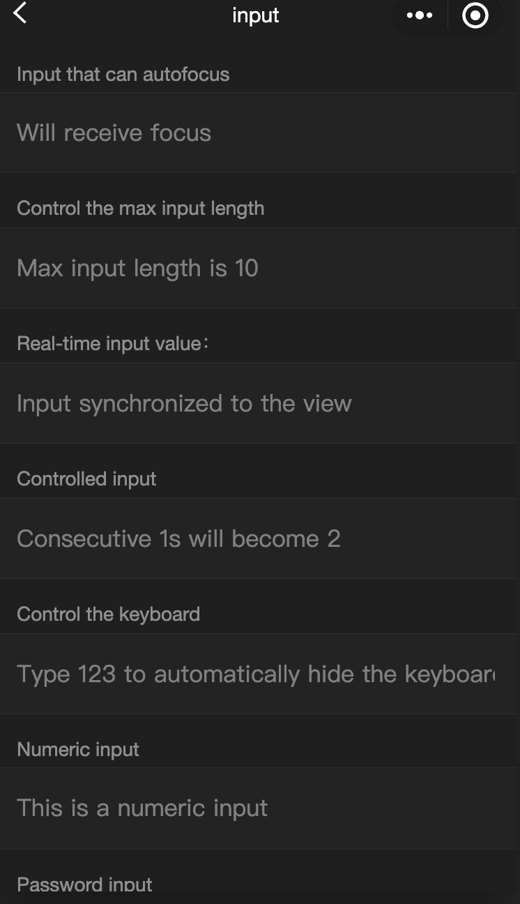
<view class="weui-cells__title">Input that can be auto-focused</view>
<view class="weui-cells weui-cells_after-title">
<view class="weui-cell weui-cell_input">
<input class="weui-input" auto-focus placeholder="Will be focused" />
</view>
</view>
</view>
<view class="page-section">
<view class="weui-cells__title">
Input that controls the max input length
</view>
<view class="weui-cells weui-cells_after-title">
<view class="weui-cell weui-cell_input">
<input
class="weui-input"
maxlength="10"
placeholder="The max input length is 10"
/>
</view>
</view>
</view>
<view class="page-section">
<view class="weui-cells__title">
Get the input value in real-time: {{ inputValue }}
</view>
<view class="weui-cells weui-cells_after-title">
<view class="weui-cell weui-cell_input">
<input
class="weui-input"
maxlength="10"
bindinput="bindKeyInput"
placeholder="Input is synced to the view"
/>
</view>
</view>
</view>
<view class="page-section">
<view class="weui-cells__title">Input that the controls the typing</view>
<view class="weui-cells weui-cells_after-title">
<view class="weui-cell weui-cell_input">
<input
class="weui-input"
bindinput="bindReplaceInput"
placeholder="Typing two consecutive ones will generate a two"
/>
</view>
</view>
</view>
<view class="page-section">
<view class="weui-cells__title">Input that controls the keyboard</view>
<view class="weui-cells weui-cells_after-title">
<view class="weui-cell weui-cell_input">
<input
class="weui-input"
bindinput="bindHideKeyboard"
placeholder="Typing 123 will automatically close the keyboard"
/>
</view>
</view>
</view>
<view class="page-section">
<view class="weui-cells__title">Input for entering numbers</view>
<view class="weui-cells weui-cells_after-title">
<view class="weui-cell weui-cell_input">
<input
class="weui-input"
type="number"
placeholder="This is a number input box"
/>
</view>
</view>
</view>
<view class="page-section">
<view class="weui-cells__title">Input for entering a password</view>
<view class="weui-cells weui-cells_after-title">
<view class="weui-cell weui-cell_input">
<input
class="weui-input"
password
type="text"
placeholder="This is a password input box"
/>
</view>
</view>
</view>
<view class="page-section">
<view class="weui-cells__title">Input with a decimal point</view>
<view class="weui-cells weui-cells_after-title">
<view class="weui-cell weui-cell_input">
<input
class="weui-input"
type="digit"
placeholder="Numeric keyboard with a decimal point"
/>
</view>
</view>
</view>
<view class="page-section">
<view class="weui-cells__title">Input for entering ID card numbers</view>
<view class="weui-cells weui-cells_after-title">
<view class="weui-cell weui-cell_input">
<input
class="weui-input"
type="idcard"
placeholder="ID card input keyboard"
/>
</view>
</view>
</view>
<view class="page-section">
<view class="weui-cells__title">
Input that controls the placeholder color
</view>
<view class="weui-cells weui-cells_after-title">
<view class="weui-cell weui-cell_input">
<input
class="weui-input"
placeholder-style="color:#F76260"
placeholder="The color of the placeholder font is red"
/>
</view>
</view>
</view>
</view>javascript:
Page({
  data: {
    focus: false,
    inputValue: "",
  },
  bindKeyInput: function (e) {
    this.setData({
      inputValue: e.detail.value,
    });
  },
  bindReplaceInput: function (e) {
    var value = e.detail.value;
    var pos = e.detail.cursor;
    var left;
    if (pos !== -1) {
      // The cursor is in the middle
      left = e.detail.value.slice(0, pos);
      // Calculates the cursor position
      pos = left.replace(/11/g, "2").length;
    }

    // Returns the object directly, filters the input, and controls the cursor position
    return {
      value: value.replace(/11/g, "2"),
      cursor: pos,
    };

    // Or returns the string directly, with the cursor at the end
    // return value.replace(/11/g,'2'),
  },
  bindHideKeyboard: function (e) {
    if (e.detail.value === "123") {
      // Closes the keyboard
      wx.hideKeyboard();
    }
  },
});
label
- Functional description: Used to improve the usability of form components.
Use the for attribute to find the corresponding id, or put the control under the label. When clicked, the corresponding control will be triggered. for has a higher priority than internal controls. When there are multiple controls inside, the first control is triggered by default. Currently, the controls that can be bound are: button checkbox radio switch input
- Parameters and descriptions:
| Properties | Type | Default value | Required | Description |
|---|---|---|---|---|
| for | string | - | No | Bound control id |
- Sample code:
wxml:
<view class="container">
<view class="page-body">
<view class="page-section page-section-gap">
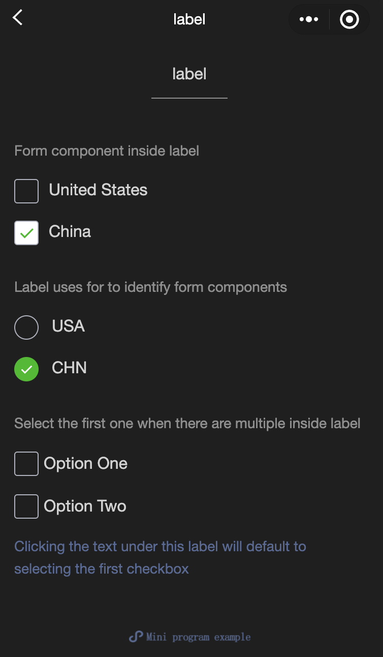
<view class="page-section-title">The form component is inside the label</view>
<checkbox-group class="group" bindchange="checkboxChange">
<view class="label-1" wx:for="{{checkboxItems}}">
<label>
<checkbox value="{{item.name}}" checked="{{item.checked}}"></checkbox>
<text class="label-1-text">{{item.value}}</text>
</label>
</view>
</checkbox-group>
</view>
<view class="page-section page-section-gap">
<view class="page-section-title">Label uses for to identify the form component</view>
<radio-group class="group" bindchange="radioChange">
<view class="label-2" wx:for="{{radioItems}}">
<radio id="{{item.name}}" value="{{item.name}}" checked="{{item.checked}}"></radio>
<label class="label-2-text" for="{{item.name}}"><text>{{item.name}}</text></label>
</view>
</radio-group>
</view>
<view class="page-section page-section-gap">
<view class="page-section-title">If there are multiple controls in the label, the first one is selected</view>
<label class="label-3">
<checkbox class="checkbox-3">Option 1</checkbox>
<checkbox class="checkbox-3">Option 2</checkbox>
<view class="label-3-text">When tapping the text under this label, the first checkbox is selected by default</view>
</label>
</view>
</view>
</view>javascript:
Page({
  onShareAppMessage() {
    return {
      title: 'label',
      path: 'page/component/pages/label/label'
    }
  },

  data: {
    checkboxItems: [
      {name: 'USA', value: 'United States'},
      {name: 'CHN', value: 'China', checked: 'true'}
    ],
    radioItems: [
      {name: 'USA', value: 'United States'},
      {name: 'CHN', value: 'China', checked: 'true'}
    ],
    hidden: false
  },

  checkboxChange(e) {
    const checked = e.detail.value
    const changed = {}
    for (let i = 0; i < this.data.checkboxItems.length; i++) {
      if (checked.indexOf(this.data.checkboxItems[i].name) !== -1) {
        changed['checkboxItems[' + i + '].checked'] = true
      } else {
        changed['checkboxItems[' + i + '].checked'] = false
      }
    }
    this.setData(changed)
  },

  radioChange(e) {
    const checked = e.detail.value
    const changed = {}
    for (let i = 0; i < this.data.radioItems.length; i++) {
      if (checked.indexOf(this.data.radioItems[i].name) !== -1) {
        changed['radioItems[' + i + '].checked'] = true
      } else {
        changed['radioItems[' + i + '].checked'] = false
      }
    }
    this.setData(changed)
  },

  tapEvent() {
    console.log('the button is tapped')
  }
})
wxss:
.label-1, .label-2{
  margin: 30rpx 0;
}
.label-3-text{
  color: #576B95;
  font-size: 28rpx;
}
.checkbox-3{
  display: block;
  margin: 30rpx 0;
}
picker
Functional description: Scroll selector that pops up from the bottom.
Parameters and descriptions:
| Properties | Type | Legal values | Default value | Required | Description |
|---|---|---|---|---|---|
| mode | string | selector:Normal selector multiSelector:Multi-column selector time:Time selector date:Date selector region:State city selector | selector | No | Selector type |
| disabled | boolean | - | false | No | Is it disabled? |
| bindcancel | eventhandle | - | - | No | Trigger when deselected |
Normal selector: mode = selector
| Property name | Type | Default value | Description |
|---|---|---|---|
| range | array/object array | [] | When mode is selector or multiSelector, range is valid |
| range-key | string | - | When range is an Object Array, use range-key to specify the value of key in Object as the selector display content |
| value | number | 0 | Indicates the number of selected items in range (subscript starts from 0) |
| bindchange | eventhandle | - | When value changes, a change event is triggered, event.detail = {value} |
Multi-column selector: mode = multiSelector
| Property name | Type | Default value | Description |
|---|---|---|---|
| range | array/object array | [] | When mode is selector or multiSelector, range is valid |
| range-key | string | - | When range is an Object Array, use range-key to specify the value of key in Object as the selector display content |
| value | number | [] | Indicates the number of selected items in range (subscript starts from 0) |
| bindchange | eventhandle | - | When value changes, a change event is triggered, event.detail = {value} |
| bindcolumnchange | eventhandle | - | Triggered when column changes |
Time selector: mode = time
| Property name | Type | Default value | Description |
|---|---|---|---|
| value | string | - | Indicates the selected time, format is 'hh:mm' |
| start | string | - | Indicates the start of the valid time range, string format is 'hh:mm' |
| end | string | - | Indicates the end of the valid time range, string format is 'hh:mm' |
| bindchange | eventhandle | - | When value changes, a change event is triggered, event.detail = {value} |
Date selector: mode = date
| Property name | Type | Valid values | Default value | Description |
|---|---|---|---|---|
| value | string | - | Current day | Indicates the selected date, in the format of 'YYYY-MM-DD' |
| start | string | - | - | Indicates the start of the valid date range, in the string format of 'YYYY-MM-DD' |
| end | string | - | - | Indicates the end of the valid date range, in the string format of 'YYYY-MM-DD' |
| fields | string | year:Selector granularity is year month:Selector granularity is month day:Selector granularity is day | day | Valid values |
| bindchange | eventhandle | - | - | When value changes, a change event is triggered, event.detail = {value} |
Region selector: mode = region
| Property name | Type | Valid values | Default value | Description |
|---|---|---|---|---|
| value | Array | [] | Current day | Indicates the selected region, the first value of each column is selected by default |
| custom-item | string | - | - | You can add a custom item to the top of each column |
| bindchange | evenhandle | - | - | When value changes, the change event is triggered, event.detail = {value: value, code: code, postcode: postcode}, where the field code is the statistical division code, and postcode is the postal code |
- Sample code:
wxml:
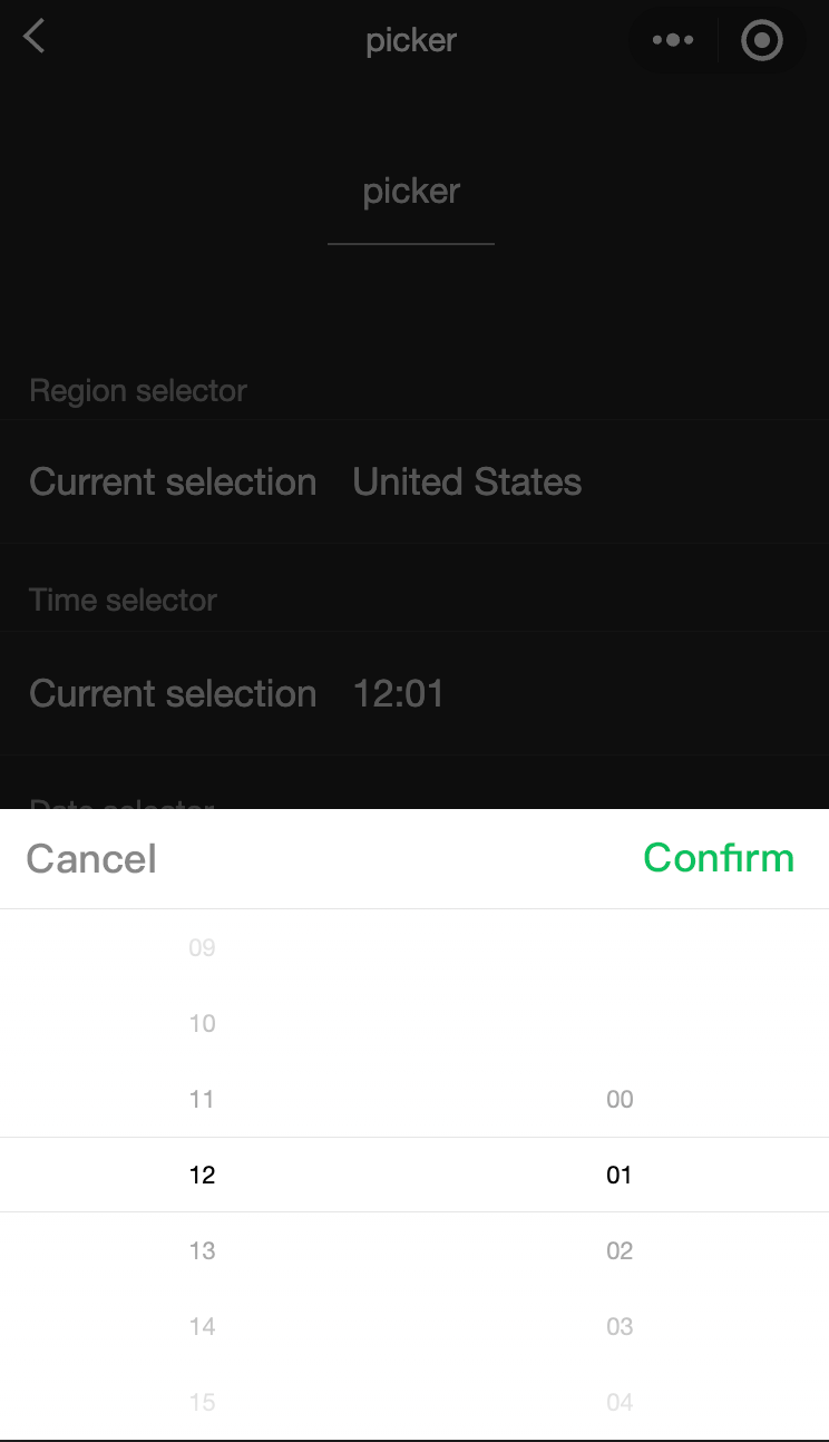
<view class="section">
  <view class="section__title">Normal picker</view>
  <picker bindchange="bindPickerChange" value="{{index}}" range="{{array}}">
    <view class="picker">
      Currently selected: {{array[index]}}
    </view>
  </picker>
</view>
<view class="section">
  <view class="section__title">Multi-column picker</view>
  <picker mode="multiSelector" bindchange="bindMultiPickerChange" bindcolumnchange="bindMultiPickerColumnChange" value="{{multiIndex}}" range="{{multiArray}}">
    <view class="picker">
      Currently selected: {{multiArray[0][multiIndex[0]]}}, {{multiArray[1][multiIndex[1]]}}, {{multiArray[2][multiIndex[2]]}}
    </view>
  </picker>
</view>
<view class="section">
  <view class="section__title">Time picker</view>
  <picker mode="time" value="{{time}}" start="09:01" end="21:01" bindchange="bindTimeChange">
    <view class="picker">
      Currently selected: {{time}}
    </view>
  </picker>
</view>

<view class="section">
  <view class="section__title">Date picker</view>
  <picker mode="date" value="{{date}}" start="2015-09-01" end="2017-09-01" bindchange="bindDateChange">
    <view class="picker">
      Currently selected: {{date}}
    </view>
  </picker>
</view>
<view class="section">
  <view class="section__title">Region picker</view>
  <picker mode="region" bindchange="bindRegionChange" value="{{region}}" custom-item="{{customItem}}">
    <view class="picker">
      Currently selected: {{region[0]}}, {{region[1]}}, {{region[2]}}
    </view>
  </picker>
</view>
javascript:
Page({
  data: {
    array: ['United States', 'China', 'Brazil', 'Japan'],
    objectArray: [
      {
        id: 0,
        name: 'United States'
      },
      {
        id: 1,
        name: 'China'
      },
      {
        id: 2,
        name: 'Brazil'
      },
      {
        id: 3,
        name: 'Japan'
      }
    ],
    index: 0,
    multiArray: [['Invertebrates', 'Vertebrates'], ['Flatworms', 'Nematodes', 'Annelates', 'Mollusks', 'Arthropods'], ['Pork tapeworms', 'Blood-sucking worms']],
    objectMultiArray: [
      [
        {
          id: 0,
          name: 'Invertebrates'
        },
        {
          id: 1,
          name: 'Vertebrates'
        }
      ], [
        {
          id: 0,
          name: 'Flatworms'
        },
        {
          id: 1,
          name: 'Nematodes'
        },
        {
          id: 2,
          name: 'Annelates'
        },
        {
          id: 3,
          name: 'Mollusks'
        },
        {
          id: 4,
          name: 'Arthropods'
        }
      ], [
        {
          id: 0,
          name: 'Pork tapeworms'
        },
        {
          id: 1,
          name: 'Blood-sucking worms'
        }
      ]
    ],
    multiIndex: [0, 0, 0],
    date: '2016-09-01',
    time: '12:01',
    region: ['Guangdong Province', 'Guangzhou', 'Haizhu District'],
    customItem: 'All'
  },
  bindPickerChange: function(e) {
    console.log('The picker sends selection change, and the carried value is' e.detail.value)
    this.setData({
      index: e.detail.value
    })
  },
  bindMultiPickerChange: function (e) {
    console.log('The picker sends selection change, and the carried value is' e.detail.value)
    this.setData({
      multiIndex: e.detail.value
    })
  },
  bindMultiPickerColumnChange: function (e) {
    console.log('The modified column is', e.detail.column, ', and the value is', e.detail.value);
    var data = {
      multiArray: this.data.multiArray,
      multiIndex: this.data.multiIndex
    };
    data.multiIndex[e.detail.column] = e.detail.value;
    switch (e.detail.column) {
      case 0:
        switch (data.multiIndex[0]) {
          case 0:
            data.multiArray[1] = ['Flatworms', 'Nematodes', 'Annelates', 'Mollusks', 'Arthropods'];
            data.multiArray[2] = ['Pork tapeworms', 'Blood-sucking worms'];
            break;
          case 1:
            data.multiArray[1] = ['Fish', ''Amphibians', 'Reptiles'];
            data.multiArray[2] = ['Carassius auratus', 'Hairtail'];
            break;
        }
        data.multiIndex[1] = 0;
        data.multiIndex[2] = 0;
        break;
      case 1:
        switch (data.multiIndex[0]) {
          case 0:
            switch (data.multiIndex[1]) {
              case 0:
                data.multiArray[2] = ['Pork tapeworms', 'Blood-sucking worms'];
                break;
              case 1:
                data.multiArray[2] = ['Roundworms'];
                break;
              case 2:
                data.multiArray[2] = ['Ants', 'Leech'];
                break;
              case 3:
                data.multiArray[2] = ['Mussels', 'Snails', 'Slugs'];
                break;
              case 4:
                data.multiArray[2] = ['Insects', 'Crustaceans', 'Arachnids', 'Myriapods'];
                break;
            }
            break;
          case 1:
            switch (data.multiIndex[1]) {
              case 0:
                data.multiArray[2] = ['Carassius auratus', 'Hairtail'];
                break;
              case 1:
                data.multiArray[2] = [''Frogs', 'Giant salamanders'];
                break;
              case 2:
                data.multiArray[2] = ['Lizards', 'Turtles', 'Geckos'];
                break;
            }
            break;
        }
        data.multiIndex[2] = 0;
        break;
    }
    console.log(data.multiIndex);
    this.setData(data);
  },
  bindDateChange: function(e) {
    console.log('The picker sends selection change, and the carried value is' e.detail.value)
    this.setData({
      date: e.detail.value
    })
  },
  bindTimeChange: function(e) {
    console.log('The picker sends selection change, and the carried value is' e.detail.value)
    this.setData({
      time: e.detail.value
    })
  },
  bindRegionChange: function (e) {
    console.log('The picker sends selection change, and the carried value is' e.detail.value)
    this.setData({
      region: e.detail.value
    })
  }
})
picker-view
Function Description: A scroll selector embedded in the page. Only picker-view-column Component, other nodes will not be displayed.
Parameters and descriptions:
| Property name | Type | Default value | Required | Description |
|---|---|---|---|---|
| value | Array.<number> | - | No | The numbers in the array represent the item selected by picker-view-column in picker-view (the subscript starts from 0). When the number is greater than the length of the picker-view-column option, the last item is selected. |
| mask-class | string | - | No | Set the class name of the mask |
| vaindicator-stylelue | string | - | No | Set the style of the selected box in the middle of the selector |
| bindchange | eventhandle | - | No | The change event is triggered when scrolling and selecting, event.detail = {value}; value is an array, indicating the item currently selected in the picker-view-column in the picker-view (the subscript starts from 0) |
| bindpickstart | eventhandle | - | No | Trigger event when scroll selection starts |
| bindpickend | eventhandle | - | No | Trigger event when scroll selection ends |
| indicator-class | string | - | No | Set the class name of the selected box in the middle of the selector |
| mask-style | string | - | No | Set the style of the mask |
| immediate-change | boolean | false | No | Whether to trigger the change event immediately when the finger is released. If not enabled, the change event will be triggered after the scroll animation ends |
- Sample code:
wxml:
<view class="container">
<view class="page-body">
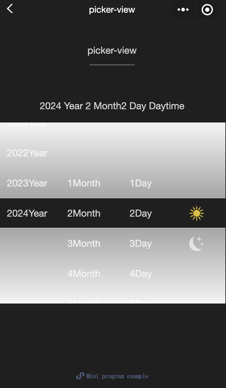
<view class="selected-date">{{year}}Year{{month}}Month{{day}}Day{{isDaytime ? "Day" : "Night"}}</view>
<picker-view indicator-style="height: 50px;" style="width: 100%; height: 300px;" value="{{value}}" bindchange="bindChange">
<picker-view-column>
<view wx:for="{{years}}" wx:key="{{years}}" style="line-height: 50px; text-align: center;">{{item}}Year</view>
</picker-view-column>
<picker-view-column>
<view wx:for="{{months}}" wx:key="{{months}}" style="line-height: 50px; text-align: center;">{{item}}Month</view>
</picker-view-column>
<picker-view-column>
<view wx:for="{{days}}" wx:key="{{days}}" style="line-height: 50px; text-align: center;">{{item}}Day</view>
</picker-view-column>
<picker-view-column>
<view class="icon-container">
<image class="picker-icon" src="../lib/daytime.png" />
</view>
<view class="icon-container">
<image class="picker-icon" src="../lib/night.png" />
</view>
</picker-view-column>
</picker-view>
</view>
</view>jacascript:
const date = new Date()
const years = []
const months = []
const days = []

for (let i = 1990; i <= date.getFullYear(); i++) {
  years.push(i)
}

for (let i = 1; i <= 12; i++) {
  months.push(i)
}

for (let i = 1; i <= 31; i++) {
  days.push(i)
}

Page({
  onShareAppMessage() {
    return {
      title: 'picker-view',
      path: 'page/component/pages/picker-view/picker-view'
    }
  },

  data: {
    years,
    year: date.getFullYear(),
    months,
    month: 2,
    days,
    day: 2,
    value: [9999, 1, 1],
    isDaytime: true,
  },

  bindChange(e) {
    const val = e.detail.value
    this.setData({
      year: this.data.years[val[0]],
      month: this.data.months[val[1]],
      day: this.data.days[val[2]],
      isDaytime: !val[3]
    })
  }
})
picker-view-column
- Function Description Scroll selector child. Can only be placed in picker-view , the height of its child nodes will be automatically set to the same height as picker-view The height of the selected box is the same.
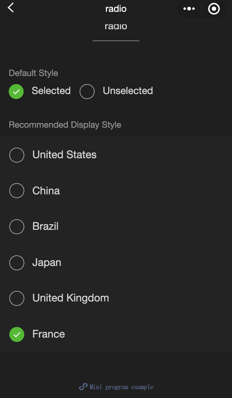
radio
Function Description: Single-select item。
Parameters and descriptions:
| Property name | Type | Default value | Required | Description |
|---|---|---|---|---|
| value | string | - | No | Radio ID. When this radio is selected, radio-group The change event will carry the value of radio |
| checked | boolean | false | No | Is it currently selected? |
| disabled | boolean | false | No | Is it currently selected? |
| color | string | #09BB07 | No | Radio color, same as CSS color |
- Sample code:
wxml:
<view class="page-body">
  <view class="page-section">
    <view class="page-section-title">Default style</view>
    <label class="radio">
      <radio value="r1" checked="true"/>Selected
    </label>
    <label class="radio">
      <radio value="r2" />Unselected
    </label>
  </view>


  <view class="page-section">
    <view class="page-section-title">Recommended display style</view>
    <view class="weui-cells weui-cells_after-title">
      <radio-group bindchange="radioChange">
        <label class="weui-cell weui-check__label" wx:for="{{items}}" wx:key="{{item.value}}">

          <view class="weui-cell__hd">
            <radio value="{{item.value}}" checked="true"/>
          </view>
          <view class="weui-cell__bd">{{item.name}}</view>
        </label>
      </radio-group>
    </view>
  </view>
</view>
javascript:
Page({
  onShareAppMessage() {
    return {
      title: 'radio',
      path: 'page/component/pages/radio/radio'
    }
  },

  data: {
    items: [
      {value: 'USA', name: 'United States'},
      {value: 'CHN', name: 'China', checked: 'true'},
      {value: 'BRA', name: 'Brazil'},
      {value: 'JPN', name: 'Japan'},
      {value: 'ENG', name: 'United Kingdom'},
      {value: 'FRA', name: 'France'},
    ]
  },

  radioChange(e) {
    console.log('A change event is triggered in the radio, and the carried value is: ', e.detail.value)

    const items = this.data.items
    for (let i = 0, len = items.length; i < len; ++i) {
      items[i].checked = items[i].value === e.detail.value
    }

    this.setData({
      items
    })
  }
})
radio-group
Function Description: Single-selector, composed of multiple radios。
Parameters and descriptions:
| Property name | Type | Default value | Required | Description |
|---|---|---|---|---|
| bindchange | eventhandle | - | No | The change event is triggered when the selected item in the radio-group changes, detail = {value:[array of selected radio value]} |
slider
Function Description: Sliding selector。
Parameters and descriptions:
| Property name | Type | Default value | Required | Description |
|---|---|---|---|---|
| min | number | 0 | No | Minimum value |
| max | number | 100 | No | Maximum value |
| step | number | 1 | No | Step size, the value must be greater than 0 and divisible by (max - min) |
| disabled | boolean | false | No | Is it disabled? |
| value | number | 0 | No | Current value |
| color | color | #e9e9e9 | No | Background bar color (please use backgroundColor) |
| selected-color | color | #1aad19 | No | Selected color (please use activeColor) |
| activeColor | color | #1aad19 | No | Selected color |
| backgroundColor | color | #e9e9e9 | No | Background bar color |
| block-size | number | 28 | No | Size of slider, value range is 12 - 33 |
| block-color | color | #ffffff | No | Color of slider |
| show-value | boolean | false | No | Whether to display current value |
| bindchange | eventhandle | - | No | Event triggered after a drag is completed, event.detail = {value} value |
| bindchanging | eventhandle | - | No | Event triggered during dragging, event.detail = {value} value |
- Sample code:
wxml:
<view class="page">
  <view class="page__hd">
    <text class="page__title">slider</text>
    <text class="page__desc">Slider</text>
  </view>
  <view class="page__bd">
    <view class="page-section page-section-gap">
      <view class="page-section-title">Set the step</view>
      <view class="body-view">
        <slider value="60" bindchange="slider2change" step="5" />
      </view>
    </view>

    <view class="page-section page-section-gap">
      <view class="page-section-title">Show the current value</view>
      <view class="body-view">
        <slider value="50" bindchange="slider3change" show-value />
      </view>
    </view>

    <view class="page-section page-section-gap">
      <view class="page-section-title">Set the min/max values</view>
      <view class="body-view">
        <slider
          value="100"
          bindchange="slider4change"
          min="50"
          max="200"
          show-value
        />
      </view>
    </view>
  </view>
</view>
javascript:
var pageData = {}
for (var i = 1; i < 5; ++i) {
  (function (index) {
    pageData[`slider${index}change`] = function (e) {
      console.log(`A change event is triggered in slider${index}, and the carried value is` e.detail.value)
    }
  })(i);
}
Page(pageData)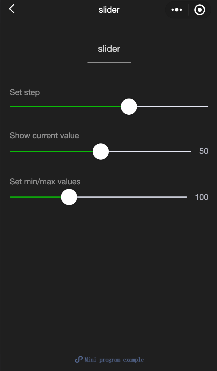
switch
Function Description: Switch selector。
Parameters and descriptions:
| Property name | Type | Default value | Required | Description |
|---|---|---|---|---|
| checked | boolean | false | No | Whether selected |
| disabled | boolean | false | No | Whether disabled |
| type | string | switch | No | Style, valid values: switch, checkbox |
| color | string | #04BE02 | No | Switch color, same as CSS color |
| bindchange | eventhandle | - | No | When the checked value changes due to a click, a change event is triggered, event.detail={ value} |
- Sample code:
wxml:
<view class="page">
  <view class="page__hd">
    <text class="page__title">switch</text>
    <text class="page__desc">Switch</text>
  </view>
  <view class="page__bd">
    <view class="section section_gap">
      <view class="section__title">type="switch"</view>
      <view class="body-view">
        <switch checked="{{switch1Checked}}" bindchange="switch1Change" />
      </view>
    </view>

    <view class="section section_gap">
      <view class="section__title">type="checkbox"</view>
      <view class="body-view">
        <switch
          type="checkbox"
          checked="{{switch2Checked}}"
          bindchange="switch2Change"
        />
      </view>
    </view>
  </view>
</view>
javascript:
var pageData = {
  data: {
    switch1Checked: true,
    switch2Checked: false,
    switch1Style: '',
    switch2Style: 'text-decoration: line-through'
  }
}
for (var i = 1; i <= 2; ++i) {
  (function (index) {
    pageData[`switch${index}Change`] = function (e) {
      console.log(`A change event is triggered in switch${index}, and the carried value is` e.detail.value)
      var obj = {}
      obj[`switch${index}Checked`] = e.detail.value
      this.setData(obj)
      obj = {}
      obj[`switch${index}Style`] = e.detail.value ? '' : 'text-decoration: line-through'
      this.setData(obj)
    }
  })(i)
}
Page(pageData)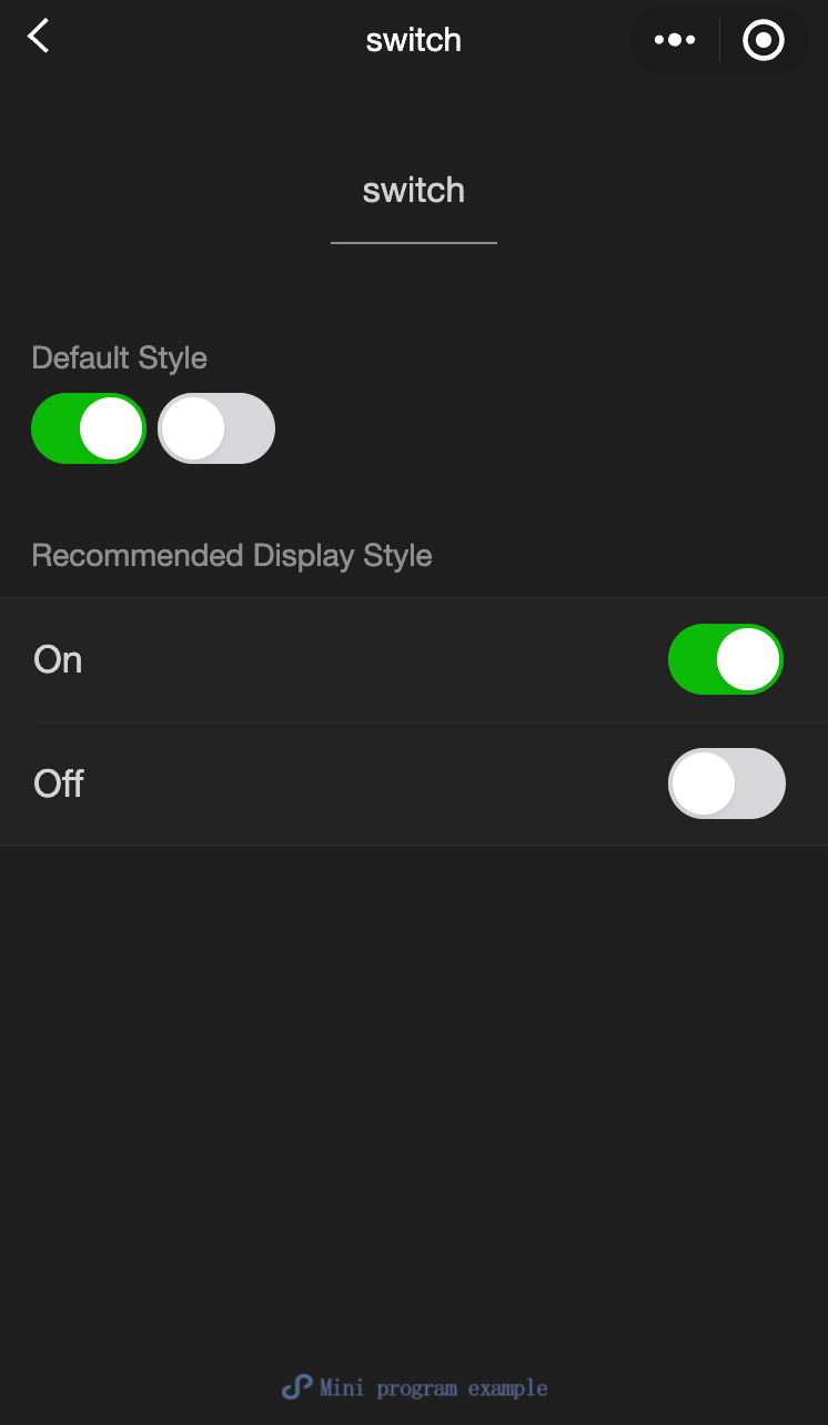
textarea
Function Description: Input box, this component is Native Component , please pay attention to the relevant restrictions when using it.
Parameters and descriptions:
| Properties | Type | Legal values | Default value | Required | Description |
|---|---|---|---|---|---|
| value | string | - | - | No | Contents of input box |
| placeholder | string | - | - | No | Placeholder when input box is empty |
| placeholder-style | string | - | - | No | Specify the style of the placeholder. Currently only color, font-size and font-weight are supported. |
| placeholder-class | string | - | textarea-placeholder | No | Specify the style class of the placeholder. |
| fixed | boolean | - | false | No | If the textarea is in a position:fixed area, the specified attribute fixed needs to be displayed as true. |
| show-confirm-bar | boolean | - | true | No | Whether to display the bar with the 'Done' button above the keyboard. |
| disabled | boolean | - | false | No | Whether to disable. |
| maxlength | number | - | 140 | No | Maximum input length. When set to -1, the maximum length is not limited. |
| auto-focus | boolean | - | false | No | Auto focus, pull up the keyboard. |
| focus | boolean | - | false | No | Get focus. |
| auto-height | boolean | - | false | No | Whether to automatically increase the height. When auto-height is set, style.height does not take effect. |
| cursor-spacing | number / string | - | 0 | No | Specify the distance between the cursor and the keyboard. Take the minimum value of the distance from the bottom of the textarea and the distance specified by cursor-spacing as the distance between the cursor and the keyboard |
| cursor | number | - | -1 | No | Specify the cursor position when focus |
| selection-start | number | - | -1 | No | Cursor start position, valid when automatically clustered, must be used with selection-end |
| selection-end | number | - | -1 | No | Cursor end position, valid when automatically clustered, must be used with selection-start |
| adjust-position | boolean | - | true | No | When the keyboard pops up, whether to automatically push the page up |
| hold-keyboard | boolean | - | false | No | When focus, do not collapse the keyboard when clicking the page |
| confirm-type | string | send:The lower right button is 'Send' search:The lower right button is 'Search' next:The lower right button is 'Next' go:The lower right button is 'Go' done:The lower right button is 'Finish' return:The lower right button is 'line break'; | return | No | Set the text of the button in the lower right corner of the keyboard |
| confirm-hold | boolean | - | false | No | Whether to keep the keyboard from collapsing when clicking the button in the lower right corner of the keyboard |
| bindfocus | eventhandle | - | false | No | Triggered when the input box is focused, event.detail = {value, height}, height is the keyboard height |
| bindblur | eventhandle | - | false | No | Triggered when the input box loses focus, event.detail = {value, cursor} |
| bindlinechange | eventhandle | - | false | No | Called when the number of lines in the input box changes, event.detail = {height: 0, heightRpx: 0, lineCount: 0} |
| bindinput | eventhandle | - | false | No | When the keyboard is input, the input event is triggered, event.detail = {value, cursor, keyCode}, keyCode is the key value, and the tool currently does not support returning the keyCode parameter. **The return value of the bindinput processing function will not be reflected in the textarea** |
| bindconfirm | eventhandle | - | false | No | When clicking Finish, the confirm event is triggered, event.detail = {value: value} |
| bindkeyboardheightchange | eventhandle | - | false | No | This event is triggered when the keyboard height changes, event.detail = {height: height, duration: duration} |
TIP
- The blur event of textarea will be later than the tap event on the page. If you need to get the textarea in the button click event, you can use the bindsubmit of form.
- It is not recommended to modify the user input on multiple lines of text, so the bindinput processing function of textarea will not reflect the return value to the textarea.
- When the keyboard height changes, the keyboardheightchange event may be triggered multiple times. Developers should ignore the same height value.
- Sample code:
wxml:
<view class="section">
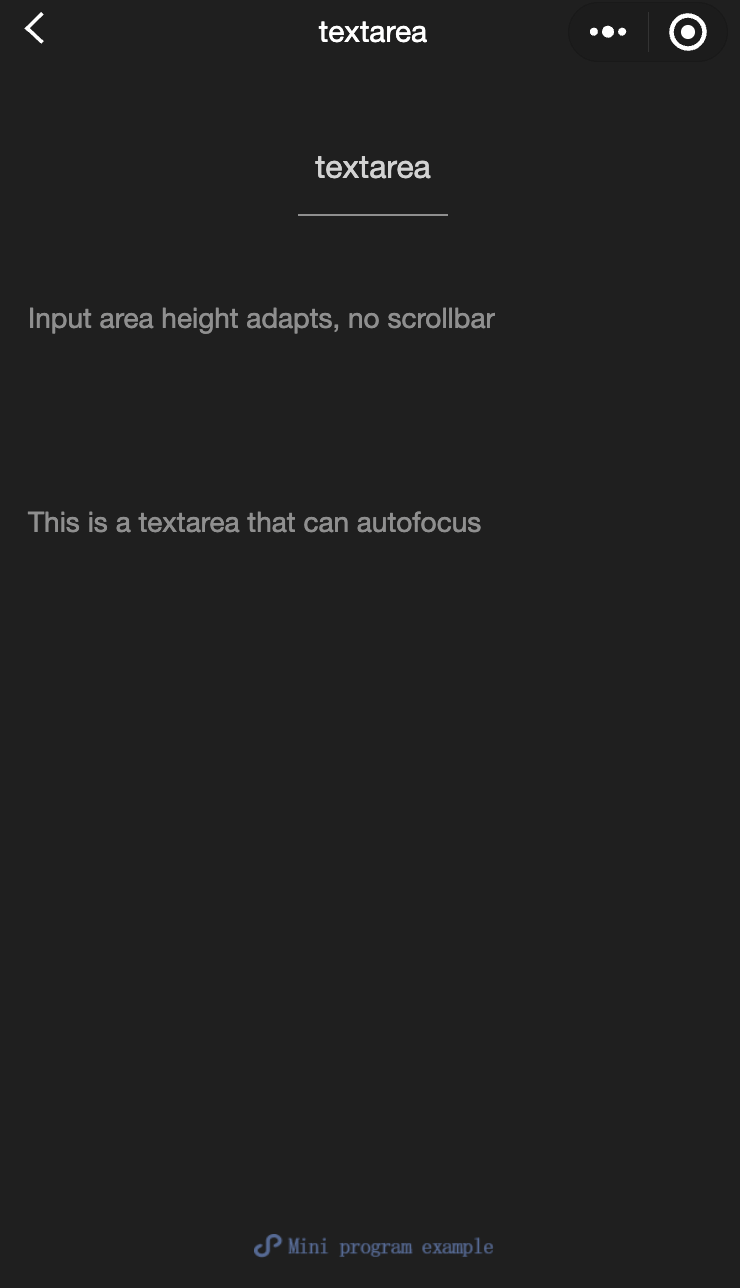
<textarea bindblur="bindTextAreaBlur" auto-height placeholder="Automatic height adjustment" />
</view>
<view class="section">
<textarea placeholder="The placeholder color is red" placeholder-style="color:red;" />
</view>
<view class="section">
<textarea placeholder="This is a textarea that can be automatically focused" auto-focus />
</view>
<view class="section">
<textarea placeholder="This will only be focused when the button is tapped" focus="{{focus}}" />
<view class="btn-area">
<button bindtap="bindButtonTap">Make the input box focused</button>
</view>
</view>
<view class="section">
<form bindsubmit="bindFormSubmit">
<textarea placeholder="Textarea in the form component" name="textarea"/>
<button form-type="submit"> Submit </button>
</form>
</view>javascript:
Page({
  data: {
    height: 20,
    focus: false,
  },
  bindButtonTap: function () {
    this.setData({
      focus: true,
    });
  },
  bindTextAreaBlur: function (e) {
    console.log(e.detail.value);
  },
  bindFormSubmit: function (e) {
    console.log(e.detail.value.textarea);
  },
});