Global Configuration
The app.json file in the root directory of the mini program is used to configure the mini program globally. The file content is a JSON object with the following properties:
Configuration items
| Properties | Type | Required | Description |
|---|---|---|---|
| entryPagePath | string | No | The default homepage of the mini program |
| pages | string[] | Yes | Page path list |
| window | Object | No | The global default window performance |
| tabBar | Object | No | The global default window performance |
| debug | Object | No | The performance of the bottom tab bar |
| subpackages | Object | No | Whether to turn on debug mode, which is closed by default |
| workers | Object | No | Sub-package structure configuration |
| navigateToMiniProgramAppIdList | Object | No | The directory where the Worker code is placed |
| preloadRule | Object | No | The list of mini programs that need to be jumped, see Cwx.navigateToMiniProgram |
| usingComponents | Object | No | Global Custom Components Configuration |
| permission | Object | No | Mini program interface permission related settings |
| darkmode | Object | No | Mini program supports DarkMode |
| themeLocation | Object | No | Indicates theme.json Location, darkmode is true and is required |
| disableSlideCloseGesture | Object | No | Whether to disable the gesture of closing the mini program by sliding sideways. The default value is false. |
entryPagePath
Specify the default startup path (home page) of the mini program. If not filled in, it will default to the first item in the pages list. Page path parameters are not supported.
{
  "entryPagePath": "pages/index/index"
}
pages
Used to specify which pages the mini program consists of. Each item corresponds to the path (including file name) information of a page. The file name does not need to have a file suffix. The framework will automatically find the four files .json, .js, .wxml, and .wxss in the corresponding location for processing.
When entryPagePath is not specified, the first item in the array represents the initial page (home page) of the mini program.
Adding/reducing pages in the mini program requires modifying the pages array.
If the development directory is:
├── app.js
├── app.json
├── app.wxss
├── pages
│   │── index
│   │   ├── index.wxml
│   │   ├── index.js
│   │   ├── index.json
│   │   └── index.wxss
│   └── logs
│       ├── logs.wxml
│       └── logs.js
└── utils
You need to write in app.json:
{
  "pages": ["pages/index/index", "pages/logs/logs"]
}
window
Used to set the status bar, navigation bar, title, and window background color of the mini program.
- default default style
- custom custom navigation bar, only keep the upper right corner pill button
- hide custom navigation bar, can support privacy navigation bar and pill button. See Note 2 immediately after the table
Note 1: HexColor (hexadecimal color value), such as '#ff00ff'
Note 2: About navigationStyle
- navigationStyle is only effective in app.json.
- navigationStyle: custom is invalid for web-view components
tabBar
If the mini program is a multi-tab application (there is a tab bar at the bottom or top of the client window to switch pages), you can specify the performance of the tab bar and the corresponding page displayed when the tab is switched through the tabBar configuration item.
| Properties | Type | Required | Default value | Description |
|---|---|---|---|---|
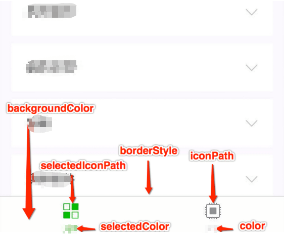
| color | HexColor | Yes | - | The default color of the text on the tab, only hexadecimal colors are supported |
| selectedColor | HexColor | Yes | - | The color of the text on the tab when it is selected, only hexadecimal colors are supported |
| backgroundColor | HexColor | Yes | - | The background color of the tab, only hexadecimal colors are supported |
| borderStyle | string | No | black | The color of the top border of the tabbar, only black / white are supported |
| list | Array | Yes | - | The list of tabs, see the list attribute description for details, at least 2 and at most 5 tabs |
| position | string | No | bottom | The position of the tabBar, only bottom / top are supported |
| custom | boolean | No | false | Customize the tabBar, for details, see Customize tabBar |
Where list accepts an array, only at least 2 and at most 5 tabs can be configured, the tabs are sorted in the order of the array, each item is an object, and its attribute values
| Properties | Type | Required | Description |
|---|---|---|---|
| pagePath | string | Yes | Page path, must be defined in pages first |
| text | string | Yes | Button text on the tab |
| iconPath | string | No | Image path, icon size limit is 40kb, recommended size is 81px * 81px, network images are not supported |
| selectedIconPath | string | No | When position is top, icon is not displayed |
debug
You can turn on debug mode in the developer tools. In the console panel of the developer tools, the debugging information is given in the form of info, which includes Page registration, page routing, data update, event triggering, etc. It can help developers quickly locate some common problems.
subpackages
When enabling Package Loading , declare the project subpackage structure.
TIP
It is also supported to write it as subPackages.
workers
When using worker to handle multi-threaded tasks, set the directory where the Worker code is placed.
navigateToMiniProgramAppIdList
When the mini program needs to use the navigateToMiniProgram interface to jump to other mini programs, you need to first declare the list of mini program appIds to jump to in the configuration file, and a maximum of 10 are allowed.
preloadRule
Declare Subpackage pre-download rules.
usingComponents
The usingComponents field declared in app.json is considered a global custom component and can be used directly in the page or custom component in the mini program without further declaration.
TIP
Global custom components will be considered to be relied upon by all pages and will be initialized when all pages are started, affecting startup performance and occupying the size of the main package. Custom components that are only referenced by individual pages or subpackages should be declared in the page configuration as much as possible.
permission
Mini program interface permission related settings, field type is Object, structure is:
| Properties | Type | Required | Description | Description |
|---|---|---|---|---|
| scope.userLocation | PermissionObject | No | - | Location related permission declaration |
PermissionObject structure
| Properties | Type | Required | Description | Description |
|---|---|---|---|---|
| desc | string | Yes | - | Chinese interface usage description displayed when the mini program obtains permission, up to 80 characters |
| desc-en | string | Yes | - | English interface usage description displayed when the mini program obtains permission, up to 80 characters |
| desc-adesc-ar | string | Yes | - | Arabic interface usage description displayed when the mini program obtains permission, up to 80 characters |
{
  "pages": ["pages/index/index"],
  "permission": {
    "scope.userLocation": {
      "desc": "Your location information will be used to display the effects of the Mini Program location interface." // Continuous Background Positioning for Freeway Driving
    }
  }
}
scope list
| scope | Corresponding interface | Description |
|---|---|---|
| scope.userinfo | wx.getUserInfo | User information |
| scope.userLocation | wx.getLocation | Get geographic location information. |
| scope.userFuzzyLocation | wx.getFuzzyLocation | Get fuzzy geographic location information. |
| scope.record | live-pusher or wx.startRecord | Live broadcast or recording |
| scope.camera | camera | Camera component |
| scope.addPhoneCalendar | wx.addPhoneCalendar | Add log |
| scope.writePhotosAlbum | wx.saveImageToPhotosAlbum | Save pictures to album |
| scope.bluetooth | wx.openBluetoothAdapter | Bluetooth |
darkmode
You can configure 'darkmode': true to indicate that the current mini program can adapt to DarkMode. All basic components will display different default styles according to the system theme, and the navigation bar and tab bar will also automatically switch according to the developer's configuration.
After configuration, please follow the DarkMode Adaptation Guide to complete the adaptation work other than the basic style.
{
  "darkmode": true
}
themeLocation
Custom theme.json Path, when configuring 'darkmode':true, the current configuration file is required.
disableSlideCloseGesture
Whether to disable the gesture of sliding to close the mini program, the default is false.
apiVersion
For APIs (for example: wx.login Version control, the latest version is used by default when not configured.
{
  "apiVersion": "v1"
}
Configuration example:
{
  "pages": ["pages/index/index", "pages/logs/index"],
  "window": {
    "navigationBarTitleText": "Demo"
  },
  "tabBar": {
    "list": [
      {
        "pagePath": "pages/index/index",
        "text": "index"
      },
      {
        "pagePath": "pages/logs/logs",
        "text": "logs"
      }
    ]
  },
  "debug": true
}